Since continuous improvements of mobile phone and tablet technologies, the challenges facing the designer of an ecommerce website are ever-changing. While technological progress in this domain is popular with the consumer and constantly provides business-owners with new opportunities for reaching customers in ever more varied scenarios and locations, it most definitely creates some hassles for designers and developers. There are several basic principles that must be taken in consideration when designing for mobile, and in this article we will discuss and go through them.
Analyzing customer behaviour
Customer behaviour on mobiles in regard to ecommerce websites is similar to the regular browsing experience but with slight particularities we will discuss now. There is an expectation of being able to access the same sites, but in such a way that is suitably simplified for the smaller screen.
Consumer purchase behaviour on mobile devices differs significantly from that seen with larger, static devices. In is presumed that tablet shoppers are more likely to make a purchase as smartphone shoppers, demonstrating the way in which the particular used tool influences the activity of the user.
Mobile devices are small and have little screen real estate so it’s important to embrace this limitation instead of fighting them. Oftentimes, applications interfere with the small space with as many things as they think a user might need but it’s believe that it is counterproductive. The best shopping experiences can be considered those that are light, where the focus is on the product and the remaining information acts as supporting content rather than fighting for the user’s attention.
Use the right Foundation
It is important to have the right foundation for your websites, especially when analyzing its mobile behaviour. There are several frameworks to choose from, and i’m so positive about them because they come with HTML, CSS and JS for numerous uses, providing various interface elements including button groups, button dropdowns, thumbnails, alerts, progress bars and lots more. They also offer some good advice on fitting it all together, as well as some suggested templates’. This helps you to make your site unique, but with the benefit of the initial guidance and the platform that is provided by the framework.
Using a framework such helps with another important aspect of ecommerce for mobile which is optimization. Tools provided by Shopify can help with using CSS instead of images wherever possible, which assists performance optimisation and provide a stable platform for occurring and future sales. If a gradient is needed, use CSS rather than an image slice. Any images can be optimised by ensuring that the file size is as small as possible without compromising quality unnecessarily. Javascript and CSS files would be minified and, most importantly, ensure that unwanted Javascript files do not get called in when loaded on a mobile device. All of these features benefit the site’s performance and improve the experience for mobile users.
Prioritise the Content
If we're talking about a responsive website, it’s vital to make sure that the most important features are carried over and the content of the mobile site is prioritised for ease of use and improved usability. Amongst the features that have got to be included in a “prioritised content” mobile environment, we could nominate:
- A search bar accessible on every page
- Link to account settings and checkout page
- Easy access to every category on site
- Full-width images images for content-centric experience
Deciding which elements are relevant to both desktop and mobile alike is a vital part of the process. The trick is in prioritising by understanding the importance of each and ensuring that the features work just as well for mobile viewers as desktop viewers. The rule of thumb for this being the idea to always keep focus on the content and prioritize it.
Use Simple Interfaces
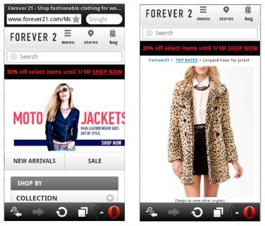
Clutter is your number one enemy, thus the idea to rely mainly on simple, uncluttered yet usable interfaces and designs. Mobile shopping experiences are best when the focus is put on the products alone. Let the user browse through your products easily by getting rid of unnecessary widgets like extra banners or unnecessary inter-site links.
A website that displays big photos and feeds full of products is the way to go. Keeping browsing easy and simple and rolling with clutter free interfaces is what lets the end user keep focus on the actual shopping through the appealing yet functional design that is provided to him.
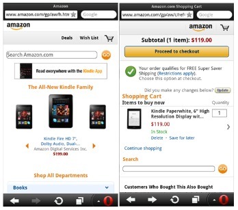
Amazon makes use of a great mobile interface that looks really simple but doesn’t feel cheap at all. A lot of whitespace and warm colors create a beautiful color palette that pleases the eyes and benefits the interfaces greatly. No matter the numerous amount of widgets the word that would describe this interface would still be simplicity because of the concordance in the way the graphics interact with each other.
Use Quality Graphics and Images
Mobile devices, especially phones, have relatively tiny screens. Product photos should not be even tinier; the products need to be seen in detail, that’s why you would like to make use of as many full-screen pictures as possible. If photos are pixelated or small, it will annoy shoppers and will affect the shopping behaviour. Shopping on a mobile device is difficult enough as it is. User experience consists of several facts, and even if image quality is not a part of it, it definitely adds up to the credibility and sometimes acts on the impulses of the end user which definitely do make up the concept of user experience which we are looking forward to improve on our mobile websites.
Have an Effective Checkout Process
As the checkout process calls for numerous text fields, this can be one of the hardest parts of an ecommerce site to get right but with the challenge come results, as an effective checkout could yield in great conversion rates. The process needs to be well-structured and easy to follow on a mobile device thus several principles have got to be implemented in this sense:
- List of products with easy + and – buttons to manage quantities
- A field for coupon codes (if any)
- Large and clear ‘checkout’ button
- Visible ‘keep shopping’ button
In designing the checkout process, an accordion structure is a great approach. This gives the user a clear view of the process and keeps all of the relevant information on one screen. This theory has been questioned by several experts but those opinions are subjective, thus you should find out what suits your needs best and be pro or against the accordion feature.
For some reason, in order to browse and shop on mobile apps the user is often required to log in/sign up. It’s very inconvenient for the end-user to commit to a sign-up from a mobile device, often times because these forms require many fields to be filled in.
Once someone decides to buy something on your website, it’s important you let them check out as easy as possible. Make sure that the process you make them commit to, is a seamless, and mindless experience – or at least it has got to be one. It’s crucial not to annoy a user when they are trying to check out. At this point, your customers have decided to buy your product so let them do right that, but in a correct way, by getting rid of any issues they might face ahead.
Conclusion
Mobile devices have a separate environment in regard with ecommerce, thus a specific approach is necessary. In this article we have discussed some basic principles that must be covered in order to provide a usable and efficient experience for the end users. It is important to realize that every website has it’s own specific traits, thus while a general approach is possible, adapting to crucial specifics of your own site is equally important.
Feature image curtsey of nadrosia


Comments 0 Responses