
Shopping cart abandonment is a phenomenon that is common in e-commerce. It is an idea that shows the proportion between the number of people who commit to an online purchase and the number of the possible customers who leave the sites at some point, without checking out.
Sadly, the registered abandonment rate, as stated by many specialists in the field, is around 60% and up to 80%. We will try to discuss several tips that could be implemented in order to improve the conversion rates and reduce the number of people abandoning your shopping cart.
Reasons for Shopping Cart Abandonment
Many details have been given trying to state why customers abandon shopping carts. Most of the reasons are similar to the ones that we would find in a real-world shopping environment
You might be wondering, why people abandon their shopping carts:
- Impatience, a thing which that is very common nowadays. Everyone is in a rush and has not enough time to dedicate to product browsing thus an excess amount of time spent on the websites without success will most probably lead the potential customer to abandon the cart.
- Confusion in regard to the functionality of the website or check-out process.
- Extra costs that were not mentioned during the process
- Caution (Most Web shoppers are cautious about disclosing their personal information, especially when it comes to the credit card details. They will easily become suspicious if too much information is requested from them.)
- Indecision
- As with real-life shopping, not any visitor is necessarily a customer. Most of them are checking prices, comparing various retailers and look where and who can give them the best deal. It is possible that a visitor might return later on and make a purchase from your website if he doesn’t feel bothered by anything.
1. Reduce the steps of your check-out process

It is believed that around 10% of customers abandon their shopping cart solely because of a lengthy checkout process.
These are most likely multi-page checkouts that keep bothering customers with extra forms, questions, or products. Check-out itself, even if it seems like a complex process, it isn’t really one, at least it shouldn’t be one from customer’s perspective.
The customers should only see a simple yet functional system that lets him complete the purchase he intends to commit without much hassle or struggle, thus simplicity might be considered one of the key points for a successful check-out process.
The necessity of a process that has a reduced number of steps comes from the fact that customers will be expecting a usable system, which minimizes the time wasted filling in forms or similar activities.
Additional features might be necessary, thus the need for a feature like “Express Checkout” comes in. Providing an “Express Checkout” will let the users commit the purchase really fast and while viewing their cart, they can immediately check out and complete the purchase.
2. Ask for account registration after the sale

Online shoppers do not like proprietary registration forms during check out. They usually make you waste time and in an era where everyone is in a hurry, time is an important fact to take in consideration when making the users waste theirs.
The aim behind asking a visitor to sign up would be to store his data for future purchases or other miscellaneous reasons, but it is to be understood that post-purchase the user is going to commit to a sign-up anyways, giving the fact that he has just committed a purchase on that website.
There are several situations in which storing user data is important, and here’s a solution. Walmart’s website is a great example of this.
As you’re checking out, they will give you 3 options for your account. You can login with your existing Walmart account, register now, or wait until you finish the purchase to create an account. This puts less pressure on the visitor, knowing that he can complete the purchase without having to register.
3. Make cart items visible at all times

It can become difficult for customers to keep track and navigate a website just for the sole fact of finding their shopping cart and preview the added items.
Even if it’s easier from a technical view to create customer shopping carts on a separate page from your e-commerce site, visitors need ready access to the cart no matter of the page they are on.
In one report, Movies Unlimited allowed its online shoppers to preview their existing shopping cart via a drop-down menu, rather than navigating to a secondary page. This yielded to an estimated decrease in cart abandonment of 4% to 8%.
ASOS also has a great way of displaying the current items in the shopping cart – just by a hover you can preview all added items and apply changes (such as add/delete item).
4. Provide a variety of payment options

These should include a variety of credit cards, third-party online payment services such as PayPal or Skrill and even various rewards cards. Apart from these digital payment options, receiving payments via check would fill in any possible gap in the payment method inconvenience by reaching more customers and even gather purchases from new customers who haven’t bought before.
- Reinforce your website security/privacy. Even if online buying has been a thing for years and online credit card transactions are usual, if your site is new to a certain customer, he might need the assurance that communicates of the security/privacy of your site in regard to his information. McAfee Secure is one example of a way to communicate extra website security.
- Display shipping fees ahead of time. Shipping costs should be clear before asking the customer for payment info. This can be done by estimating shipping costs and adding an approximate fee to every product or integrating some type of shipping calculator button that enables the customer to calculate shipping prices at any desired time whilst involved in the shopping process.
5. Allow for Easy Order Modification
Users are most likely going to make mistakes during the shopping process. Letting customers to correct and change their order in the middle of the checkout process can prevent abandonment or at least get rid of a reason for its possible happening.
Providing a link that allows to remove the item from cart next to each and every item provides the visitor with the feeling that he is under control of situation and also doesn’t make it necessary to go through a lengthy process just to make a small correction.
Place the ‘Continue Shopping’ button somewhere close to the order specifications. This way when users spot a mistake, they will be able to correct it immediately by choosing a different item.
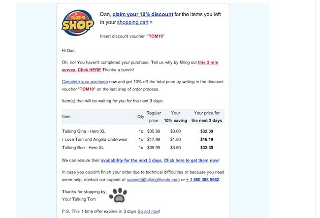
6. Cut Out the Cuteness and Focus on Clarity
Including humor and fun content in your abandoned cart email may work with some audiences, but in general, your best bet is to get right to the point.
That means to have a blunt one-liner as the email subject, a quick mention of the products still in the cart and a button so they can complete the purchase.
Even a plain text email works fine for this.
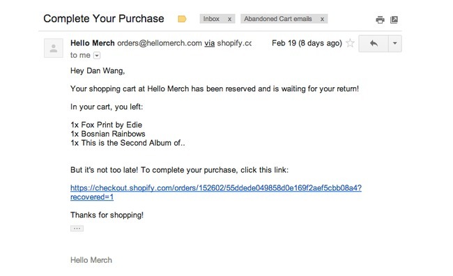
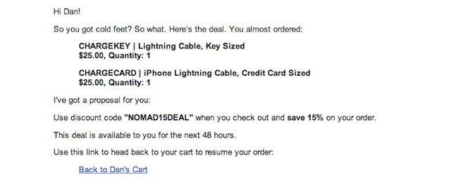
I received this one below regarding an abandoned cart, where they offered me a further 10% to complete the purchase. However, it's not obviously clear that this email is regarding an abandoned cart.
You can't always assume that people left their cart without purchasing because they had an issue. They may have been busy, or called away to do something else, so just remind them plainly that it's still there.
Takeaways:
- Use plain language, someone might have genuinely forgot about their cart and this is a good reminder
- Don't be scared to send plain text emails
7. Use the Best Tools for Bringing Back Users
Many online businesses think that using a newsletter tool like MailChimp is enough for abandoned cart emails. However, nothing could be further from the truth.
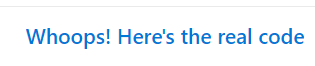
You need an automated email software with support for storing data, sending out on time, linking to the right products and maybe even storing payment information. Rejoiner isn't a bad choice, however, there are many options are out there on the market.
Manually sending emails to abandoned cart users can be a hugely time-sapping task so using a tool is vital. A tool like Rejoiner helps you segment in many different ways such as:
- Order value
- Days since purchase/items left in the basket
- Previous purchases
- Specific products
Takeaways:
- Use software to send your abandoned cart emails
- Segmenting by order value is important. Offer a discount to high value orders?
- Have a high mark up on a certain product? Offer a discount on this
8. Offer Live Chat on Your Ecommerce Site
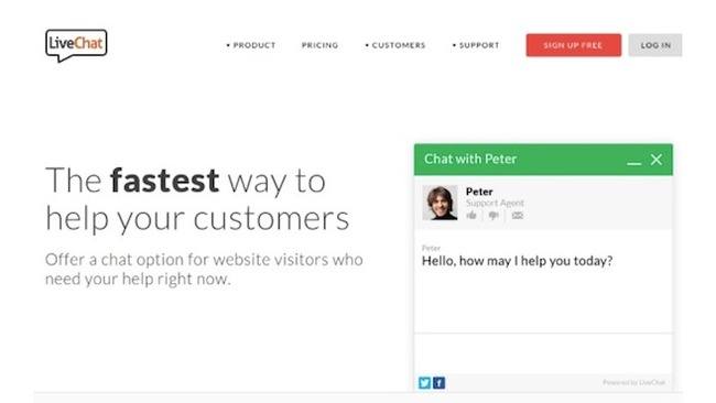
People have questions when buying on your website, and if they go unanswered, they may just leave without buying anything. Install one of the best live chat apps to ensure that customers don't have to rely on product descriptions and specs.
Studies have shown that in particular live chat is popular with millennials. 71% of 16-24 year olds demand a quick response from an ecommerce store and they want that response via live chat.
In fact, live chat usage on websites has risen from 67% to 81% over a 3 year period.
Takeaways:
- Use live chat to solve customer issues
- Are your target market millennials? Then it's imperative to have live chat
9. Let Customers Edit Their Shopping Carts When They Return
Nothing is more annoying for a customer than when they are locked into what they were looking at before. Give your customers the opportunity to edit their shopping cart upon return.
Shopify and Bigcommerce have tools available within their software which allow for this.
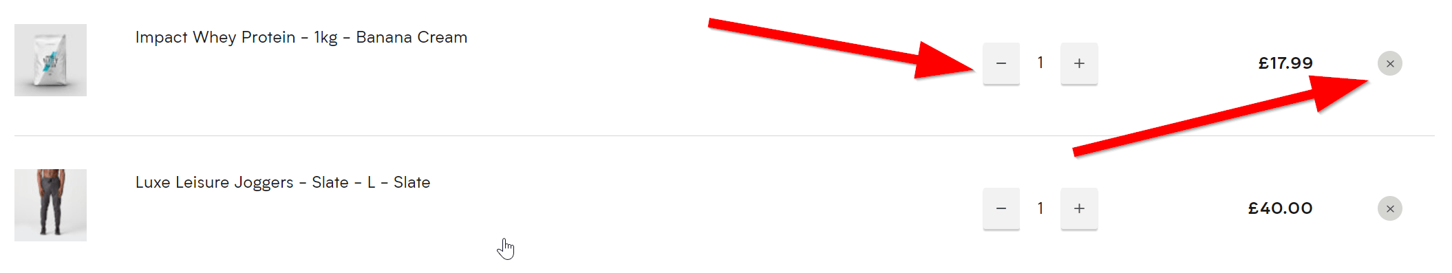
You should be giving your customers the option to remove that item with a simple cross displayed above.
However, it's also a good idea to add a minus and plus sign to encourage customers to add more items than they originally intended.
Takeaways:
- Give customers the ability to edit their basket
- Allow them to add more items with a simple toggle button
10. Reveal How Far They Are Along in the Process
One study from Kissmetrics shows that when customer know where they are in the process, they are more likely to finish checking out. Sometimes it feels like you're stuck in the checkout line for quite some time.
When will it end? Therefore, take a hint from Amazon and reveal progress.

This ensures that there is an end in sight for the customer. Additionally, you can add a percentage mark to show how far along in the process they are.
Allowing them to click back on this process is important as well, as they have had to change shipping or billing information. Nothing is more annoying than having to click the company logo to go back to the first step.
Takeaways:
- Show customers how far along the process they are via a numerical step or percentage mark
- Allow users to back to a particular step of the checkout
11. Only Ask for Payment Information After Shipping Has Been Discussed
Imagine how frustrating it must be if you had to punch in your credit card information before learning about shipping costs. Some websites have this setup, so it's wise to evaluate the order in which people type in their information.
They should have the total price given to them prior to filling in credit card numbers.
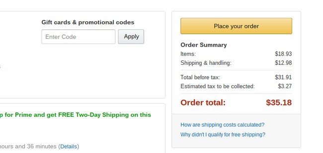
Additionally, you can also display how close they are to free delivery. This may prompt them to add an item they were looking at earlier to avoid a shipping charge.
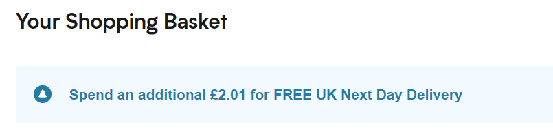
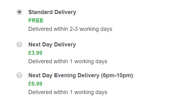
Having several different options for delivery is important as people may not want the items soon and may want to keep their costs low.
Takeaways:
- Only ask for payment when the shipping has been added
- Display how close the customer is to free delivery in the checkout
12. Be Smart With Your Coupons
A significant amount of people suggest that they left an online store because they were searching for a coupon online but never found it.
This means that if you have a coupon for new or returning customers, it must be readily available and visible right from your website. Even explaining how to use a coupon in an email is smart.
Displaying the code at the top of your website is considered good practice as it will be right in the users eyeline.
What could also work well is to use a countdown on your website for the discount. Like we touched on in point 1, this is a great way of creating urgency with a visitor to your site.
Takeaways:
- Display your discount codes clearly on your site
- Use a countdown to create urgency
13. Keep the Cart Visible at All Times
Is it possible that customers forget that they already put items in the shopping cart? You bet!
In fact, it's more common than you think. Therefore, it's important to have a little shopping cart icon towards the top of the website with a ticker of how many items are in there. Some stores even show the list of items.
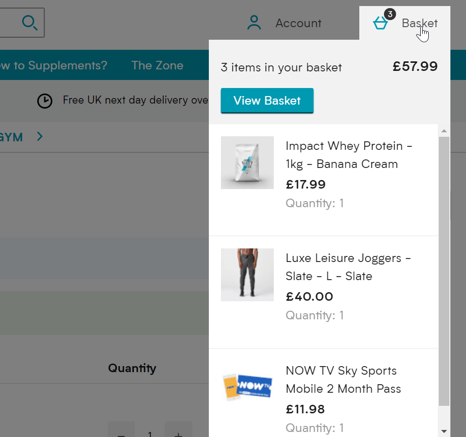
A good option is to allow the following happening when users hover over their cart:
- Show total price
- Display quantity of each product
- Include a mini image of the products
- Show individual product prices
- Allow visitor to view basket to edit
Takeaways:
- Allow users to see their basket
- A hover option is more user-friendly, include a click through to view more information as well
14. Remove Items on Your Site and Checkout That Are Distracting
Some websites are so packed with bells and whistles that it's intimidating for the customers. Other times, they may get so distracted that they forget to checkout.
From the homepage to the checkout module, don't be a company with tons of banners, suggestions, widgets and products constantly popping up when the customer just wants to make a purchase.
The website above has messages for discounts, rewards, competitions as well as daily deals. Add a pop-up into the equation here and it can be very overpowering.
Takeaways:
- Avoid pop-ups too early on your website
- Use one message on your homepage, otherwise, users won't register any of it
15. Include Testimonials to Add Credibility
A testimonial tool, like the Testimonial Rotator plugin, is a sure fire way to build your credibility.
We've talked about how customers take risks with buying from your site, so if they see that others have done so without any problems, you're on the right track to decreasing abandonment rates.
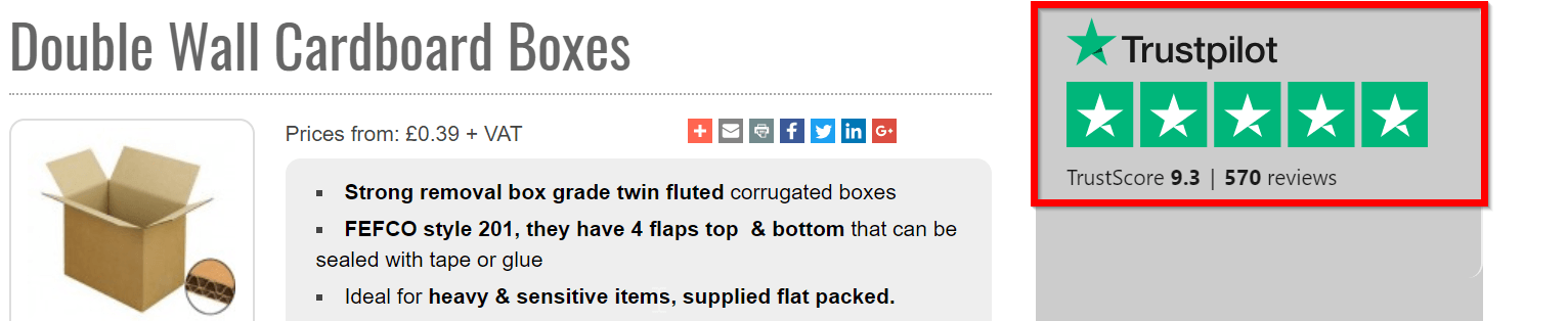
As we touched on earlier, using a service such as Trustpilot is vital in turning visitors into customers. What some websites fail to do though is add these reviews in meaningful places.
Reviews tend to be just kept for below the fold content on the homepage or used in the website footer.
But what if nobody sees them?
You should have reviews hard corded on to your website so they can be easily identifiable. This is especially the case on important pages such as product pages, cart/basket pages and even on the checkout.
Takeaways:
- Use a service such as Trustpilot to get user reviews, maybe by offering them a discount on their next order
- Display reviews on important pages on the checkout journey
16. Forget About Making People Register for Your Site
If someone doesn't want to register for an account on your website, don't make them. Not everyone is ready to give away their information that easily.
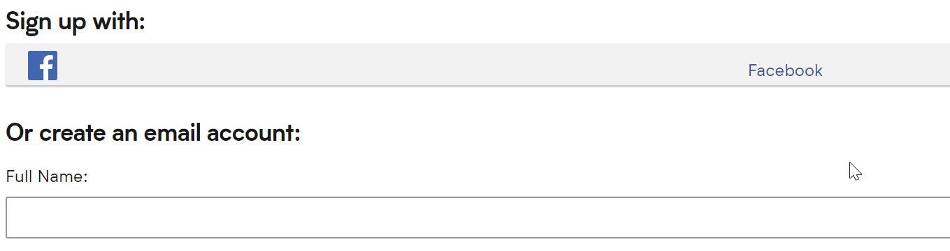
Additionally, you can use a social media sign up so customers can sign up with their Facebook profile. This a two advantage as its quicker for the customer and you will receive all the requisite details from their Facebook profile.
Takeaways:
- Don't push people to register an account as users see this as timely
- Offer a social login/register to make the process quicker
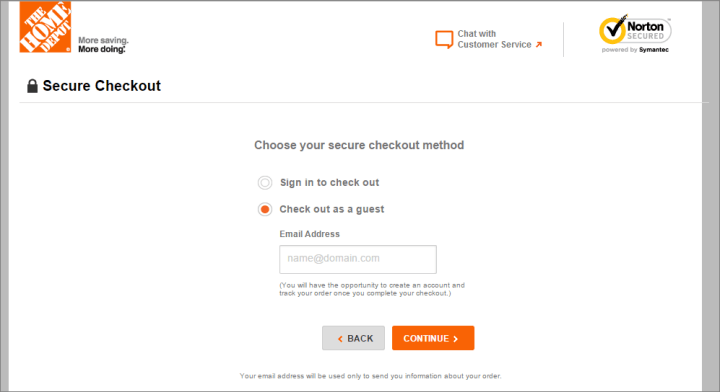
17. Instead, Offer a Guest Account Option
The solution for those who are not willing to register with your website is the guest checkout option. It goes along with some of the many improved checkout principles.
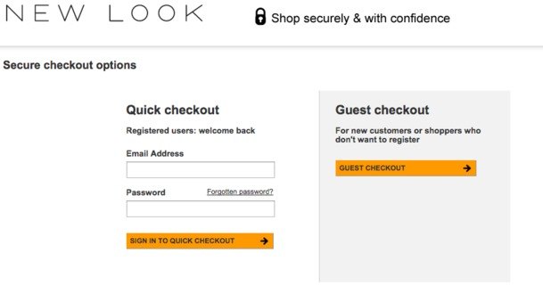
They don't have to give up their information, but at the same time, you can make a sale.
As they get towards the end of the checkout, however, it may be worth reminding them why they should register an account, aslong as it isn't overpowering.
Here's a good subtle example from The Home Depot which reminds people they can only track their order if their register an account. That way the user may feel they should then and in future, you can send them marketing materials.
Takeaways:
- Offer a guest option to speed up the process
- Show the advantages of registering an account once they go through the checkout
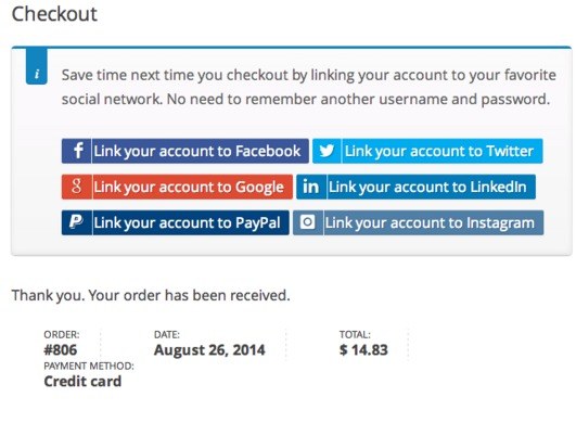
18. Provide Multiple Registration Options
As we've mentioned, some people would rather register an account without having to go through the whole process of typing in their information. That's where social networks come into play.
The example we showed in point 16 only had the option for Facebook, but it is a good idea to give them several options.
Since so many internet users already have their information punched into places like Facebook and Twitter, you can have a one-click registration right at the start of your website.
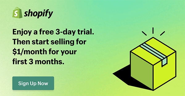
Shopify offers this with their tool in their app store called One Click Social Login. This also offers them to sign in via Twitter, Instagram and Amazon.
Takeaways:
- Social media doesn't have to be the only login, you can also try PayPal and Amazon
- Use a maximum of 4 options as you don't want to bamboozle them
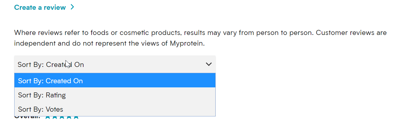
19. Implement a User Review System
Similar to how testimonials work, you can have a user rating and review system on all of your product pages. Since people can see when other folks are satisfied with a product, they remove doubt when walking through the checkout module.
Yotpo is a solid option for including reviews and ratings on your site, but many other solutions exist. In addition, you can find WordPress themes with review tools built-in.
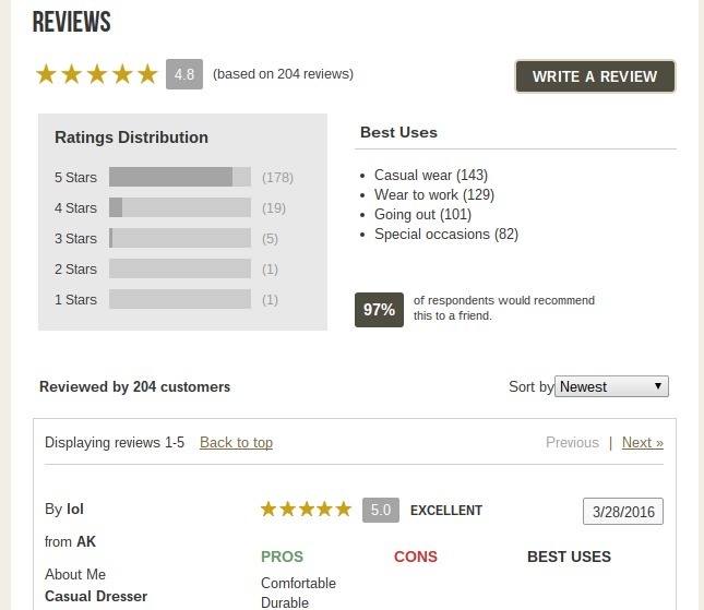
As you can see from the review above you should be as in-depth with your reviews as you can. Simply offering someone to offer a score between a 1-5 just isn't enough.
Let users enter in pros, cons and best uses for the product.
Offer a ‘was this review helpful' option on the reviews so that other users can vote for the best reviews, which does the hard work for you. Also, give them the option to sort their reviews by a particular star rating or the date it was created.
Takeaways:
- Add a ‘was this review helpful' voting system to reviews so the best are filtered to the top
- Get creative, ask for additional information. 1-5 just isn't enough information
20. Include Comparison Tools on Your Website
A customer who feels uneducated about a product is less likely to buy. So, you should incorporate a comparison tool on your website so that people can place similar products next to each other.
There are some big companies such as JCPenney, Dell, HP and John Lewis which offer a specific page where you can add items and compare them.
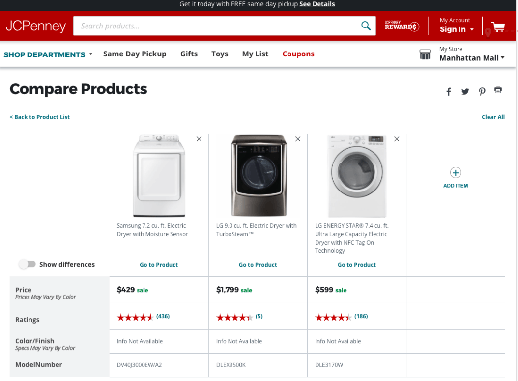
Here is a study from Baymard which highlights some great examples of product comparisons.
This allows users to see a snapshot of several products that they've considered side by side. This tactic is particularly good if you sell expensive or high-end products. The process is much slower when it comes to conversions on sites like these and users want to ensure they are getting the best deal.
Takeaways:
- Use product comparisons so visitors can see a snapshot
- Product comparisons work well for stores with expensive items
21. Spice Up Your Return Policy
Since more than 60% of shoppers look at return policies before buying, it's clear that many of the people on your website are willing to leave if the return policy is not up to their standards.
That's why you must clearly state exactly what your return policy is. In addition, you need a quality policy, preferably with free returns and a simple process that gives them printable labels so they can drop it off at the post office the next day.
The returns policy is the blanket that shoppers need to carry out their purchase. Placing a graphic on product pages and near the add to cart button can help turn visitors into customers.
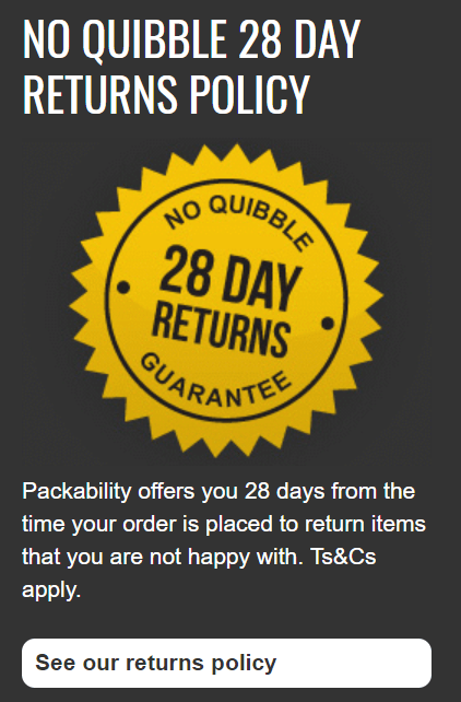
Using a phrase such as “no quibble”, “no hassle” or “no questions asked” puts the customer at ease that it will be sorted if there is an issue or they change their mind.
Takeaways:
- Put your returns policy on your product pages
- Use language that will make customers feel confident
22. Use Mobile Everything
Several apps are available for you to improve the way you do business on the mobile front.
In short, mobile is the new way of doing business, so your company requires a mobile website, mobile checkout, mobile media items, mobile newsletters and mobile abandoned cart emails. If they can't open your communications on a phone, you're basically telling them to abandon their cart.
Mobile commerce is set to reach $700 billion in 2019, which is a huge rise from the $460 reported in 2018. Therefore if you have the budget you should be looking into building an app for your webstore.
There are some great companies on the market such as apptuse and appypie that can help you set up a mobile app for your website. Having an app offers the following advantages:
- Customizable storefront
- Push notifications to customers on offers
- Offer loyalty cards to customers
- Integration with social media
Takeaways:
- Look to launch a mobile app for your store
- Push notifications are big business
23. Personalize the Heck Out of Your Cart Abandonment Emails
Email personalization has a few different levels.
First of all, you need to address people by their names in both the email and email subject line. It's also essential to have a list of all the products they were looking at, as we talked a little bit about above.
Here is a good example that I received from Saltrock recently. It's a simple touch but I really liked the touch of the emojis in the email as well.
Personalisation is one thing but it's also important to be topical and timely. This is as an attractive subject line as you'll see.

Takeaways:
- Import CSV to your email provider with the names included
- Don't be scared to use emojis
24. Reveal Areas for Customers to Ask Questions and Talk to Each Other
The best example for this is where Amazon has a whole list of questions that past users have asked. The sellers can answer the questions, or other customers can chime in.
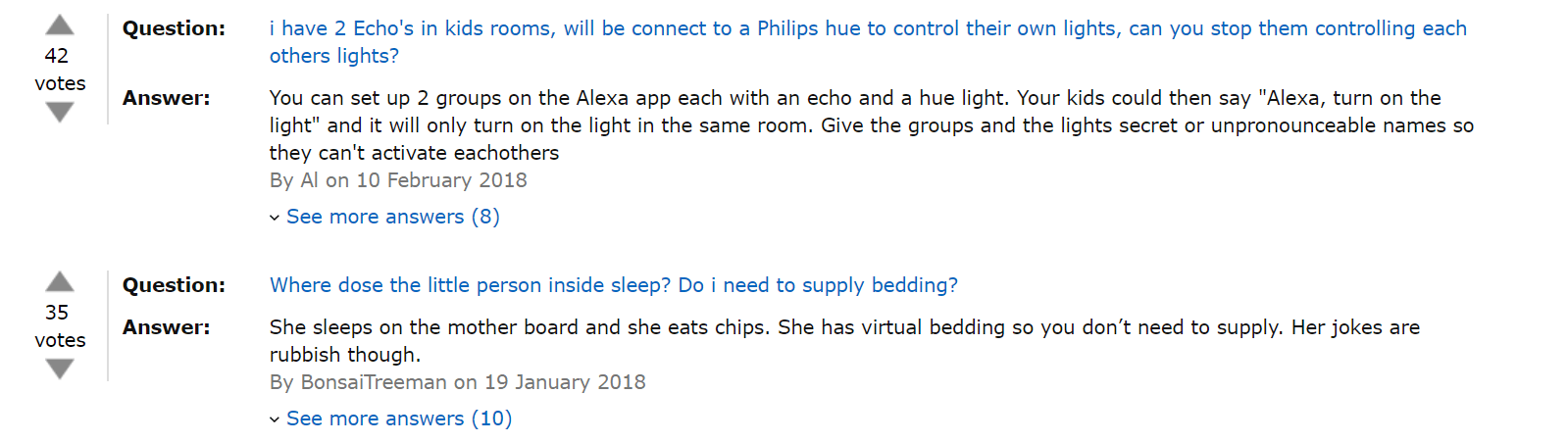
Whether you're implementing an FAQ module or including a forum for people to chat with each other, consumers want answers, and they are less likely to abandon if those answers are clear.
You don't want to display this on the real estate of your pages, but perhaps a clickthrough that says “XXX questions answered”, when people click that then they are taken to the answer section.
Takeaways:
- Use a tab system and have people click a “XXX questions answered” to go to the answer section
- Allow upvotes similar to reviews so that the most popular questions are nearer the top
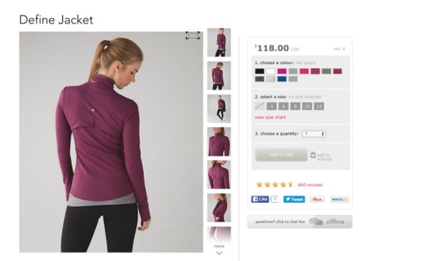
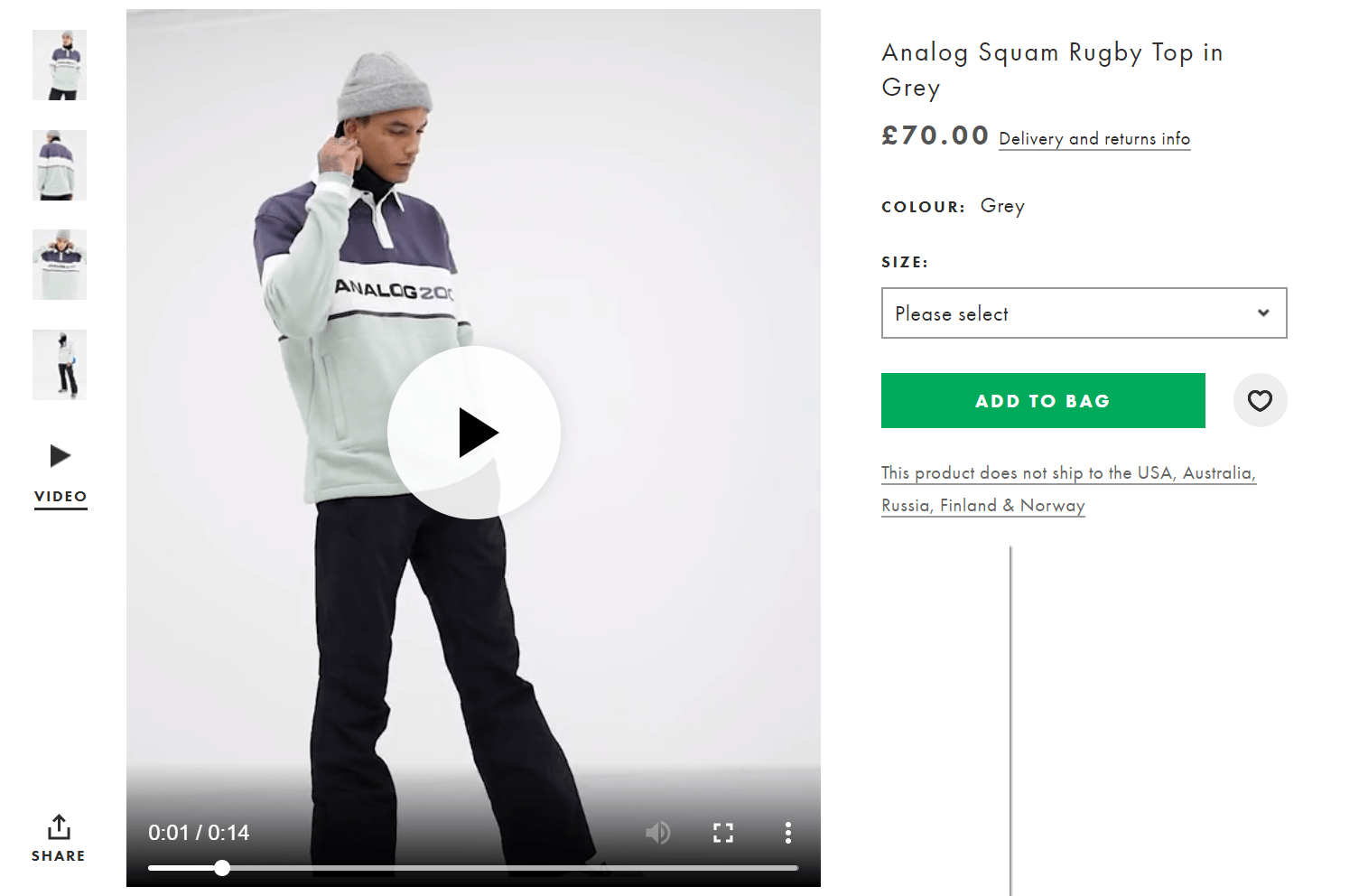
25. Pack Your Product Pages With Images and Videos
Shopping online has one big disadvantage, you can't touch and play around with the item.
That's why imagery is so crucial to keeping people around. Aim for ten or twenty photos for each item with real high-quality images. Ideally with the option to zoom in.
You should consider making short video clips that you can upload on to the product page. Here's a fantastic example from ASOS, where a model turns around for 14 seconds so that you can see every inch of the piece of clothing you're about to buy.
Statistics from StyleShoots show that 73% more visitors who watch videos of your products will buy them.
Takeaways:
- Use 10 or more high-quality images with the ability to zoom
- 15 second clips of your product will help people convert
26. Use Conversion Tools for Displaying Local Languages and Currencies
Unfortunately, this mainly depends on your theme, ecommerce platform or even your payment processor.
But the logic is simple. If someone comes to your site and puts items in their shopping cart, they are not going to checkout if they can't convert to their local currency.
Most of these are situated in the top right-hand corner need the account and basket area.
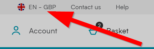
From this, your users can click on it and change it to their specific country. Of course it's worse noting at this point that it's only worthwhile putting the countries that you are able to ship to here.
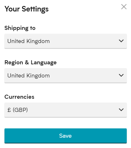
Offering the customers flexibility here is important as they may want to shop to a different country and may want a different language to their country they are in.
Takeaways:
- Offer different languages and currencies near the account area
- Be flexible, people may speak different languages to the country they are in
27. Follow Steps to Boost Your Site Speeds
If your site takes more than three seconds to load, 40% of the people are going to leave because of it.
Optimizing your site requires quite a few techniques, but your number one focus should be speed. Amazon actually performed some tests which showed that they would lose $1.6 billion a year if they slowed their website speed by just 1 second.
A good starting place is Google PageSpeed Insights which will give you some great suggestions on quick fixes to make your website quicker.
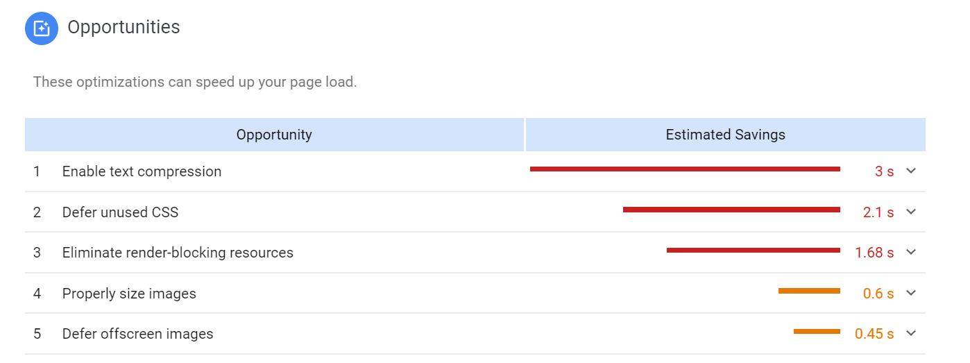
You can click in to this and it will show you the specific URL's this applies to and what needs fixing as a priority.
It's also important to look at your mobile page speed as we've touched on and you can also test this with Google.
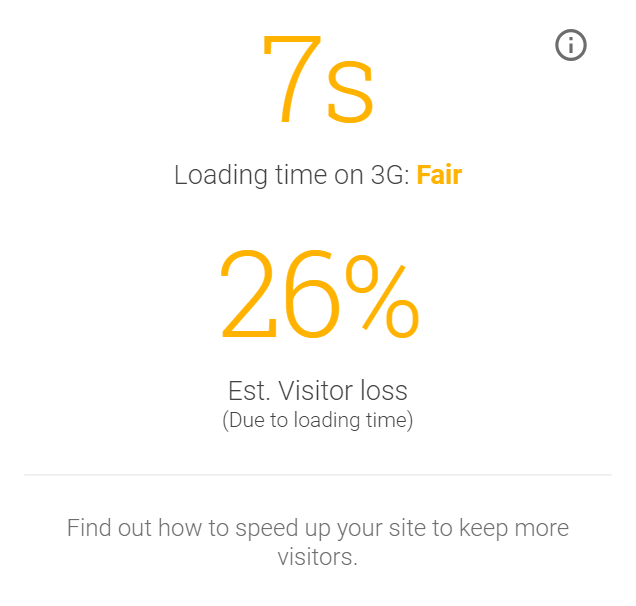
This also gives you an estimate on how many visitors you will lose, you can also have a report forwarded to your email addresses for more detail on how you can fix these issues.
Takeaways:
- Use Google PageSpeed Insights for quick wins
- Check your mobile speed and download the free report
28. Send People to the Right Landing Pages After an Ad
If a customer clicks on a Google Ad that markets men's basketball shoes, and they end up on a homepage, you can bet they leave your site quickly.
This might sound obvious but it's crazy how many times that I've clicked ads to be sent to something irrelevant.
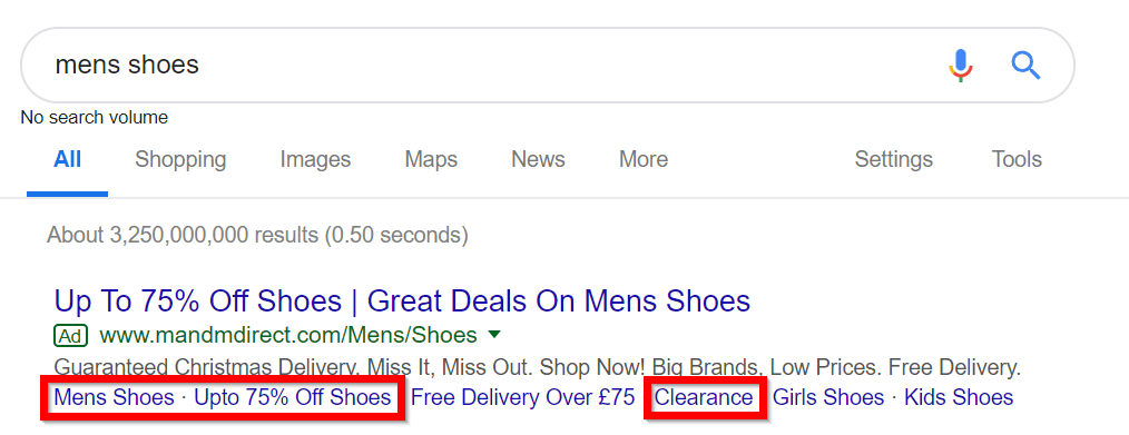
It's also good to include sitelinks in your Google Adword campaigns.
Let's say that someone types in something general such as “men's shoes” this can be quite vague and offering additional clicks such as shoes on offer, or clearance shoes can help you narrow down the choice for the visitor.
Another good example here would be to use different styles such as casual, formal, trainers, sandals, boots etc.
Takeaways:
- Ensure your adwords are going through to a product page
- Use sitelinks to use more granular choices
29. Reveal How Much Money Has Been Saved
Whether listing money savings on the homepage or in an email, it's never a bad idea to keep reminding people of how much they can or have saved with you.
Further, than that, it's a good idea to display how much they have saved in the checkout. Whether they have used a discount or bought items in the sale it's good to show what it would have cost and had the discount not been applied.
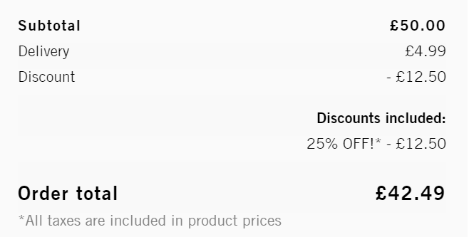
This can help convert customers as it really emphasizes the saving they are making.
Takeaways:
- Put your discount on the homepage as well as your emails
- Display the savings on the items in the checkout process
30. Make Sure You Have Free Shipping
This one is simple, but having some sort of benchmark free shipping program is a sure way to calm the nerves of people who don't want to be spending more money on your site than they would be by walking into a retail store.
As we mentioned in point 11 its a good idea to include the amount they need to spend to get to that free delivery threshold.
In some cases, orders can increase by as much as 90% when you add free shipping. It's also worth looking at what your current average order is and setting your free delivery bar just above that.
In a few months time check your reports and see if its increased, you'll be pleasantly surprised!

Using a stick menu to advertise your free delivery will help you meet that benchmark. Also looking at offering two free options can increase your order value even more. One free delivery which is delivered as a standard 3-5 days and one which is next day.
Takeaways:
- Analyse your average order value and set your free delivery threshold higher than that
- Use a sticky menu to advertise your free delivery
31. Utilize Micro Copy
What's micro copy? It's basically a little bit of text that sits in a field that your users have to fill out. The micro copy suggests what people might type in, and it guides the process along a little better.
For example, your checkout fields may include suggestions for what to type in or even little question boxes to explain why it's important to get their address and other personal information.
This is particularly good for discount code and rewards points whilst in the checkout.
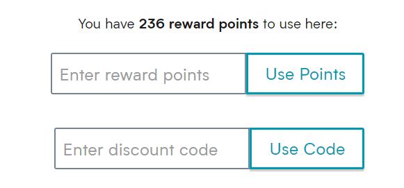
This can help differentiate between the two very quickly and makes it easier for the visitor to complete the purchase quickly.
Takeaways:
- Use microcopy to highlight your range of products
- Have a loyalty scheme? Use it to differentiate between loyalty points and discount codes
32. Start Remarketing and Retargeting
The idea behind retargeting and remarketing is fairly simple: You engage users after they have left your site or bought something in the past.
However, quite a few forms of retargeting and remarketing are available. From seasonal marketing to post-conversion retargeting, the options are rather helpful in turning more of your visitors into customers.
One of the most powerful forms of retargeting is Facebook. After you've visited a site you will see the store you've just visited very close to the top of your feed.
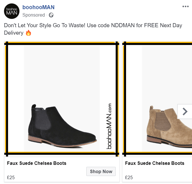
The benefit of Facebook remarketing is that you can use a carousel to offer likeminded products that the visitor may not have seen previously.
The text above also allows you to add information about your current discount code, free delivery threshold or even your returns policy to push them over the line.
Takeaways:
- Use Facebook retargeting carousel to offer likeminded products
- Display your USPs in the text above to convince your visitors to become customers
What’s the bottom line?
Even if there are several tactics to persuade customers to buy, inevitably some people will get to the payment screen and decide not to continue with the purchase.
Almost any method that helps to seal the deal is certainly worth considering, and given the little time in regard to work involved in implementing an email to recover abandoned carts, it’s a great place to start. Designers and developers are in a powerful position to help their clients increase their revenue, by having the ability to interfere in the purchasing process the customer will have to go through.


For Online Retailers , I would like to take attention to the price optimization part of
preventing shopping cart abandonment.
There are some studies demonstrate that the typical shopping cart abandonment rate for online retailers varies between 60% and 80%, with an average of 67.91% and %89 of consumers had abandoned the shopping cart at least once.
For mobile it is estimated as %97.
Pricing and timing are being shown as the main reason of these rates. In such cases Saas Solutions like Prisync.com could be helpful.