Is this the year you’re going to redesign your ecommerce website? If it’s been a few years since you have, then you need to know that a lot has changed.
It almost goes without saying that a modern ecommerce site has to be designed for mobile first, as most that I work with now get 70% or more of their traffic from mobile devices. However that’s just a starting point—there are a lot of subtleties to consider if you want to your site to convert users into customers.
I’ve consulted on the usability for a wide range of ecommerce sites over the last five years and I’ve worked out the principles that the best ones follow. I’ll take you through eight ways to make sure your site is up to scratch for today’s user.
The Benefits of Investing in Ecommerce Site Redesign
First, it’s worth establishing why redesigning your website can sometimes be a good idea.
Redesigning your store, or creating a new website from scratch is a time-consuming process. You need to research your market, find the right professionals to work with, test your store upgrades, and even find the right budget for your project. However, the benefits of a redesign can often far outweigh the disadvantages. Provided you’re redesigning your site for a good reason (we’ll cover this in a minute), updating your store can help with:
- Increasing customer loyalty: A well-designed store doesn’t just make your site more attractive to new customers, it can also improve your chances of retaining existing clients too. If your site is difficult to use, unattractive, or missing crucial features, 88% of customers say they would likely avoid coming back to it. Investing in a website redesign could therefore help you to reduce customer churn, and increase brand loyalty.
- Strengthening your brand: Your website is an important part of your brand identity. It has a direct impact on everything from your image, to how you share your personality with customers, and even how you differentiate yourself from your competitors. With a website redesign, you can make sure the core values and benefits of your brand stand out for your target audience. Plus, you can ensure your brand is consistent across all channels.
- Improving SEO: Redesigning your site can also give you an opportunity to implement new methods of improving your SERP rankings. You can experiment with technical and on-site SEO methods to make sure your site ranks for all the right keywords. Simply improving the user experience of your site also helps to ensure customers stay on your site for longer, reducing bounce rate, and improving your authority in the eyes of Google.
- Boosting sales and conversions: Updating your website is a fantastic way to improve your chances of increased sales and conversions. An attractive site makes your brand appear more trustworthy, so customers will be more likely to buy from you. Plus, if you focus on enhancing the user experience on your site, you’ll make it easier for customers to purchase your products and interact with your company.
5 Signs It’s Time for an Ecommerce Website Redesign
Clearly, investing in an ecommerce website redesign can deliver a lot of benefits. But, as we mentioned above, it’s important to get the timing right. Since redesigning a site costs time and money, you shouldn’t be doing it on a monthly basis, or you’ll end up draining your cashflow.
Additionally changing your site too frequently can lead to a more confusing experience for your audience. Customers don’t want to re-learn how to navigate your store every time they visit it.
So, how often should you redesign your store? The answer to that question depends on a number of factors, from your chosen industry, to how quickly your ecommerce platform features update, and even the feedback you get from your customers.
Here are a few clear signs that indicate a website redesign might be a good idea:
Your Bounce Rate is Rising
The term “bounce rate” refers to how frequently customers click onto your website and hit the back button quickly, without doing anything else. A high bounce rate can be caused by numerous factors, from poor SEO strategies, to slow-loading pages. However, it can also often be a sign that you need to redesign your website. If your bounce rate is higher than 70%, it’s worth examining whether people are abandoning your site because of slow loading times, poor user experience, or overall bad design.
You’re Missing Crucial Functionality
Does your current ecommerce store live up to your customer’s expectations? A website redesign could be an excellent way to add extra functionality to your site, from targeted landing pages to increase sales, to a blog or news section for SEO. It’s also an opportunity to make sure your site is working well across all platforms and devices. If your site fails to load quickly on mobile devices, or it makes it harder for customers to place orders on the move, you could miss out on sales.
Sales and Profits are Falling
Speaking of missing out on sales, if your profit margins are consistently dropping, this could be yet another sign that it’s time for a website refresh. Your website needs to look great and perform well to convince customers to convert. If customers can’t find your CTAs (Call to action buttons), track down the right products in your catalogue, or use your checkout without stress, your revenue will suffer. A website redesign could be a good way to ensure your site is generating the best possible ROI.
Customers are Complaining
Today’s customers are pretty vocal when they don’t like something about an online experience. If you allow your customers to leave comments on your store, or you listen to the things they’re saying about you on social media, you might notice regular references to a poor website experience. If your customers are constantly complaining about the performance or appearance of your site, it could be time to seek out a UX design or UI design expert.
Your Brand or Business is Evolving
Finally, sometimes it makes sense to invest in a website redesign if you need to update your business or brand. If your business evolves, you may need to consider adding new features to your website. You can use your redesign to update your shopping cart with new payment methods, offer customers subscriptions and membership accounts, or add new apps and widgets to your store. You can also use your redesign to ensure your branding is consistent across all channels. Your colors, fonts, logos, and all other brand assets should be consistent across every touchpoint you have with customers.
How to Redesign Your Ecommerce Site: 4 Steps
Now you know why and when you should consider redesigning your ecommerce store, it’s time to figure out a plan for success. It’s worth noting that the exact process you follow when updating your ecommerce website design will depend on numerous factors, from your overall goals to the in-house professionals you have in your team.
Here are a few of the key steps involved in updating your online store.
Step 1: Audit your Site and Set Goals
Before you start making significant changes to your store, it’s worth deciding what you absolutely need to change. It’s best to start by pinpointing real problems with usability and performance first. Explore your website from the perspective of a customer, and ask yourself which issues might prevent you from making a purchase.
Highlight anything that doesn’t work particularly smoothly, from the checkout process, to your CTA buttons, and even the images in your product page designs. Once you’ve found the key problems with your site, set goals for what you want to achieve during your redesign.
Do you want to simply create a more user-friendly experience for your customers, or do you want to give your ecommerce business a boost by enhancing site appearance and search engine optimization at the same time? Setting goals will help you to determine what kind of help you’ll need.
Step 2: Figure out Your Budget
Next, it’s worth noting an ecommerce store redesign is always going to require some investment, but it doesn’t have to cost the earth. Your budget will depend on how much of your store you need to change, and how many experts you’ll need to hire to help you.
If you’re using a simple store builder, like Shopify or WordPress, you might be able to make tweaks to your template yourself, or even purchase a new one without spending a fortune. Alternatively, if your ecommerce website design is a little more complex, and requires some coding expertise, you may need to hire website development experts to work with you.
Other points to consider when building your budget include:
- The cost of any plugins or add-ons you’ll use in your ecommerce re-design
- Costs for wireframes, themes, templates, and other tools
- The cost of managing downtime if your store needs to go offline.
Step 3: Find the Right Support
If you’re using a relatively simple website builder, or you have a team of web design experts available in house, you might be able to make changes to your store without accessing any outside help. If not, you’ll need to think about hiring specialists to ensure your web redesign is successful.
You can consider hiring an agency, or working with freelancers from sites like Fiverr or Upwork. Think about whether you need a web design specialist, a web developer, or a combination of the two. A web design expert will work on the appearance and usability of your site, while a developer will manage backend functionality.
While you’re hiring experts to work on your store, you might also want to consider looking for some bonus help with search engine optimization, or graphic design. These professionals can assist with making sure your marketing strategies pay off.
Step 4: Implement Changes Strategically
After finding the experts you need to build a high-quality new store, start implementing changes slowly, and carefully. It’s often best to make alterations one at a time, so you can make sure the steps of your ecommerce redesign process don’t break other parts of your site.
Make sure you have backups of your site available at each stage too, so you can roll your store back to a previous version if something does go wrong. Once you’ve finished making all of your changes, and you take your site live again, pay close attention to any metrics that might help you to determine whether your strategy was successful or not.
Look at how many new customers now access your site using smartphones if you were focused on responsive design. Track SEO performance using Google Analytics if you want to boost your site’s visibility, and always keep an eye on your conversion rate.
How to Redesign Your Ecommerce Site: Top Tips
Avoid long videos on the homepage
The homepage is a place to impress. A lot of websites put money into high-end photography but you might consider using video here to show off products or tell the brand story. After all, video is everywhere now, especially on social media.
When used correctly, video can be great for informing users as well as exciting them. Yet no matter how flashy your video, if the user needs to click play, be prepared for most people to ignore it. In the many user tests I’ve watched, this is the most common behaviour with landing page videos.
Why? At this stage of the user journey, their attention spans are short. Users are more likely to leave the site altogether and bounce, not commit time to watching something unknown.
At the start you should help users move through quickly so stick to short, silent, auto-playing, looping videos. This way you get the information across without them needing to engage deeply. Longer videos can become very useful later in the journey for explaining things like product features, when the user is more interested.
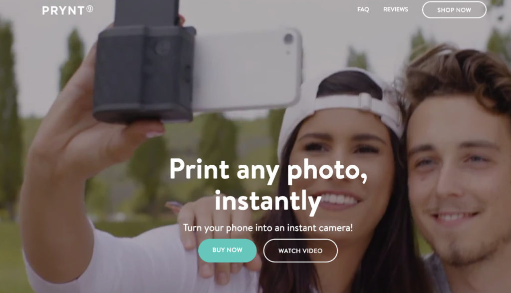
- The Prynt site uses a short auto-playing video to show the product in action. There is also an option to watch the full thing with sound.
Don’t fill your homepage with excess content
If you’ve done the hard marketing work in getting users onto your homepage and you’ve created a compelling pitch for your store, what next? There’s lots you could tell them about your company so is now the chance?
Be careful. The longer you make your landing page the more you risk the user switching off or getting confused. Whilst users are comfortable scrolling, they’ll soon stop if the content isn’t directly related to their task.
Whenever you design, stick to the rule of ‘one page, one purpose’. The purpose of this page is to introduce what you sell, and get the user to look for those products.
Do they really need to see your five most recent blog posts, your latest tweets, and a wall of Instagram images? Social posts are particularly unhelpful as you’ve just got users onto your site and clicking these will take them away again.
The more things you put on the page, the more distractions you're giving the user from your main action and the key thing you want them to do. Mobile users tend to have shorter sessions and focus on achieving tasks—extra content won’t help with that.
Make your filters easily accessible
When you have a lot of products, filters are essential for helping users find what they need. The vast majority of ecommerce sites (about 90% of those I’ve studied) have their filters in an overlay on mobile. This makes sense when there isn’t much space available but it does mean users aren’t very likely to actually see them.
As a rule 95% of users don’t change defaults and this applies to opening a filters menu to select specific options. It’s something that has been borne out in the ecommerce user tests I’ve watched too. Finding products on listings pages is one area where the ecommerce browsing experience is superior on desktop.
If your users filter then they’re more likely to find a product that they actually want. Your challenge on mobile is finding space-saving ways of doing so. One method is showing the most relevant filter category in the page with buttons for the options (see Macy's below). Tapping one would load listings with that filter applied, at which point the next most relevant filter would show.
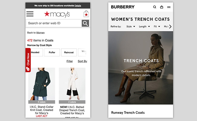
- The Macy’s site brings some filter options into the page as buttons. Burberry makes the filter categories visible on the page.
At the very least make sure your button to reach the full filter menu is obvious. It should also clearly indicate when a filter is applied, so users know when they are seeing a limited set of results.
Redesign your listings for bigger images
Most ecommerce listings pages try to show many products on screen at once. As a result the product images tend to be quite small (it’s why they’re traditionally known as thumbnail images).
Yet the image is a key part of helping the user make a decision about which product to select. In many cases it tells you a lot more than any text can. Products like clothing and furniture rely on the user making a subjective distinction between the different things on offer.
You can even have big images on mobile. Apps like Instagram have led users to expect high quality wherever they are and I've often seen users appreciate this. It doesn't matter where they are on the site, good photography is always loved.
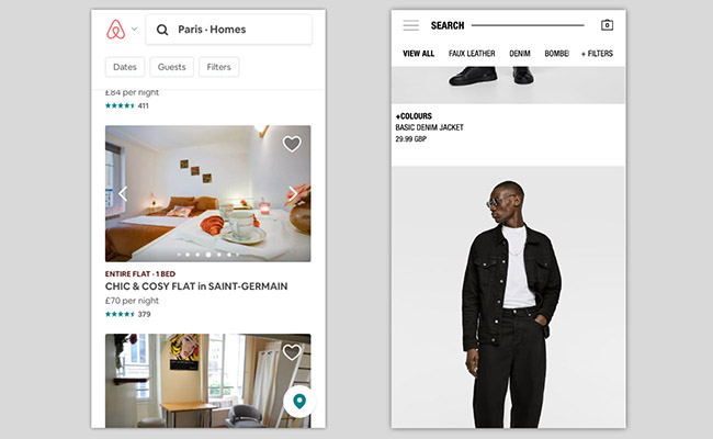
- Airbnb have big images that can be scrolled through (left). Zara (right) have full screen width images on their listings.
Of course if you think something can be better sold in a few images then do so. Travel sites often have multiple photos in listings thumbnails with a subtle arrow to scroll through them. Many clothing sites offer the option of showing the product on its own and being worn by a model.
Display product options as buttons
You'll be aware that many products are available in variations such as colour, size, material, or something else. The product details page is where users ultimately make that choice. To make the choice easier you should avoid dumping these options in dropdown menus.
They should be visual buttons to help the user see all options and they should make clear when a variation means a change in price. If the variant changes the look of the product (such as the colour) then selecting it should update the main product image. This leaves the user in no doubt as to what will be ordered.
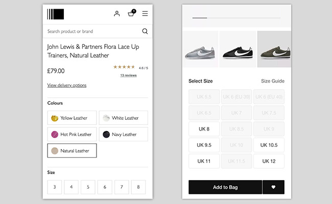
- John Lewis (left) have product colours as buttons with visual indicators. Nike (right) expose all size options and disable the sizes that aren’t available.
Another benefit is that by disabling certain buttons, the user can then see at a glance which variants are out of stock. Again, this saves scrolling through a dropdown list of options.
When it comes to size selection it’s best not to have a default size. If there is users could end up adding the default rather than they one they want. This could lead to you getting lots of returns and frustrated customers.
Leave out the share buttons
Facebook, Twitter, Pinterest, Instagram, LinkedIn, Snapchat. Your users probably hang out at one or more of these social networks. So should you give them sharing buttons on your product details pages?
Many ecommerce sites still present those little icons in the hope that it will encourage people to promote their wares around the web. Unfortunately, they’re almost certainly a waste of time.
No-one clicks them. Actually 0.2% of people do, according to one study. Also it might seem like a snippet of code but it comes with lots of extra stuff that slows your page speed down.
The rise of paid ‘influencers’ means the modern user no longer wants to go broadcasting for brands without something in it for them. More people will be willing to share in private with a friend or family member. Links that allow sharing through email or an instant messaging service like WhatsApp are likely to work better.
Integrate payment wallets
Payment wallet services such as PayPal, Apple Pay and Android Pay are on the rise. It’s increasingly common to see them as options on ecommerce checkout flows. In fact they may kill off the standard checkout and possibly the use of credit cards and cash altogether.
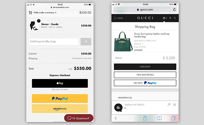
- Tamara Mellon (left) have the option of Apple Pay, PayPal, and Amazon Pay in their basket and checkout. Gucci offer the ability to jump to PayPal from the ‘add to bag’ notification.
Entering a password, fingerprint, or face scan and then being able to immediately complete checkout is so much more convenient than filling out forms. With ecommerce dominated by mobile, offering easy payment that doesn’t involve fiddly form-filling is essential.
The sheer ease of use should encourage more users to complete checkout with you. There’s also a security benefit as users will likely feel safer with a wallet as intermediary if they haven’t heard of your brand before.
Across the user tests I’ve run on checkout flows, I regularly hear comments like “I much prefer the option of using PayPal” and ”I’m very security conscious and will only pay using PayPal“. PayPal is currently well known but when deciding which to use go with your site's most popular countries and devices.
Allow users to collect
A growing number of ecommerce websites offer users the ability to collect their order rather than have it delivered. It’s good for users who aren’t at home very often and also can’t get delivery to their place of work. Giving this option will only increase the number of users who can buy from you.
The easiest (and often the best) approach is to add collection as an alternative to delivery in the checkout. Ask the user to enter their location and show them options for where they can pick up their order. It’s also important that you show the pick up location’s opening hours—this data often comes from integrating with a delivery company.
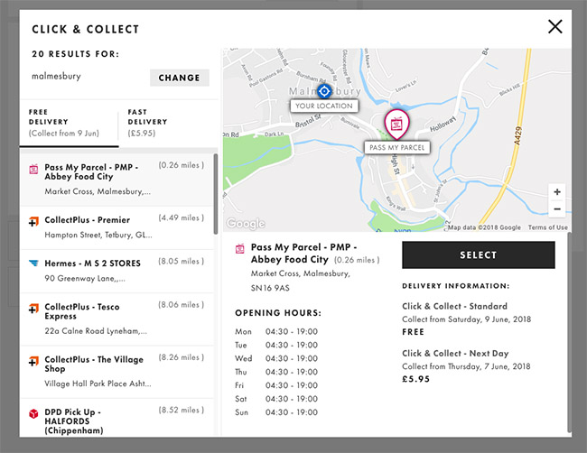
- A click and collect window from the ASOS checkout, allowing the user to choose which convenience store to send their delivery to.
The more complex approach is for you to integrate the option to collect into every product details page on the site. This makes sense if you have bricks and mortar stores as it allows stock checking in specific shops.
However problems can arise when users have multiple products in their order. If they aren’t careful they can end up with some products for delivery and some for collection (a ‘mixed’ basket). To avoid this the earliest I recommend letting the user specify collection or delivery is at the basket stage so it applies to the whole order.
Make the Most of your Store Redesign
Effectively updating your store’s design can take significant time and effort, but it can also be a crucial part of making sure your small business continues to thrive in the digital world. The better your website looks and feels, the more potential customers you’re likely to capture.
Remember, the chances are you’ll need to make alterations to your site again in the future. Continue to watch your metrics, pay attention to testimonials, and monitor the trends of the market, so you know when it’s time for another update.


Comments 0 Responses