Are you looking for a way to improve your customer relationships? An FAQ page might just do the trick. Not only is an FAQ area essential for guiding your customers around your site, but it can serve as a trust-builder, convincing customer to buy more products by giving them additional information. But how do you create the perfect FAQ page? Keep reading to find out.
The Perfect FAQ Page: What Can It Do For You?
Many ecommerce professionals consider an FAQ page an afterthought. They think it's a nice extra item to have on their online store, but not entirely necessary to get more business. That couldn't be further from the truth.
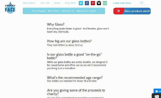
FAQ page example #1: Faucet Face – built using Shopify (read our full Shopify review here). Check out similar sites in our ecomm.design gallery.
In fact, an FAQ page does several things to improve your conversions and even cut some costs.
For example:
- An FAQ frees up time for your support team, since the most common questions are published online for your customers to read.
- An FAQ page builds trust between you and your customers, because they see that you've taken the time to guide them and display your knowledge of your products.
- People are more likely to purchase from your store when they know as much information as possible. An FAQ page helps with that.
- Search engines see FAQ pages as high-information resources. They're bound to improve your SEO seeing as how it helps with navigation, purchasing knowledge and more.
How to Construct the Perfect FAQ Page for Your Ecommerce Store
The first step to a solid FAQ page is to ask yourself whether or not you need one. Most of the time the answer is yes, but sometimes it may just clutter your website and make your customers more confused. For example, if your product is straight forward, and everyone knows how it works (like coffee,) there's no reason to explain how coffee makes you focus and wake up in the morning.
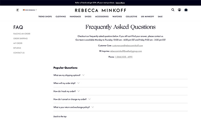
FAQ page example #2: Rebecca Minkoff – built using Shopify (read our full Shopify review here). Check out similar sites in our ecomm.design gallery.
However, the FAQ provides the opportunity to explain what makes your coffee so unique. Therefore, the FAQ either functions as a way to talk about what makes a seemingly basic product unique, or it's a page for explaining a lesser known product, like a completely new invention.
Finding the Right Questions for Your Perfect FAQ Page
Making up your own questions is not a good idea. A startup might feel like they're left with no other choice, but you need to get feedback from testers or real customers before writing up the questions.
Whether you're getting emails from customers or selecting a focus group to test out the product and give you feedback, your questions should be structured around real people and their thoughts.
For the Perfect FAQ Page: Talk to Your Customers the Way They Want to Be Talked To
All customer-bases have their own language. A snowboarding company might realize that its customers are more laidback, with certain jargon being used by the people who shop from the store. A company that sells school supplies to students and parents might stick to more professional, yet fun communications.
The language you use on your ecommerce site should reflect your brand and the type of message you're trying to communicate to the customers. If your customers are serious professionals, speak to them like that. If they are younger gamers, use some language that might apply to them. This can be utilized in product pages, homepages, category pages, and much more.
But don't forget about your perfect FAQ page!
One way to make it even more perfect is to speak the language of your customers. How do your customers phrase the questions when they come in through email, phone, or chat? Why not phrase them just that way and try to write the questions in a similar fashion?
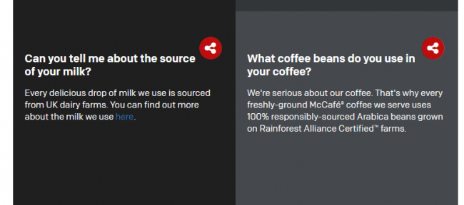
FAQ page example #3: McDonalds
For example, McDonald's knows that its customers are coming into the store for a delicious meal. McDonald's has always marketed about fun, family, and enjoying the good things in life. So, it makes sense that there's a more casual tone when you look at the McDonald's FAQ page.
They talk about how serious they are about the coffee, but they also go into the specific details that customers want to know. It makes customers feel as if they're hearing the answers from a friend as opposed to a computer or corporation.
The Perfect FAQ Page: Format Your FAQs Properly
FAQs look different on all ecommerce websites, but the good ones follow similar formatting models to ensure that customers are getting valuable information and not becoming more confused. As we'll discuss further into the article, it all starts with locating your FAQ page in reasonable positions on your website.
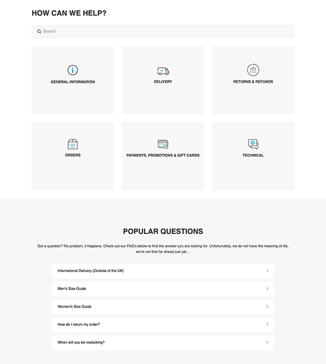
After that, we recommend taking a look at your list of FAQs and deciding if you need to categorize or not. As a rule of thumb, anything more than 10 questions is enough to make categories. No one wants to read through dozens of questions, so your best bet is to make headings that categorize each topic, with relevant links to the questions below that.
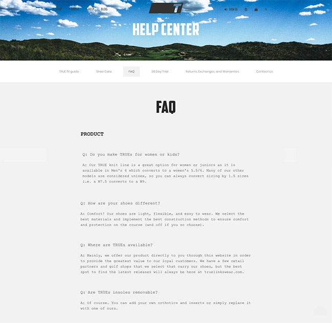
FAQ page example #4: TRUE– built using BigCommerce (read our full BigCommerce review here). Check out similar sites in our ecomm.design gallery.
Great FAQ pages have hammer down effects, keeping the primary information consolidated and the overall look of the page clean and not intimidating. Therefore, the customer can quickly scroll through the questions, locate what they need, then only open up the question that relates to their problem.
We also recommend utilizing pictures whenever needed. Sometimes pictures are a little overkill, but visuals often help out your customers more than words do. For example, you may have an FAQ that explains the return process. If that's the case you should have links to the full return policy, along with some visual steps to complete the return.
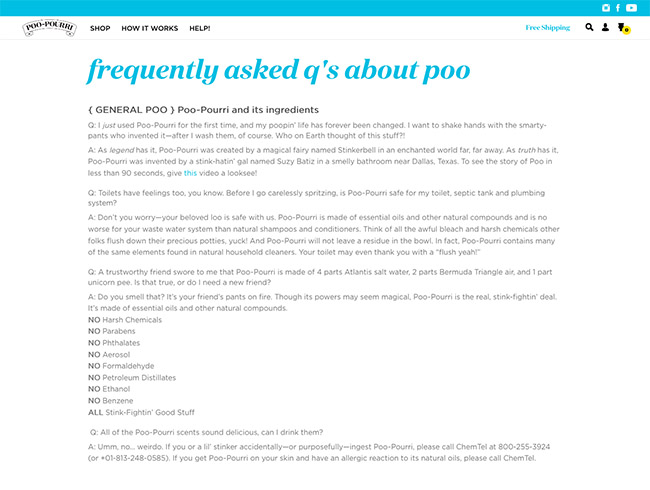
FAQ page example #5: Poo-Pourri – built using Shopify (read our full Shopify review here). Check out similar sites in our ecomm.design gallery.
Finally, branding and your company's voice comes into play far more often than you may think with an FAQ page. These questions are an opportunity to let your voice shine and either represent a professional or fun tone. For example, the folks at Poo-Pourri make jokes throughout the FAQ, most of which relate to stinkiness in the bathroom. It's a playful take on the product, and it makes people feel more comfortable with a subject that probably isn't talked about much.
Not only will this approach put your customers at ease, but it's a method for clearly stating what your customers need to know, while also telling them a little story about your company.
Make Sure All FAQs Lead to Something More
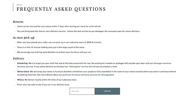
FAQ page example #6: Wrightwood – built using Shopify (read our full Shopify review here). Check out similar sites in our ecomm.design gallery.
Answering each question then leaving it at that isn't exactly the point of an FAQ. Like we stated before, these questions offer a wonderful chance to cut down on support resources and build trust right before customers want to buy. That's why FAQs should have additional links leading to relevant products, support areas or even blog posts with more information on the subject. The example above even has a field for finding furniture store delivery locations.
The FAQ should act as a funnel, not a dead end. This will not only improve your SEO as a form of navigation, but you should start to see your customers feeling more informed right before making purchases.
Make Your Perfect FAQ Page Accessible
It's important to show that your FAQ page is a valuable resource to customers. If it looks like your company doesn't believe in the FAQs, your customers won't either. That's why it confuses me when I see a tiny little FAQ link in the footer area, and that's all.
As long as the FAQ page is justified, formatted properly and shows great value to your customers, it deserves a link on the main menu.
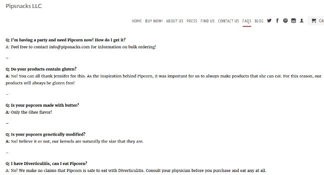
FAQ page example #7: Pipsnacks – built using Shopify (read our full Shopify review here). Check out similar sites in our ecomm.design gallery.
It's also not a bad idea to consider placing the FAQ in different locations of your website. For example, some businesses realize that these questions often arise when customers are working their way through the purchasing process. Therefore, they have FAQs on the actual product pages, below product descriptions.
Furthermore, you might think about integrating a customer support system like ZenDesk in with your FAQs. The whole idea behind this is that customers would look at the FAQs first. If those don't solve the problem, it would then offer options to submit a ticket, browse through forums or call the support team.
Think About Using Visuals If It Would Help
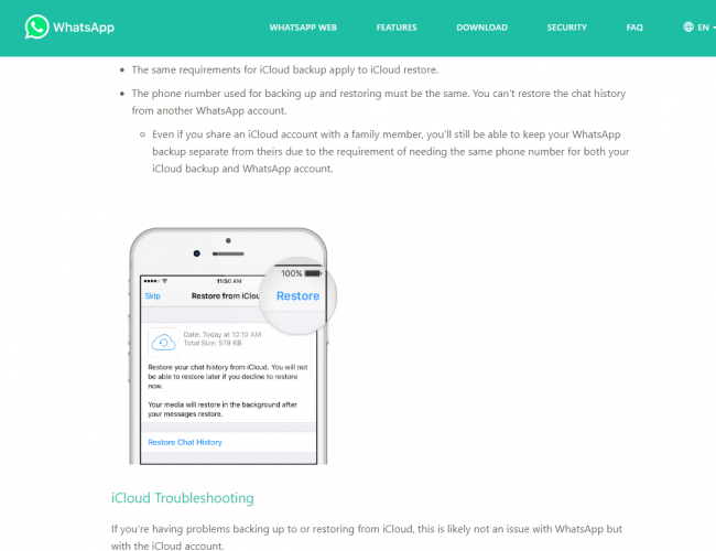
For some reason, most FAQ pages you see stick with text answers. That's great as long as they speak directly to the audience and remain short and sweet. However, media elements are bound to speed up the process as well. Think about it–videos are usually easier to consume than text. The same can be said about screenshots and audio. All the customer has to do is watch a two-minute clip or look at a picture to actually see the solution to the problem.
FAQ page example #8: WhatsApp Web
Sure, the text description is nice for those who want to read (and for the search engines,) but an image is bound to improve the customer's understanding of what they are supposed to be learning.
For instance, let's say you run a software company and one of the FAQs is about how to create an account. You can definitely write a step-by-step outline of how to create an account, but wouldn't it be nice to also have a screenshot with arrows pointing to the right buttons and tabs?
Simply put, people love pictures and videos, so give them what they want if it is going to help solve the problem.
Allow Customers to Search Your FAQ (Especially If You Have Lots of Questions)
You should try to keep your FAQ list to a minimum, but sometimes even shorter lists need some sort of search or filter functionality.
Adding a search bar allows customers the chance to quickly type in a keyword instead of scrolling through your list of questions. You also might activate the search for the answers, seeing as how there might be some relevant keywords in those as well.
FAQ page example #9: Gymshark – built using Shopify (read our full Shopify review here). Check out similar sites in our ecomm.design gallery.
Overall, a list of ten FAQs may not look that intimidating to you. However, the average customer is busy and doesn't want to look at every single question to find one in ten.
Remember:
You defeat the purpose of an FAQ page if you have too many questions and too much information. If your customers have to search through paragraphs of information, even after going through a search field, you're technically making a knowledgebase and not an FAQ. Your FAQ page should be made with short, succinct answers to the most pressing of questions. Otherwise, you're simply going to confuse your customers and make it harder on your customer support representatives.
Consider Landing Pages for the Big Questions
This is one of the more unique tips for making the perfect FAQ page, but it ties into SEO and guiding search engine users to questions that pertain to them.
Let's say that you have one or two questions that are asked by customers far more frequently than the others.
Similar to category pages on your ecommerce website, dedicating a whole page to a question is a great way to boost your SEO–since many of these users are searching those exact questions through Google.
In addition, this gives you the opportunity to expand on the question and include a wide range of information that might be helpful. You're able to add tons of links, images, and videos that would typically clutter your standard FAQ page.
15 More Examples Of Well Executed FAQ Pages
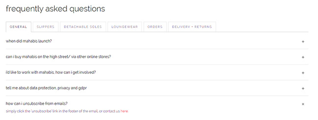
Mahabis
Mahabis has tactfully tackled a common problem with standard FAQ pages. Instead of publishing an extensively long piece with bulky chunks of text, everything has been systematically organized in topics. That way, visitors can proceed directly to their areas of concern without necessarily being forced to scroll through irrelevant text.
You’ll also notice that the Mahabis FAQ page provides very brief but detailed answers. There’s no beating around the bush here. The answers go straight to the point and address issues in the fewest words possible. And in case you’d like to know more, the text includes hyperlinks to more detailed sections of the website. Quite a clever way to avoid repetitions, don’t you think?
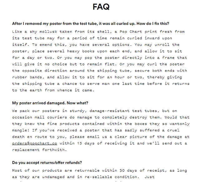
Popchart
The answers on PopChart’s FAQ page are not exactly as short as Mahabis’, and rightfully so. You see, PopChart is a seemingly small company that only deals with infographic posters. So, of course, you can bet that there are only a handful of questions that visitors and customers might have. Well, all that has been addressed by the FAQ page in the simplest way possible.
Another outstanding thing about this specific page is the overall language and tone. If you assess everything critically, you’ll notice that both questions and answers have not been written in textbook formal language. Rather, the support team has used a conversational approach that resonates well with their target market.
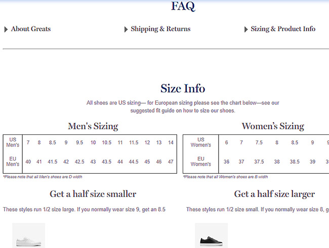
Greats
While most FAQ pages come with just questions and statements, Greats have chosen to use a much more intuitive approach to address customer concerns. They’ve built images, tables, and buttons into the text to help customers interpret stuff right off the bat. It’s fairly obvious that you’ll find it easier to remember the info here compared to many other typical FAQ pages.
To make the experience even better, the Greats FAQ pages doesn’t even use questions. Instead, it pretty much only throws a brief statement in bold at you then proceeds to outline the answers. It’s almost more of a mini information page than a website section with frequently asked questions. And to cap it off, the whole thing ends with a contact form, plus alternative contact details for customers who might need additional help.
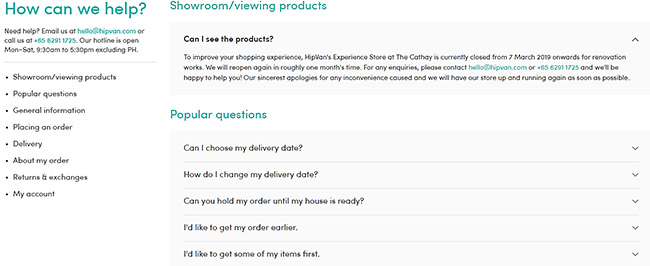
HipVan
If you’d like to see a comprehensive well-structured FAQ page, this HipVan example would be a great place to start. You’re bound to find any information you need, thanks to a to an extensive series of questions, featuring popular inquiries, general information, and issues relating to the entire shopping process- from order placement to shipping, plus refunds. And to organize all that accordingly, the entire FAQ has been grouped into eight straightforward topics.
That said, HipVan provides an expand button next to each question for revealing the corresponding answers. This feature helps hide irrelevant extra information that you might not be interested in, consequently keeping the page short and orderly.
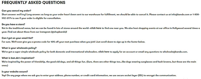
Bando
Who said you can’t leverage an FAQ page to convert leads? Bando is a good example of how you can take advantage of even customer queries to drive sales. The type of questions here are basically what a warm lead would ask before committing to a purchase- things like “Is your website secure?” and “what’s your wholesale policy?”.
Bando then cleverly promotes itself through the subsequent answers. It includes promo codes, discount guarantees and various customer assurances that will, admittedly, compel you to proceed with the checkout. Additionally, the shop capitalizes on an informal conversational tone to seem trustworthy, approachable and friendly to customers.
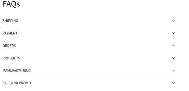
BlackMilkClothing
BlackMilkClothing is another website whose FAQ page has been fundamentally organized into topics that essentially cover the whole shopping process. Apart from sale and promo, it addresses issues relating to manufacturing, products, orders, payment, and shipping. You don’t even need a search tool here since navigation is as simple as expanding a specific topic you’re interested in, then proceeding straight to the relevant questions.
For an online shop that goes by such a name, it’s not surprising that the FAQ page has been set up with an informal tone. Therefore, customers are bound to enjoy the whole experience- which consequently boosts the company’s conversion rate.
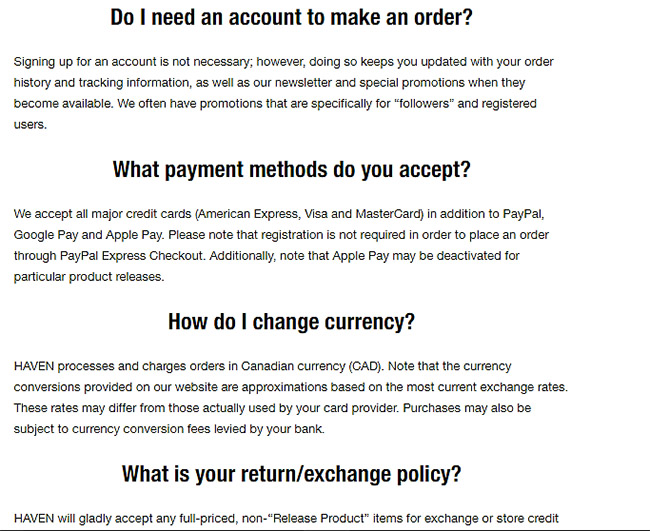
Haven
Most of the FAQ pages we’ve sampled so far publish their answers in informal and conversational tones. Haven, however, uses a different style- the same old formal business language we’re used to. It makes the brand seem serious and committed, as opposed to being playful. Come to think of it, that should work well for Haven’s customer base, which includes international shoppers.
Going by the apparently large product inventory here coupled with a dynamic business framework, you’d probably presume that the FAQ page encompasses numerous issues. But, interestingly, Haven has decided to feature only the most commonly asked stuff. No reason to worry though- because if your search happens to be unsuccessful, the page provides support contact details.
100PercentPure
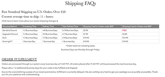
All things considered, the FAQ page on 100PercentPure is the opposite of what we’ve seen on Haven. While the latter prefers a brief approach, the former has implemented quite a large FAQ system, which is comprised of two pages- Shipping FAQs and Afterpay FAQs.
Shipping FAQs comprehensively cover stuff about order fulfillment and the actual shipping process. The questions and answers have been arranged based on their respective topics and subtopics to help customers navigate easily.
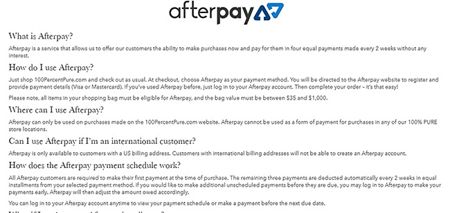
Then the Afterpay FAQ page, on the other hand, provides information regarding an installment payment model that the shop’s customers commonly use. From the look of things, the site has built a different page for it to avoid interfering with typical shopping matters.
TaylorStitch
Creating a detailed knowledgebase is, admittedly, a challenging task that may take quite some time. And drafting a comprehensive FAQ page isn’t a walk in the park either. So, instead of handling them individually, TaylorStitch cleverly built a holistic FAQ page into its help center. The resultant knowledgebase, therefore, delivers information in the form of questions and answers.
Although this ecosystem is very diverse with answers for pretty much anything, you won’t have a hard time looking for a specific set of questions. Everything here has been structured in systematic topics and subtopics, with the information itself hidden behind expand buttons. So, the whole page is uncluttered with a minimalistic layout. Then to make things even easier, TaylorStitch supplements all that with a powerful search tool that can crawl through the entire knowledge base in less than a second.
MvmtWatches
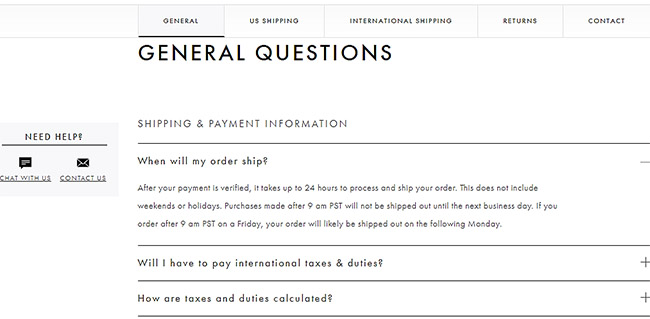
The MvmtWatches FAQ page is another pleasantly organized layout with a minimalistic design. But, don’t get me wrong. The only minimalistic thing here is the design. The amount of information, on the other hand, is undeniably very extensive. And Mvmt Watches has seemingly given it all- from technical details about watches to anything you might be curious about concerning the actual shopping process.
And yes. Each piece of information has been placed in its respective category and subcategory. Customers then use tabs to switch between the principal sections, headers to scroll through various subsections, and ultimately get to reveal answers by clicking on the plus sign. That said, email and live chat support icons on the side will follow you everywhere you go for quick assistance, in case of any additional concerns.
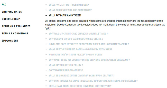
DeadStock
The DeadStock FAQ system closely resembles what we’ve sampled on Mvmt Watches. Apart from the fact that it addresses all the critical details relating to the shopping process, the questions and answers have been grouped methodically in topics. But, instead of using subtopics to categorize stuff further, DeadStock goes from the main topics straight to the corresponding questions.
One particularly notable aspect here is that clicking on a question immediately reveals its answer, while hiding information from other queries. The system even highlights the specific question and answer while the rest of them fade into the background. Now that’s a thoughtful way of avoiding possible distractions, which are common with systems that open multiple pieces of information at the same time.
Rothys
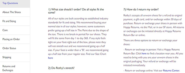
If you’re considering an FAQ page with chunks of text, you might want to look at how Rothys has implemented theirs. They have arranged everything in columns to minimize the scrolling range when you’re seeking information. Additionally, the questions and answers have been numbered sequentially to help you conveniently follow the text as you switch between columns.
Now, the answers provided here are anything but brief. And that’s a good thing for customers who’d prefer complete answers. In the end, this approach alone could mean fewer support calls because all the fundamental concerns are addressed conclusively beforehand. That said, the whole FAQ system is set up in topics, with the answers delivered in typical business language.
Penny Arcade
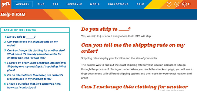
Penny Arcade moves away from the boring common style to give you a colorful FAQ page. The questions are italicized in red with a blue and white background, while the corresponding answers are published in black. Well, come to think of it, this perfectly suits such an artsy website that handles colorful comic-branded stuff.
The entire FAQ itself is pretty brief, and it only addresses issues related to shipping. I guess the support team came up with that idea after surveying queries that customers commonly raise. Besides, you can bet that Penny Arcade’s customers are not the type of people who’d patiently scan through an extensive FAQ. As a matter of fact, they even get a table of contents to help them jump straight to specific questions. And if that fails to work out, you can take advantage of the email contact link placed at the end of the FAQ.
Eagle
It goes without saying that most FAQ pages don’t come with search functionality. And when they do, the search box is commonly placed at a corner, possibly because it’s typically perceived as a secondary option. However, and rather contrastingly, the search function is seemingly a prominent element on Eagle’s FAQ page. It’s placed right at the top to help you avoid the trouble of scanning through all the questions. So, of course, it’s possible to conveniently get your answer without scrolling further.
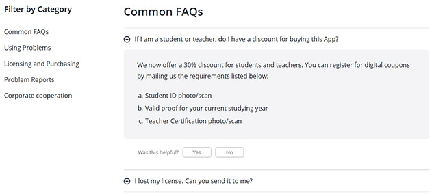
But, in case you choose to proceed, Eagle has organized all the questions by their respective categories. You can switch between them as you look for a specific issue. Then ultimately, you can also vote to let Eagle’s support team know if their answer was helpful or not.
Are You Ready to Build the Perfect FAQ Page?
Have you walked through all of the steps? Start by figuring out if an FAQ page is right for you. Then find the questions that customers care about the most. Finally, walk through formatting, locations and the funnel that's going to lead people elsewhere. I would also recommend that you check out some of the FAQ pages from brands that you enjoy or those that run in your own industry. This should give you a great start.
After that, you should have something close to a perfect FAQ page!
Let us know in the comments if you have any questions about designing and writing the perfect FAQ page.
header image courtesy of





Comments 0 Responses