The best Ecwid store examples are a great source of inspiration for anyone planning on building their own ecommerce website with Ecwid technology.
Available either as a plugin for your existing website, or as a standalone solution for building a simple online presence, Ecwid offers a cost-effective and simple solution to brands getting started in the digital space.
Versatile and flexible, Ecwid ensures any business owner can start selling products across a range of channels and platforms.
Plus, the solution even integrates directly with Lightspeed Payments for the US, enabling rapid payment processing and transaction management.
Today, I’ll be sharing some of my favorite examples of stores built with Ecwid, to provide you with a behind-the-scenes insight of what you might be able to accomplish with your own store.
What are the Best Examples of Ecwid Stores in 2025?
Bad Squiddo Games
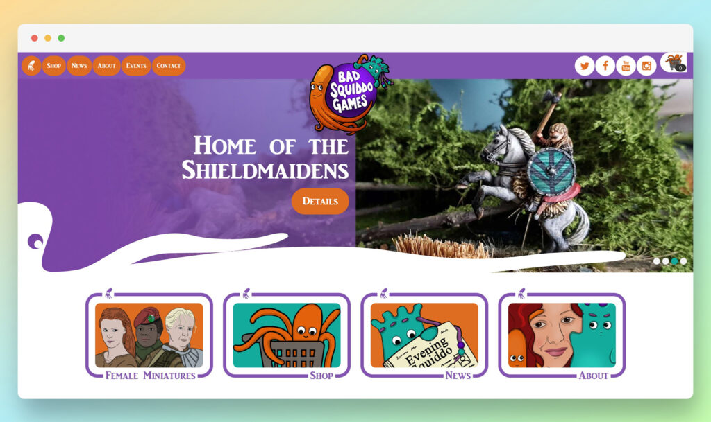
Simple but effective, the Bad Squiddo Games site is an excellent example of a web presence built to appeal to a specific audience.
The site’s carousel-style header provides an instant insight into what customers can access from the brand, quickly grabbing attention with colorful graphics.
Plus, thanks to Ecwid, the organization has been able to link its store to a range of social media channels.
My favorite thing about this website has to be the custom hover animations, which rapidly bring each section of the site to life with dynamic movement.
The convenient shopping cart is excellent too, with a mini menu included to help guide customers back to store pages.
Terrapin
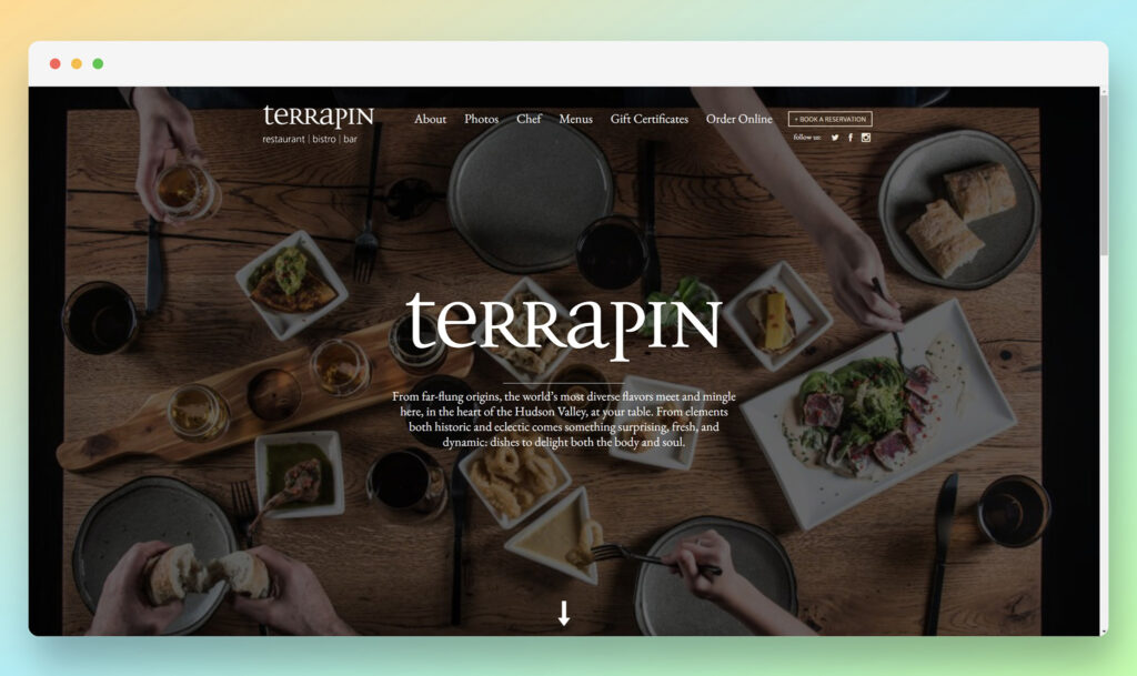
The Terrapin website is an excellent example of how simple websites can still generate excellent responses from customers.
The homepage for the site includes direct access to a range of tools for social sharing, browsing through menus, and checking out upcoming events in one place.
Plus, the Terrapin company has taken advantage of a Google Maps integration, to allow consumers to find their closest location, and access directions to it within the website itself.
I’m particularly impressed by the built-in booking form for reservations.
Freckle Pot
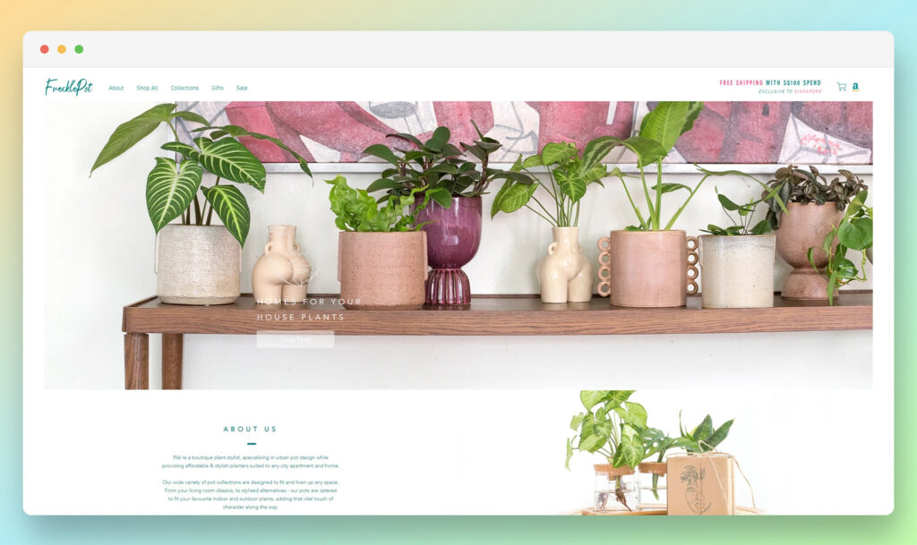
The Freckle Pot website is a beautiful, minimalistic site, with a host of great features to explore. The customized pop-ups on the website immediately entice visitors with sales, discounts, and deals, while the dynamic banner on the top of the screen keeps us updated on offers.
I love the use of imagery on this website. Custom photographs and illustrations are absolutely everywhere, making the whole experience feel more professional and engaging.
Freckle Pot also takes advantage of Ecwid’s Amazon integration to give customers multiple ways to make a purchase.
Quasimodo
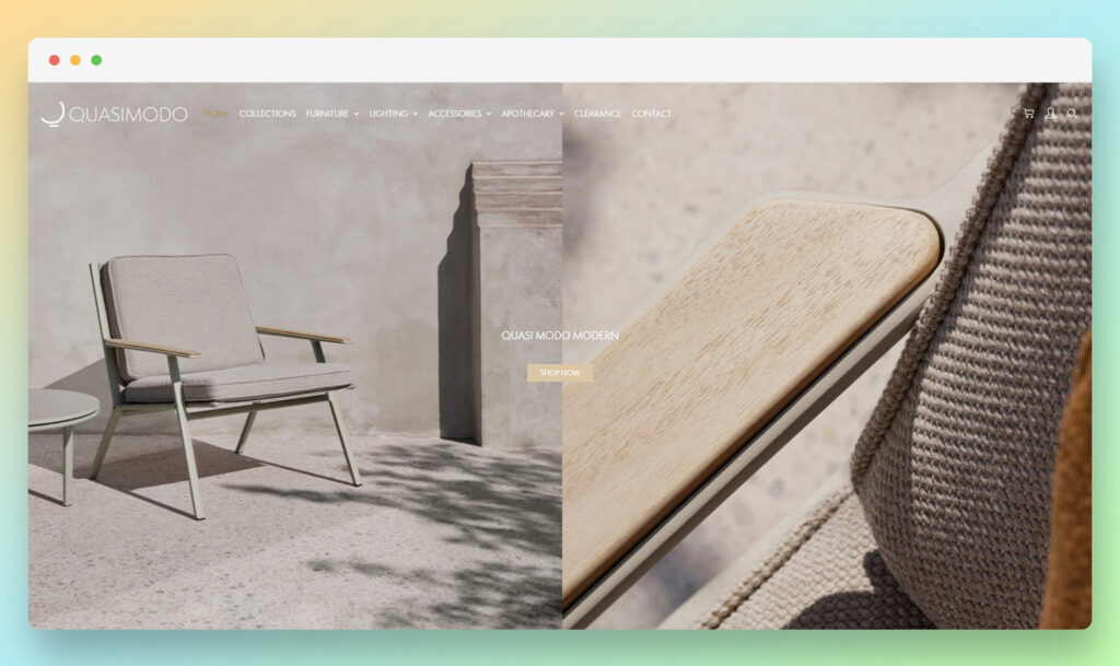
Stylish and minimalistic are the two main words I’d use to describe the Quasimodo Modern website.
Every aspect of the site has been designed to deliver a phenomenal, streamlined user experience, from the automatically scrolling product carousels, to the timed pop-ups.
The mini expandable menu is also an excellent part of this site, giving customers the freedom to navigate seamlessly between different collections and product options.
I’m also a big fan of the Facebook Messenger integration, which ensures potential prospects can quickly reach out to staff members with any questions they might have.
Les Tricots D’o
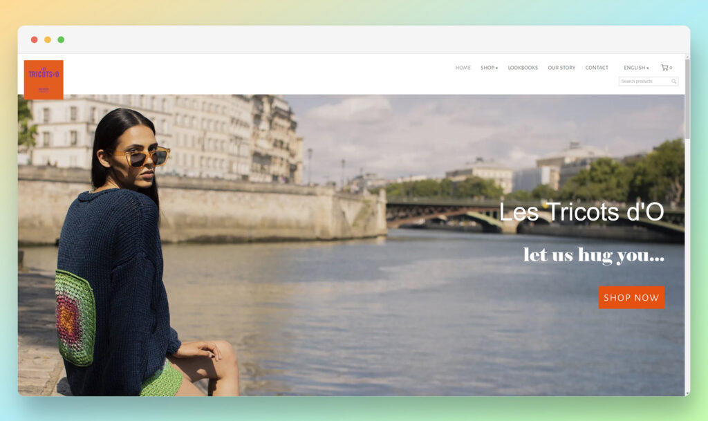
This company has used Ecwid’s ecommerce technology to build a website that puts the products on offer front and center on every page.
I adore the way the brand has leveraged hover effects for product pictures, to show different items from a range of angles as you move your cursor over them.
The company has also integrated a social media newsfeed, connected to Instagram, to keep customers up to date on the latest products in their collection.
Another great feature is the multi-lingual capabilities on this site, which ensure you can browse content in the language of your choice.
Tropicouture Plants
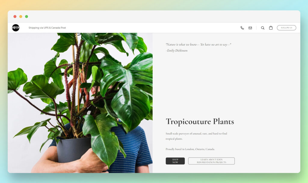
With timed slide-ins to encourage social followers to find the company on Instagram, Tropicouture instantly engages its visitors.
The site is wonderfully mobile-friendly too, and comes with click-to-call buttons embedded into the menu bar, so you can connect with the team straight away.
This company makes shopping simple, providing all the information you need about the brand’s product collections on the home page.
The only (slight) downside is the pages can take a little while to load on some browsers.
Minor Fine Jewelry
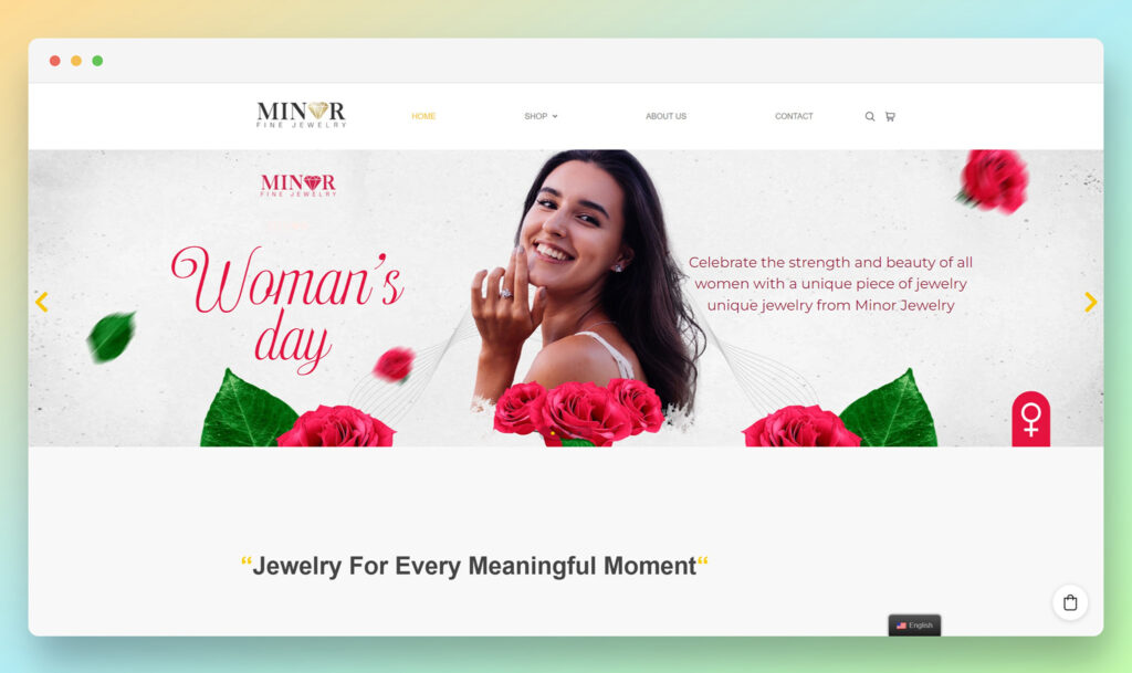
While I’m not a huge fan of some of the font and banner choices on the Minor Fine Jewelry website, the overall functionality of the site itself is great.
I like the scrolling carousel on the home page, which instantly introduces visitors to all of the different product categories the brand has to offer.
Plus, like many other sites built with Ecwid, this company takes advantage of numerous integrations with tools like WhatsApp, for messaging, and Google Maps, to help customers find a local retailer.
There’s even a built-in multi-lingual translation tab, so you can change the language of the store in seconds.
Darjeeling Tea Boutique
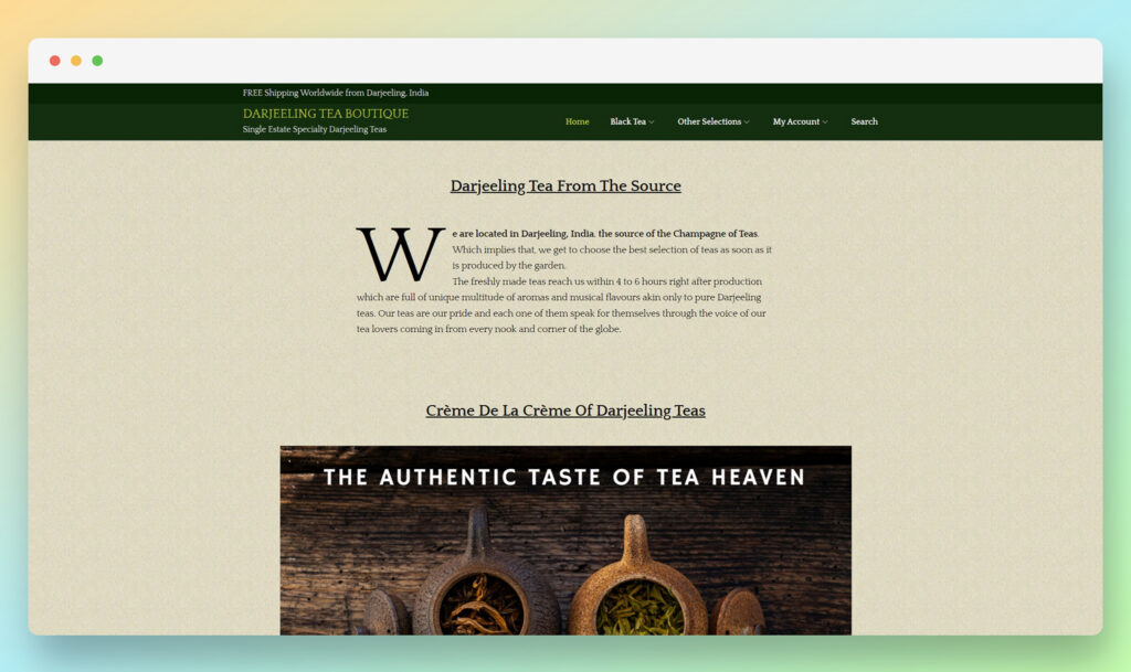
One of the best things about the Darjeeling Tea Boutique store, is the integrations it uses to demonstrate social proof to customers.
There’s a handy pop-up app included within the site which lets customers know every time another person makes a purchase.
The site also has it’s own range of social feeds from Facebook, Twitter and Instagram, so consumers can stay up-to-date on the latest news and user-generated content curated by the team, without having to click away from the website.
Candy Love

The use of a video at the top of the home page on the Candy Love store is an excellent way to make the website feel more human and engaging.
At the same time, as you scroll through the website, you’ll see sticky buttons on both the left-hand side and bottom of the page, directing you towards customer reviews, and a convenient live chat service.
Candy Love’s website is brimming with great features to engage and delight customers, including social media buttons, animated hover effects, and a custom search bar.
Plus, I love the fact that the menu stays with you as you scroll.
Galavas Wines
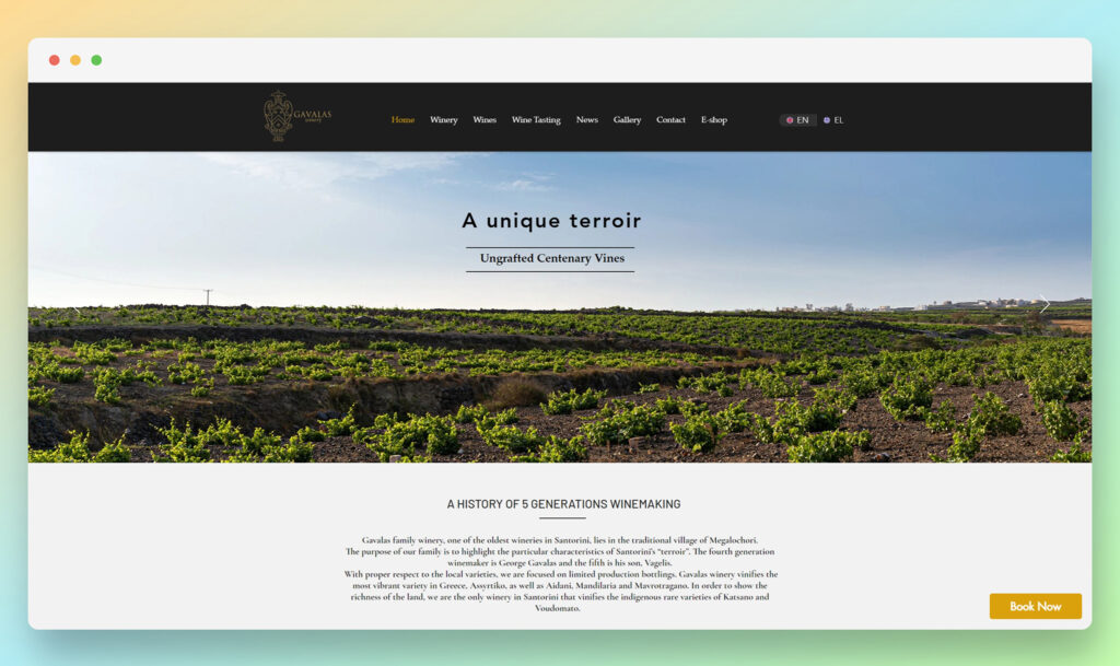
Elegant and sophisticated, the Galavas Wines website instantly exudes professionalism and quality.
On the home page, you’ll find a phenomenal scrolling carousel of pictures, designed to offer a behind-the-scenes insight into the brand.
The site has it’s own beautiful ecommerce shop, complete with a range of payment options for customers to choose from.
Plus, there’s a handy “book now” button which sticks with you as you browse through the website, ensuring you can rapidly arrange a delivery as soon as you feel inspired to buy.
Ozwald Boateng
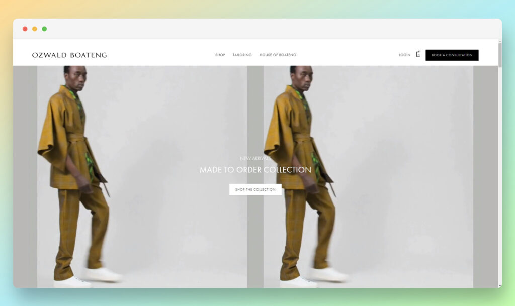
Style and innovation come together perfectly on the Ozwald Boateng website. The site welcomes visitors in with animated videos at the very top of the page, ensuring they everyone can view the beautiful clothes on offer from a range of angles.
I’m a big fan of the layout for this website, which organizes content into need squares and blocks, with animations that grab your attention as you continue to scroll.
The website also has a host of great integrations implemented, for social media, and print on demand selling.
Soles 4 Souls
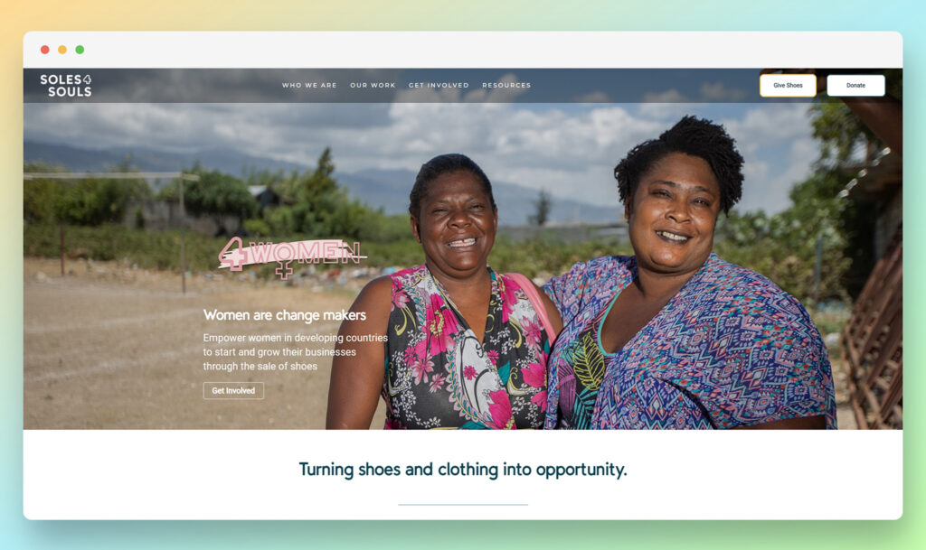
Authenticity is the first thing I think of when I see the Soles 4 Souls website. This compelling website instantly grabs the attention of visitors with a behind-the-scenes insight into the mission and vision of the brand.
As you scroll through the site, it’s easy to feel a connection to the company, thanks to the use of genuine, authentic imagery and photos.
Though the website is relatively simple, it sends an important message about giving, without being overwhelming. I love the social proof section at the bottom of the page, showcasing the brand’s accomplishments too.
Mia Mau
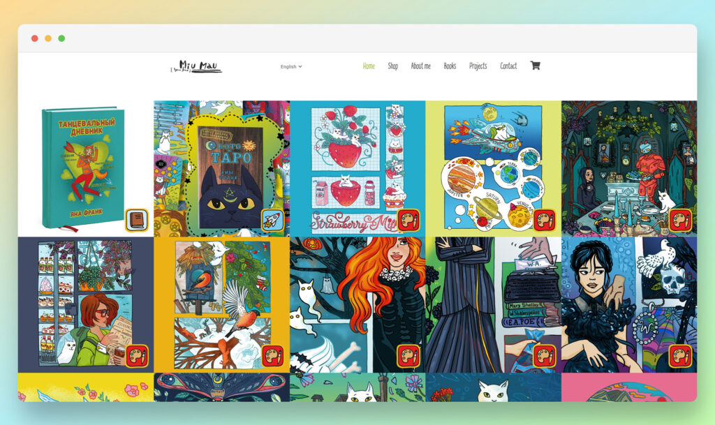
The Mia Mau website is an artist’s dream come true. As soon as you arrive on the site, you’re instantly exposed to a variety of beautiful images, which you can access and purchase with a quick click of a button.
Mia Mau uses custom icons and menu sections on its website, to showcase its creative nature, alongside some fantastic illustrations.
The site also integrates with a range of other online resources owned by the brand, including a Vimeo and Behance channel, Flickr, Facebook, Tumblr, Instagram, and YouTube.
Sand and Stone
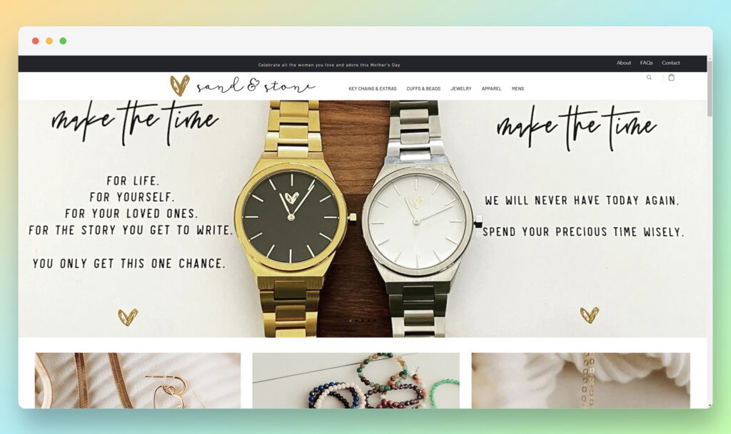
Wonderfully elegant and minimalistic, the beautiful Sand and Stone website is perfectly suited to a company in the jewelry and apparel landscape.
I’m a big fan of the custom fonts used throughout the site, which correspond well with the company’s logo.
Plus, I like the fact that the company has integrated Google maps into the footer of their homepage, so you can see exactly where all of your purchases are coming from.
The custom search bar is another fantastic feature of this site, making it much easier for customers to navigate.
Oh, So Pretty
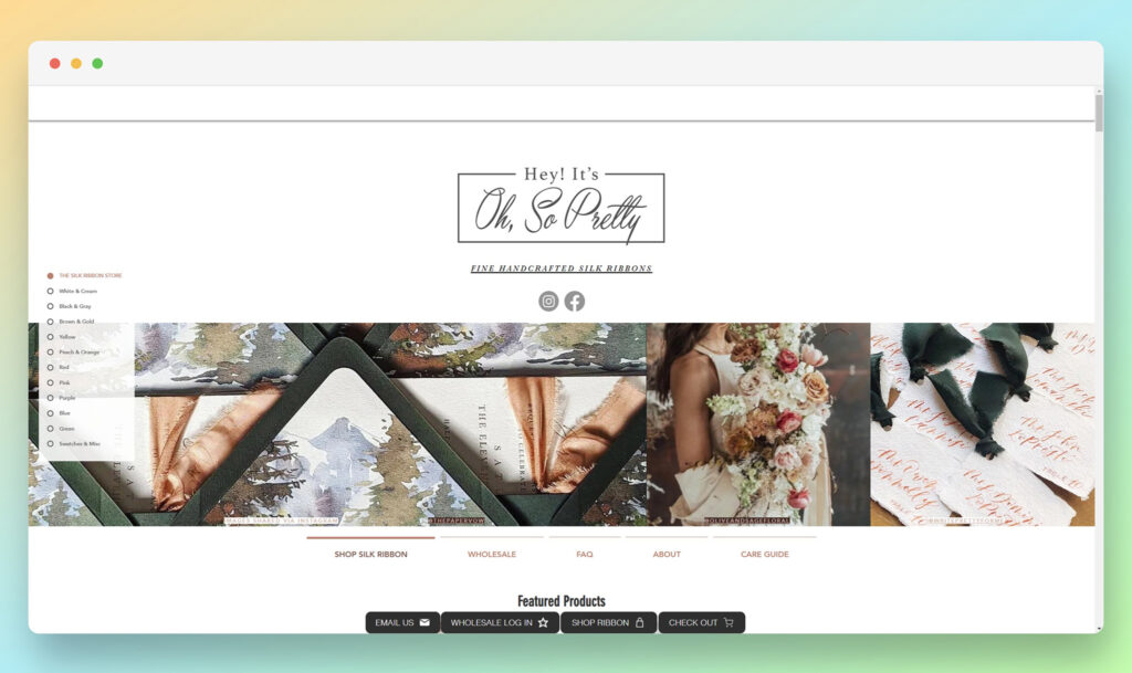
Oh, So Pretty keeps things simple with a fantastic straightforward website, where users can instantly find the products, they’re looking for using a sticky navigation bar on the left-hand side of the page.
Clicking on a section will take you to the products tagged with a specific color.
At the top of the page, you can find an extended menu, where you’ll be able to click for information on the company’s wholesale offerings, and the brand’s identity.
Customers can even create their own accounts on the site to make checking out faster and more convenient.
Firefly
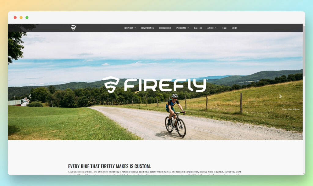
The Firefly website feels marvelously modern from the moment you click onto the home page, with it’s minimalistic design and attractive high-fidelity images.
The sticky navigation bar means you’ll never have trouble jumping between pages when looking for products or inspiration. Plus, there’s plenty of integrations with social media to check out too.
Perhaps my favorite thing about the Firefly website, is how accessible it is. A sticky accessibility tab allows users to quickly take advantage of features for negative contrast, high contrast, or even increasing the size of font.
Five Oaks Farm Kitchen

Finally, the Five Oaks Farm Kitchen website is a lovely, rustic-style site, designed to make it easier for customers to connect with the brand however they choose.
Customers can leverage maps to find their closest location, access an ever-updated stream of news and blogs, and even order items directly online with a couple of clicks.
The site even has its own “waitlist” solution, which allows customers to find out exactly how long they’re going to need to wait for a table in different environments.
If you’re ready to book, you can select your party size and reserve your space instantly with a GuestManager plugin.
What Makes Ecwid Unique?
Ecwid isn’t just another eCommerce platform. It’s built for flexibility, making it perfect for small businesses, side hustlers, and serious brands. Here’s why it stands out:
- Plug & Play – Add it to any website (WordPress, Wix, Squarespace) or use it as a standalone store.
- Mobile-Optimized – Works across all devices out of the box.
- Multi-Channel Selling – Sell on Instagram, Facebook, Amazon, eBay, and even in-person—all from one dashboard.
- Zero Transaction Fees – Unlike Shopify, Ecwid doesn’t take a cut of your sales.
- SEO & Marketing Features – Built-in tools to rank higher and bring in more traffic.
Why Design Matters for Conversions
Bad design = lost sales. Here’s why:
- If it’s hard to navigate, people leave – 38% of users bounce from ugly, confusing websites.
- If it looks sketchy, they won’t buy – 75% of credibility comes from first impressions.
- If it’s slow, they won’t wait – A 1-second delay can drop conversions by 7%.
A great design makes shopping frictionless. And friction kills conversions.
So, how do you fix your store’s design? Keep reading.
Key Features of a High-Converting Ecwid Store
Want more sales? Your design needs to check these five boxes:
1. Clean and Modern Layout
- Less clutter = more sales.
- Stick to 2-3 colors, simple fonts, and plenty of white space.
- Keep the navigation bar simple—Home, Shop, About, and Contact. That’s it.
Pro Tip: If your homepage has too many options, people get overwhelmed and leave. Keep it clean.
2. Mobile Optimization
- Over 60% of online sales come from mobile. If your site isn’t mobile-friendly, you’re losing money.
- Check your store on a phone—is the text readable? Do buttons work? Is checkout smooth?
Pro Tip: Test your store on both iPhone and Android—they can display things differently.
3. Fast Load Speed
- Every extra second of load time = 7% fewer sales.
- Optimize your images—use WebP instead of PNG/JPG.
- Cut out unnecessary apps and scripts that slow things down.
Pro Tip: Use Google PageSpeed Insights to check your store’s speed. Anything under 3 seconds is solid.
4. Trust Signals (Reviews, Security Badges, Social Proof)
- No reviews? People don’t trust you.
- Add real customer photos and testimonials.
- Use security badges like SSL encryption, PayPal Verified, and Trustpilot ratings.
Pro Tip: If you’re new, offer a money-back guarantee to build trust fast.
5. Seamless Checkout Experience
- No one likes a 10-step checkout process.
- Offer guest checkout—forcing people to create an account kills conversions.
- Display multiple payment options (Apple Pay, Google Pay, PayPal, Credit Card).
Pro Tip: If you see cart abandonment, your checkout might be too complicated. Test it yourself—how fast can you buy something?
How to Apply These Design Strategies to Your Own Ecwid Store
Want to upgrade your store’s design? Here’s what to do next:
- Pick a design style – Minimalist? Bold? Luxury? Make a decision.
- Upgrade your product images – Blurry photos kill conversions.
- Simplify navigation – Make it stupid-easy to buy.
- Make mobile a priority – Test your store on every device.
- Use strong CTAs – “Buy Now” should pop, not blend in.
Amazing Examples of Ecwid Stores
While Ecwid might not be the most comprehensive tool available for companies looking to build an ecommerce site, it is one of the easiest solutions out there for beginners.
As you can see from the examples above, this simple and streamlined platform ensures any business owner can rapidly create a stunning website, with minimal time or effort.
If you’re looking for an affordable way to design and host your own ecommerce store, Ecwid could be just the solution you’ve been searching for.
Check out our other articles for insights into the costs, functionality, and features of Ecwid.
Final Thoughts: Build a Store That Sells
A good design isn’t just about looking pretty—it’s about making more money.
Take inspiration from these stores. Apply the lessons. And if your Ecwid store still isn’t converting, fix it today.




Comments 0 Responses