

Shopify powers millions of businesses in 175+ countries, and its merchants generated $119.1 billion in GMV in Q3 2026, according to its November 3, 2026 results. But the useful question behind these Shopify website examples is smaller: what makes one store easier to shop than another?
I checked these 30 live stores in November 2026, looking at their homepages and menus and reading their theme metadata. Each entry pairs a design lesson with the theme or storefront architecture indicated by its page code. Seventeen start from a Theme Store theme, including nine substantially customized builds; ten use custom themes, and three are headless.
I’ve focused on navigation and buying decisions rather than decoration alone. After the examples, you’ll find theme-detection instructions, usability benchmarks, and a theme-price comparison to help you build your own version. If you’re still choosing a platform rather than planning a redesign, start with my Shopify review.
Table of contents
- 1. Parachute: Explain the Choice Before Shoppers Have to Ask
- 2. The New York Times Store: Reuse the Typography Your Customers Already Know
- 3. Peak Design: Let Shoppers Browse by Activity
- 4. The Sill: Turn Size and Growing Conditions Into the Menu
- 5. Ugmonk: Sell a System, Not a Single Product
- 6. Fishwife: Give Newcomers a Starter Pack and a Recipe
- 7. Rhode: Keep Product Names to One Lowercase Word
- 8. Caldera + Lab: Package the Line as a Regimen
- 9. Harper Wilde: Let the Menu Answer the Fit Question
- 10. Olipop: Sort the Range by the Spec Buyers Care About
- 11. Polaroid: Hand Gift Buyers a Finder Tool
- 12. Hydrant: Swap Adjectives for Numbers
- 13. Wild One: Bundle the Hero Product Into a Kit
- 14. Soylent: Make a Plain Product Feel Credible
- 15. Brightland: Put a Trust Strip Right Under the Hero
- 16. Cotopaxi: Make the Mission Part of the Merchandising
- 17. Artifox: Name Products So They Read Like a System
- 18. Rachel Comey: Let Named Edits Do the Styling
- 19. Vuori: Split the Funnel Early and Name Your Fabric
- 20. Our Place: Group a Hero Product by Material
- 21. Not Pot: Make the Brand Voice Do the Design Work
- 22. Blume: Shop by Skin Concern, Then Show the Proof
- 23. Léo et Violette: Let Photos Lead and Put the Detail in the Menu
- 24. Supergoop: Own the One Category You Sell
- 25. Golde: Put Recipes Next to the Bestsellers
- 26. Mahabis: Put the Colorway in the Product Name
- 27. Fetching Fields: Give Every Product a Story Name
- 28. Areaware: Write Microcopy People Remember
- 29. Counter-Print: Let the Product Covers Be the Interface
- 30. Jackie Smith: Localize Payments, Shipping and Gifting
- How to Tell Which Theme a Shopify Store Uses
- What These Shopify Stores Have in Common
- How to Get This Look on Shopify
- Shopify Design Trends for 2027
- The Bottom Line
- FAQ
1. Parachute: Explain the Choice Before Shoppers Have to Ask
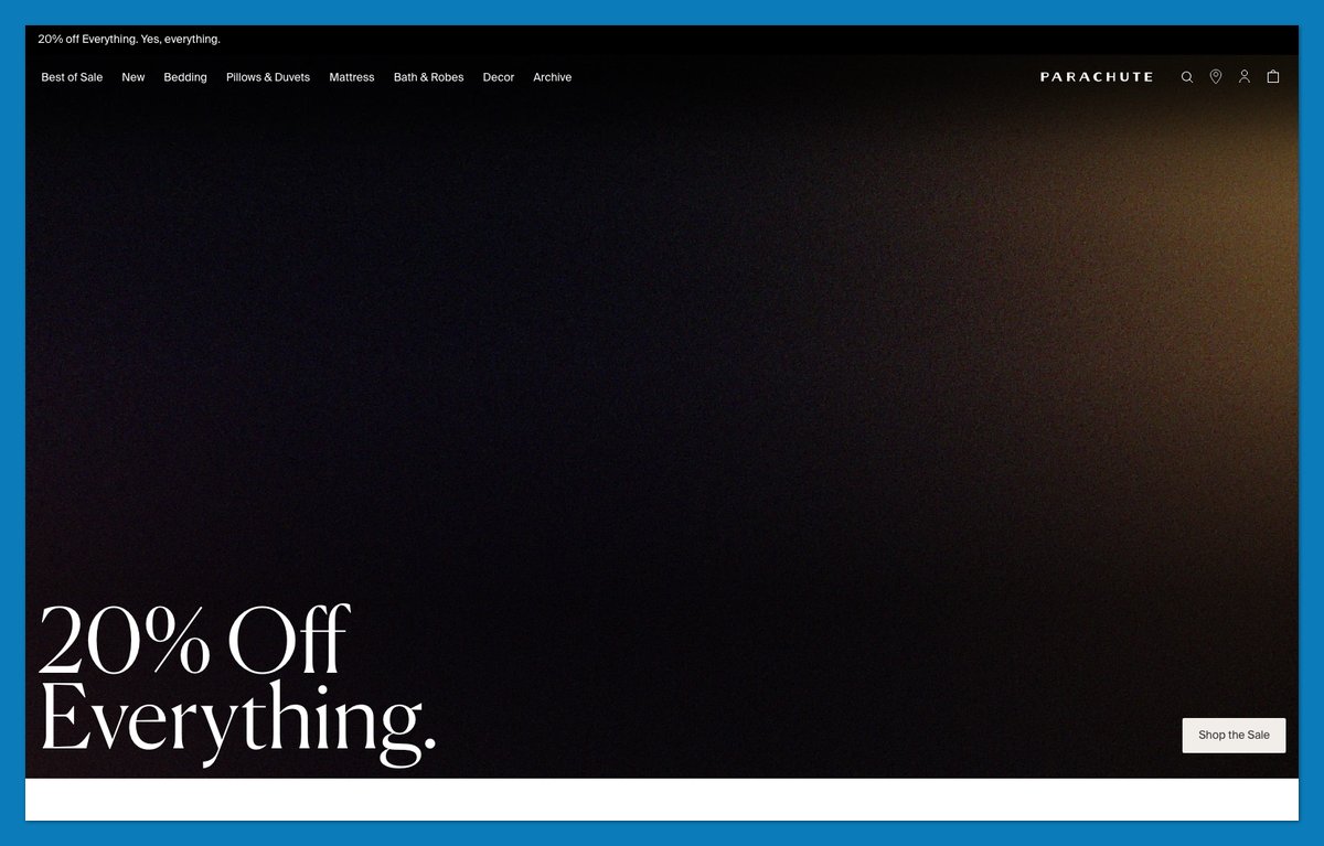
Can your customers explain the difference between your variants? Parachute doesn’t assume they can. Its menu describes percale as “Crisp. Cool.” and linen as “Airy. Relaxed.” Those descriptions give shoppers a reason to choose before opening a product page.
The guidance continues with “Which insert is right for you?” and links to “Shop Swatches” and “Discover our Fabrics.” Canela and Petrona display serifs sit above Suisse Intl body text, distinguishing educational headings from shopping copy. I’d copy the explanation before worrying about the fonts: the menu already does part of a sales assistant’s job.
If your product comes in variants people don’t understand, write a two-word description for each and put it in the menu.
Theme: Custom theme (built on Dawn)
2. The New York Times Store: Reuse the Typography Your Customers Already Know
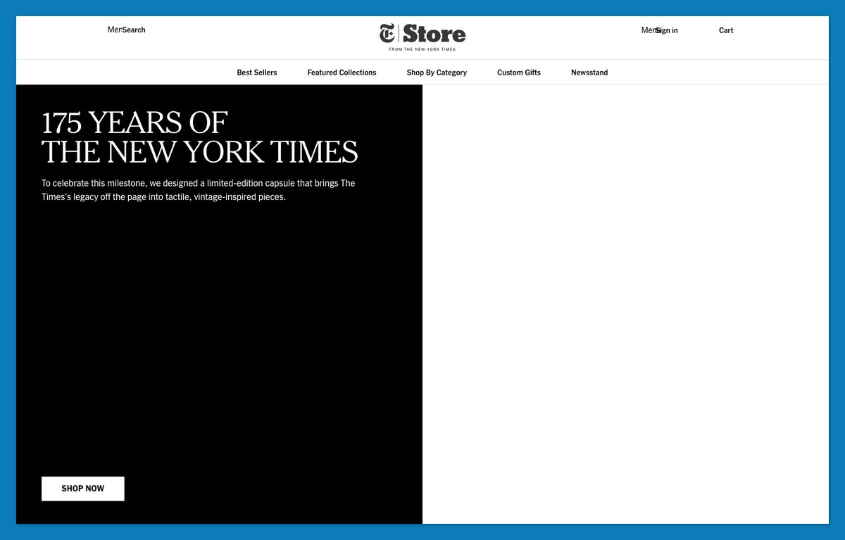
The New York Times Store carries the newspaper’s identity into ecommerce through NYT Cheltenham Light, its recognizable serif. “The Archival Collection” reinforces the connection, while merchandising blocks keep the next action simple with a single “Shop Now” CTA.
Personalized front-page reprints and name-and-finish-time products turn the archive into something you can buy for a particular person.
This approach suits brands with recognizable typography or an archive worth revisiting. Reuse those assets before commissioning a separate store identity.
Theme: Custom theme
3. Peak Design: Let Shoppers Browse by Activity
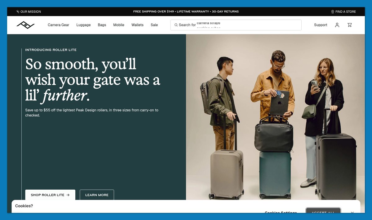
What if your best-seller grid started with the trip, not the bag? Peak Design lets shoppers filter “Best sellers” through activity-led pills such as Travel and Outdoor. “Moto” gives motorcycle shoppers an equally direct route into relevant gear.
The City Line block advertises three colors exclusive to the brand’s store, providing a reason to buy directly. Lifestyle photography reinforces the use cases, with alt text describing activities rather than leaving images anonymous.
This headless Hydrogen storefront runs on Shopify’s Oxygen, so replicating the build needs developers. Copying the activity filters doesn’t. The Sill below uses the same situation-first thinking on a conventional Shopify theme base.
Theme: Headless: Hydrogen on Oxygen
4. The Sill: Turn Size and Growing Conditions Into the Menu
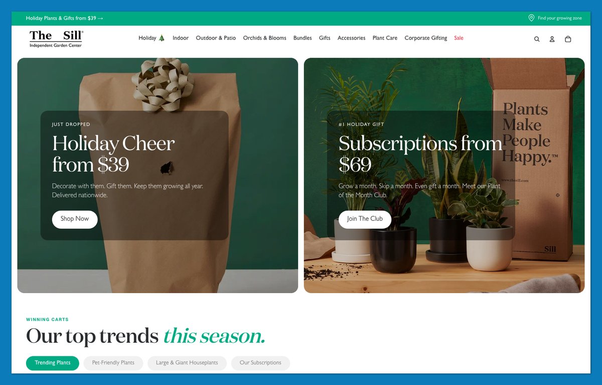
You might know how much space you have without knowing a single plant name. The Sill accommodates that with “Shop by Size” and “Shop by Solution,” plus a “Find Your Growing Zone” tool for outdoor decisions.
Its navigation separates indoor plants from outdoor and patio options, while Plant Care gives beginners somewhere to turn after choosing. DM Serif Display headings and Geist body text distinguish editorial guidance from everyday shopping labels.
The Sill also appears in EP’s wider ecommerce store design collection. Here, the transferable lesson is size-and-climate routing: use it when your buyer’s constraints matter more than product names or familiarity with the category.
Theme: Custom theme (built on Horizon)
5. Ugmonk: Sell a System, Not a Single Product
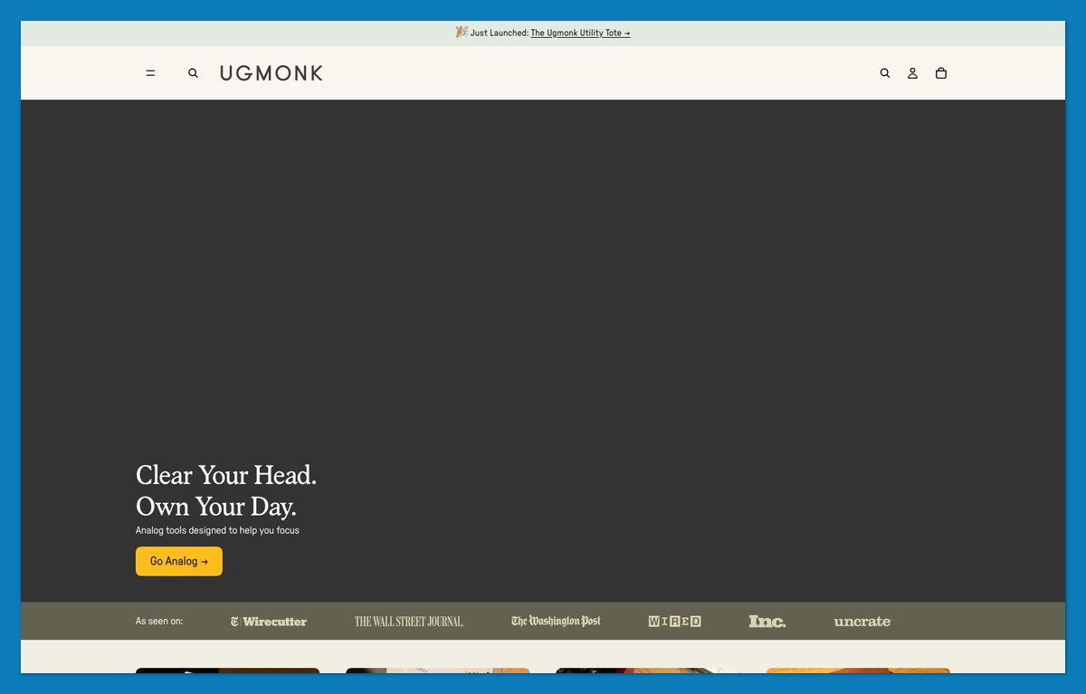
Give a first-time buyer a complete starting point. Ugmonk offers its Analog Card Bar Kit and Daily Focus Kit rather than making every shopper assemble a productivity system from individual pieces.
Multipacks extend the same logic, while a cart-drawer upsell provides a place for the next useful accessory. “Think Better on Paper” explains the purpose more directly than a technical description of the card system.
Ugmonk uses Tinker, which Shopify listed as free on November 17, 2026. A premium-looking brand doesn’t automatically require a paid theme. If you sell one hero product, build a starter kit around it and put the add-on in the cart drawer.
Theme: Tinker (Theme Store)
6. Fishwife: Give Newcomers a Starter Pack and a Recipe
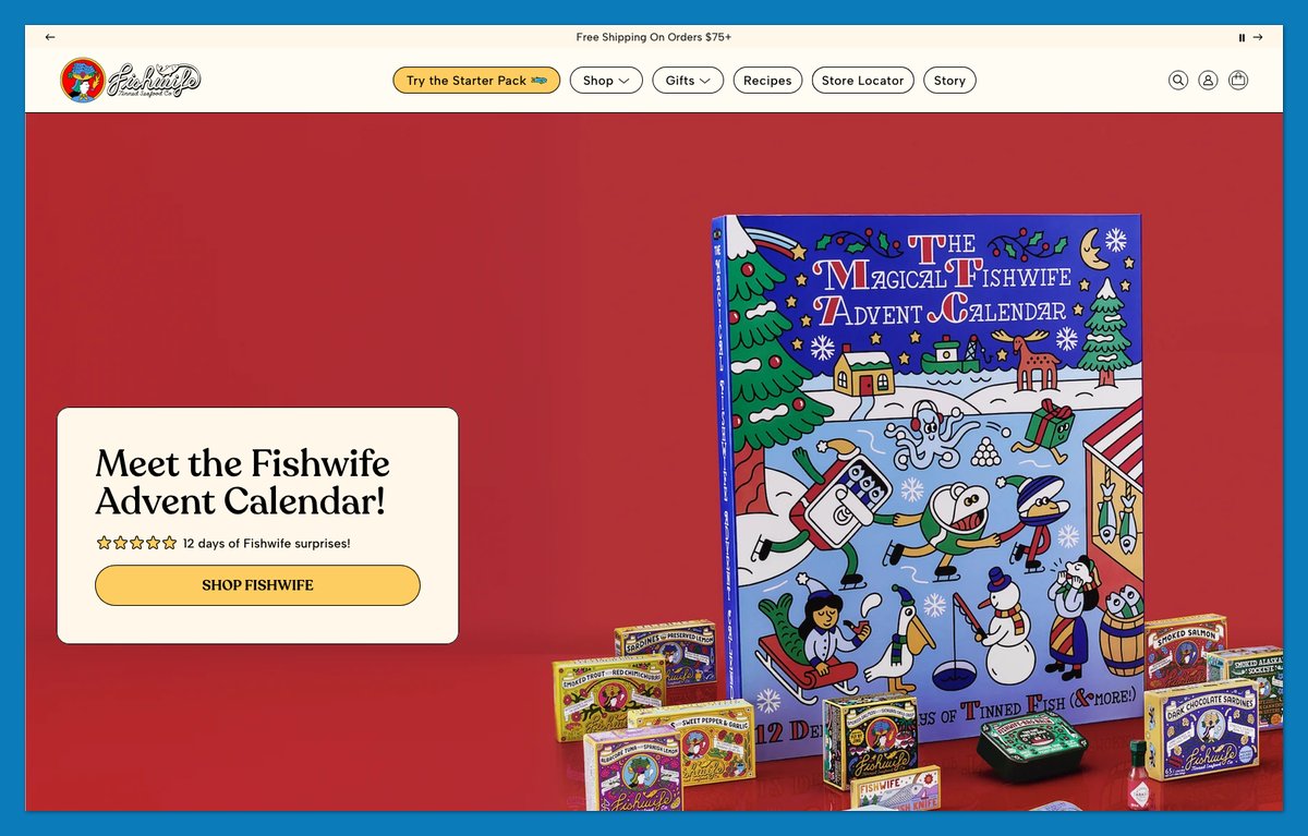
A newcomer to tinned fish needs more help than another product photo. Fishwife offers “The Starter Pack” for an introduction and “Build Your Own Bundle” for shoppers who already know what they want.
“Creamy Tuna Pasta al Limone with Anchovy Breadcrumbs” turns a tin into a meal, while “Meet Our Canneries” gives sourcing information its own destination. Gift shopping has a separate route through price-based collections, so buying for someone else doesn’t require category expertise.
Like Golde at number 25, Fishwife puts usage ideas beside products. The extra lesson is the starter pack: it makes an unfamiliar category a more manageable first order without requiring shoppers to assemble their own selection.
Theme: Blockshop (Theme Store)
7. Rhode: Keep Product Names to One Lowercase Word
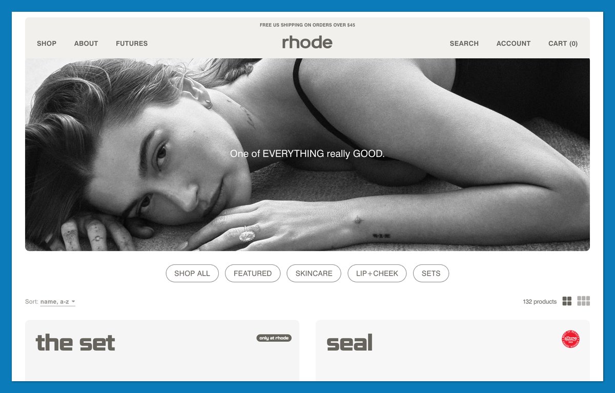
How much product copy can you remove before a store becomes confusing? Rhode tests that boundary with lowercase labels such as “plush” and “depuff,” paired with image-led tiles and a terse “SHOP” CTA.
Swiss 721 typography keeps those labels consistent. The navigation supplies context that the product names omit, separating Skin from Lip+Cheek and giving Sets their own route. A short name can be memorable without explaining the entire product by itself.
I’d borrow the naming discipline, not strip descriptions from an unfamiliar brand. This approach needs strong photography and an audience that already understands what Rhode sells. Without those, a one-word label can leave the shopper guessing what they’re buying.
Theme: Custom theme
8. Caldera + Lab: Package the Line as a Regimen
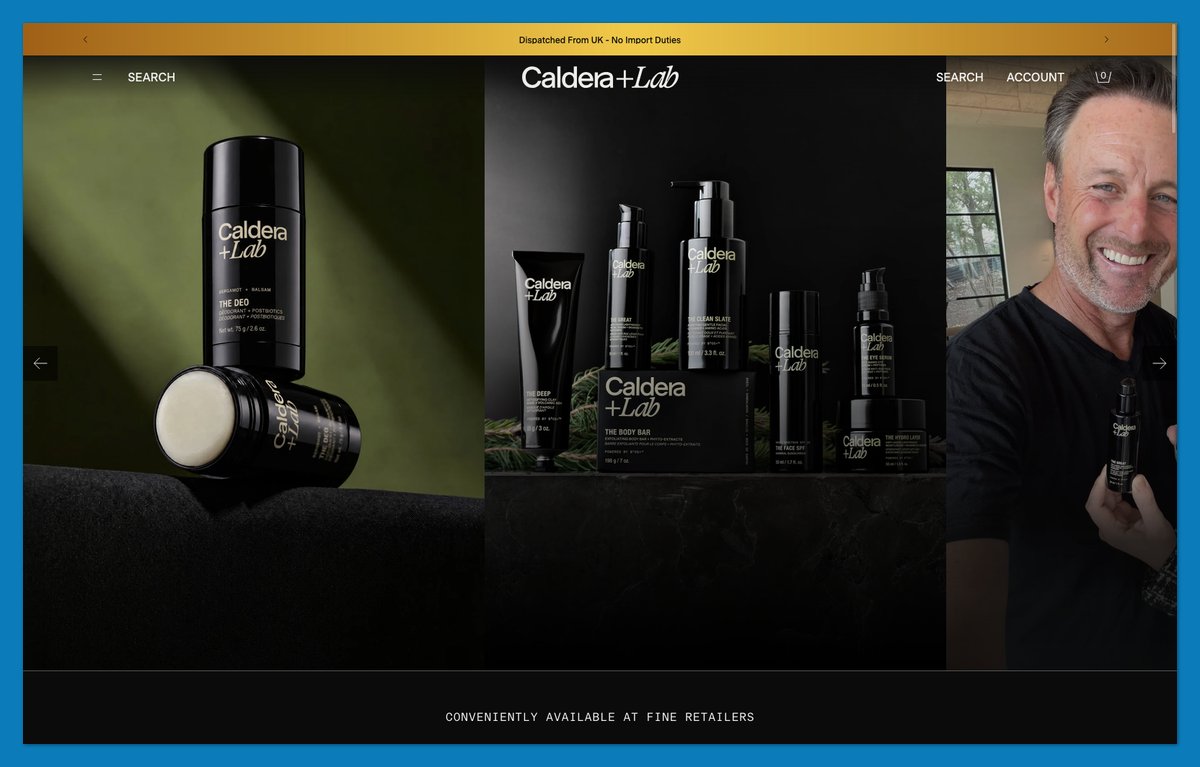
A skincare beginner shouldn’t have to construct a routine from unfamiliar bottles. Caldera + Lab puts “The Regimen + Eye Defense” and “The Regimen Rich” directly in its navigation, alongside “FIND YOUR ROUTINE.”
“Find Your Personalized Routine” leads to “Start Skin Analysis,” giving uncertain shoppers another way forward. Names such as “The Base Layer” and “The Clean Slate” make the line read like connected steps rather than unrelated formulas.
Condensed uppercase headings separate these decision points from Inter body copy. Compared with Rhode’s image-first approach, Caldera + Lab offers more explicit guidance. Use this structure for a small line where a two- or three-step routine is the real purchase.
Theme: Custom theme (built on Horizon)
9. Harper Wilde: Let the Menu Answer the Fit Question
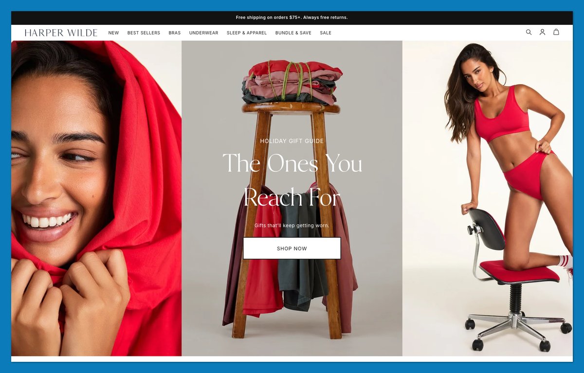
Put the fit question ahead of the product grid. Harper Wilde organizes navigation around styles such as Wireless and Underwire, then offers another route through fabric families, including Bliss and Cloud Cotton.
A “Find my size” CTA addresses the next uncertainty, while product-family quick-add buttons let confident shoppers move straight to “Add to Bag.” Its standing policy message states free shipping on orders of $75 or more and free returns, as displayed in November 2026.
The menu helps shoppers reach the right family before comparing individual bras. If returns are your biggest cost, put a size finder in the hero, not the footer.
Theme: Custom theme (built on Dawn)
10. Olipop: Sort the Range by the Spec Buyers Care About
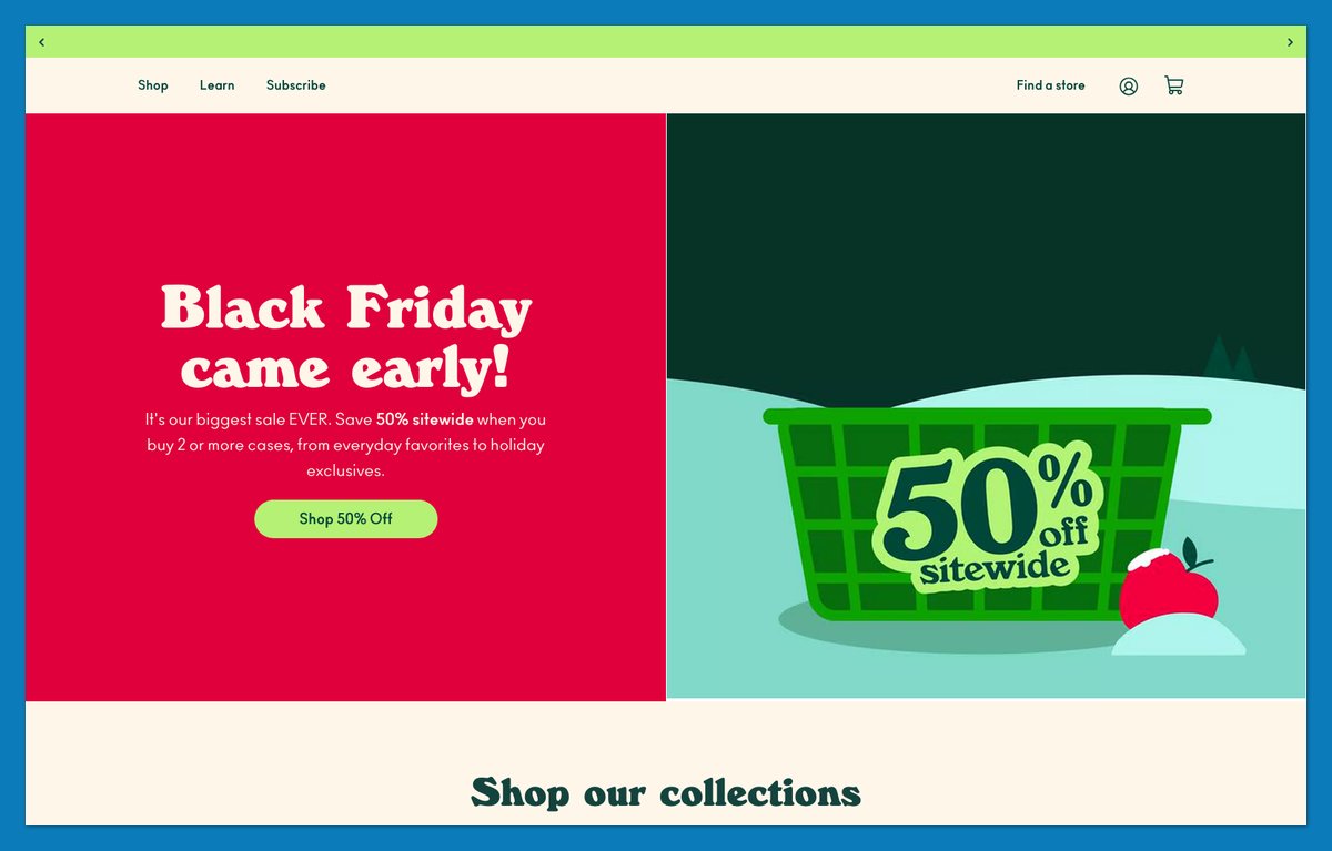
Olipop gives fiber content its own shopping routes: “Shop 9g fiber” and “Shop 6g fiber.” That’s a more specific starting point than asking every visitor to choose a flavor from a wall of cans.
“Shop by fiber line” repeats the distinction further down the page. Variety packs serve undecided shoppers, while an “Available in stores” module connects the online catalog to retail purchasing. Ano and Windsor display faces add personality without carrying the product explanation.
Hydrant at number 12 also leads with numbers, but Olipop builds its collection logic around one specification. Copy this when customers compare your products using a measurable attribute, not merely because numbers look persuasive.
Theme: Custom theme
11. Polaroid: Hand Gift Buyers a Finder Tool
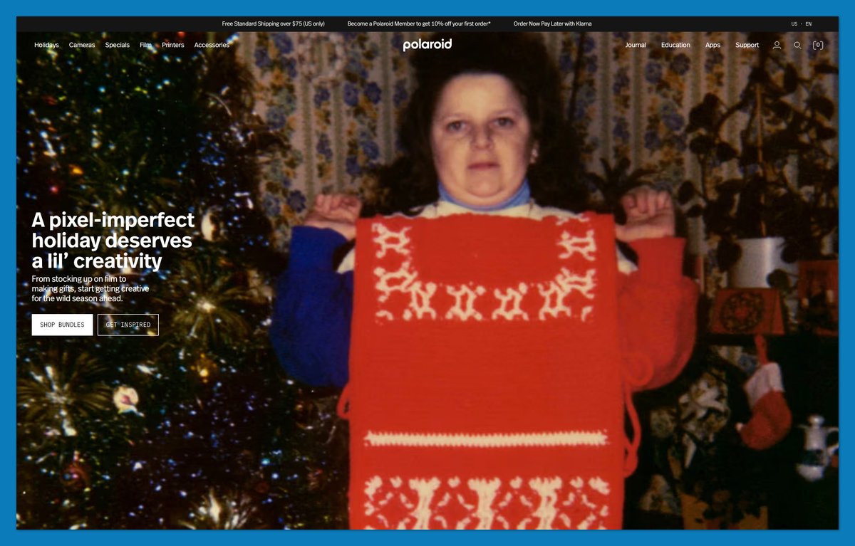
Buying the wrong film can spoil a thoughtful camera gift. Polaroid addresses that uncertainty with Camera Finder and Gift Finder tools, alongside camera-plus-film starter sets.
Education continues after selection, with how-to content for cameras such as the Mod and Go Gen 3. The store helps shoppers choose equipment and get started, rather than assuming they already know instant photography.
Its page code points to a Next.js front end with records tied to Shopify product IDs. That’s a technical inference, not a platform statement from Polaroid. Copy the finder-and-set approach for gift-heavy categories containing several similar models.
Theme: Headless storefront (Next.js) with Shopify products
12. Hydrant: Swap Adjectives for Numbers
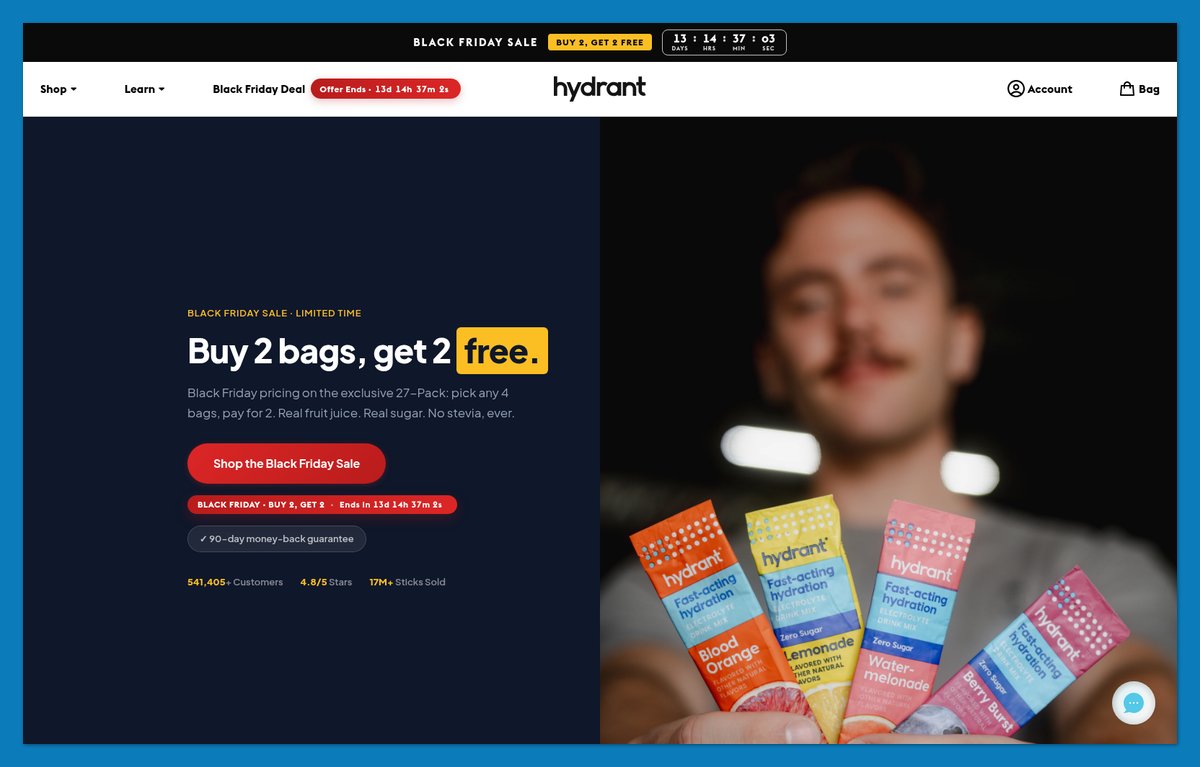
“541,398 customers. Here’s what they say.” That was Hydrant’s own customer-count claim in November 2026, presented as a headline rather than buried in an About page.
Another heading breaks a 120-stick pack into a per-stick price, making the quantity easier to evaluate. “What does ‘science-backed’ actually mean?” invites shoppers to inspect a familiar wellness phrase instead of simply accepting it.
I’d copy the specificity while keeping evidence behind every number. Unlike Olipop’s spec-based collections, Hydrant uses figures to explain value and support credibility within the page. Replace one adjective on your homepage with a number you can prove.
Theme: Custom theme (built on Dawn)
13. Wild One: Bundle the Hero Product Into a Kit
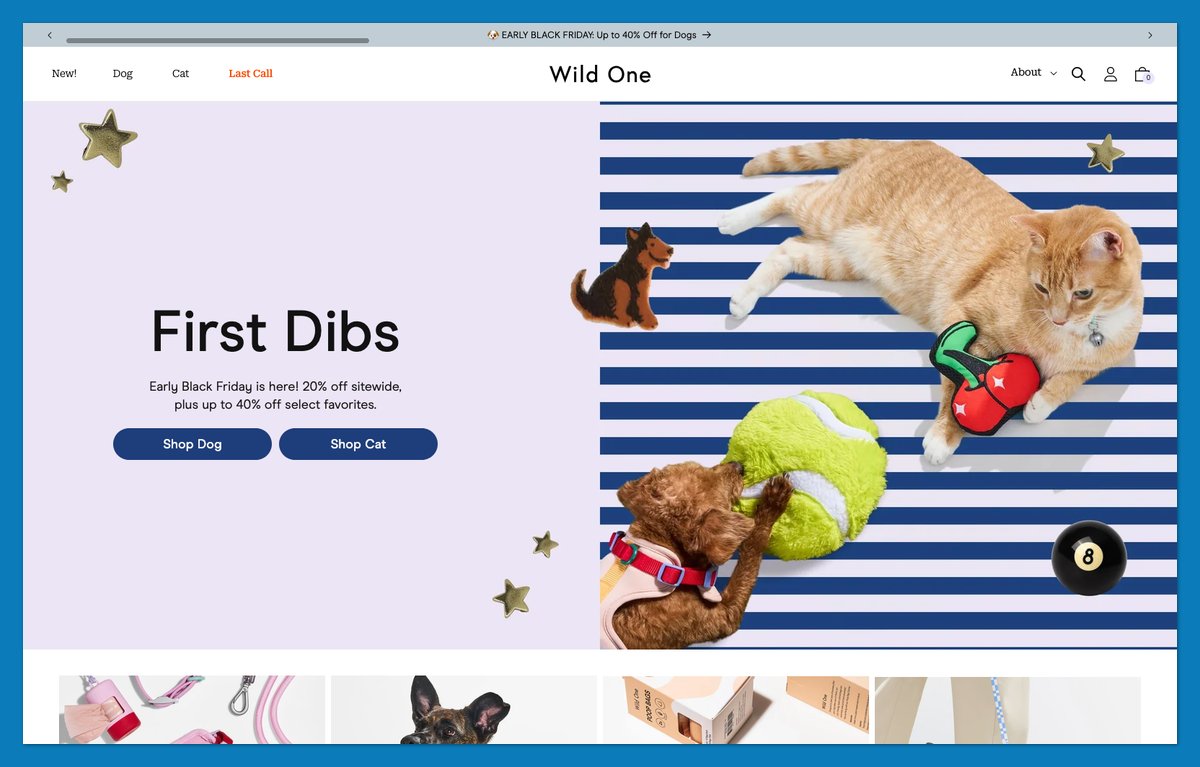
Wild One makes a matching purchase explicit with its “Cushioned Harness + Hands-Free Rope Leash Walk Kit.” Shoppers don’t have to infer which accessories belong together from separate product cards.
The first navigation split is equally practical: Dog or Cat. “Dog Favorites” and “Cat Favorites” continue that separation, while “Most Loved Walk Kits” gives bundles another entry point. A store finder, labeled “Experience Wild One IRL,” serves shoppers who prefer seeing equipment in person.
This is Ugmonk’s starter-kit idea applied to a physical set that needs to work together. Bundle around a recognizable activity, not a collection of unrelated extras.
Theme: Custom theme (built on Dawn)
14. Soylent: Make a Plain Product Feel Credible
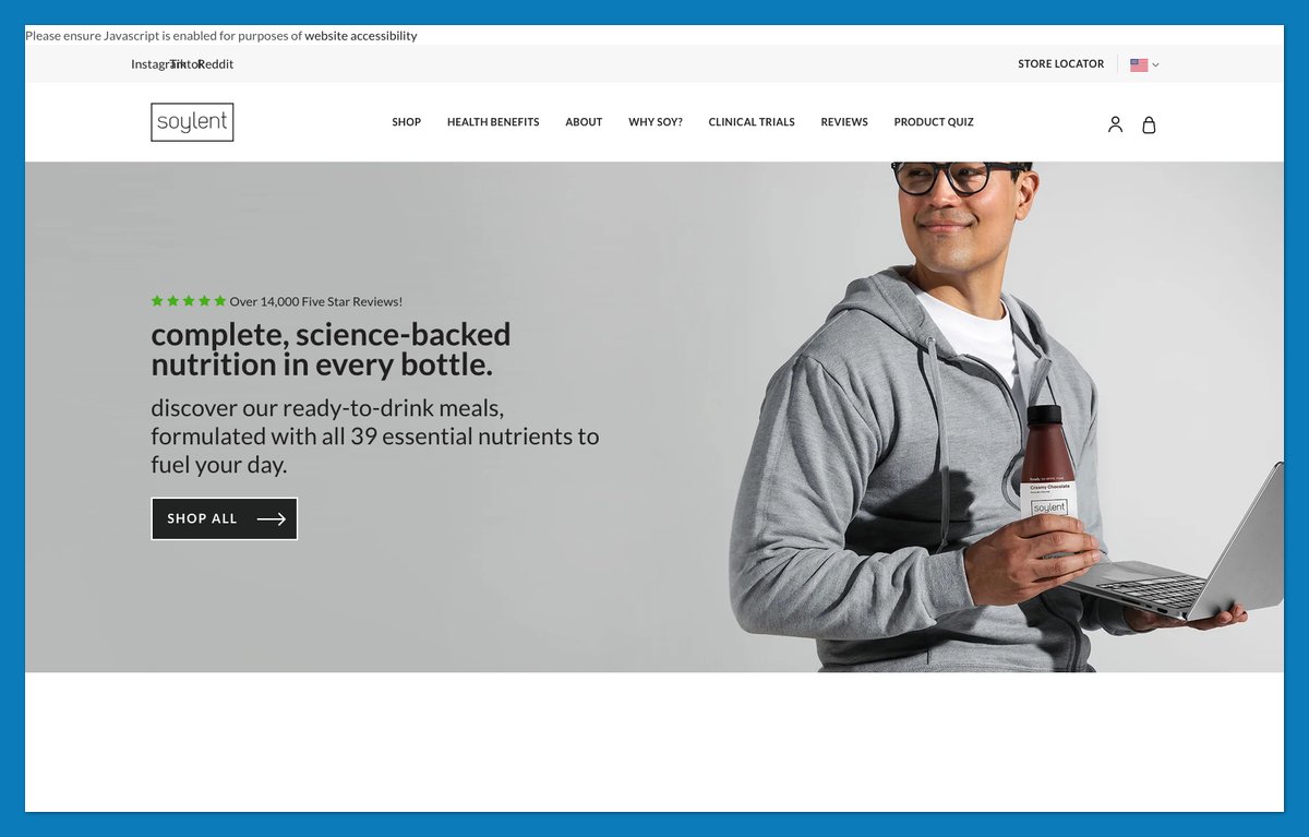
Can a functional product have a voice without hiding the explanation? Soylent pairs lowercase headings such as “technically, delicious.” with a “find your perfect match” product quiz.
The quiz complements clearly named lines, including Complete Meal and Complete Protein. “The science behind Soylent’s ingredients” gives the brand space to explain its formulation. Soylent describes its products as “science-backed”; that remains the brand’s claim, not a conclusion established by the design.
A “Find Soylent near you” locator offers an alternative to ordering online. Copy the structure: help shoppers choose, then make the ingredients explanation easy to find. Don’t borrow claims you cannot substantiate.
Theme: Custom theme
15. Brightland: Put a Trust Strip Right Under the Hero
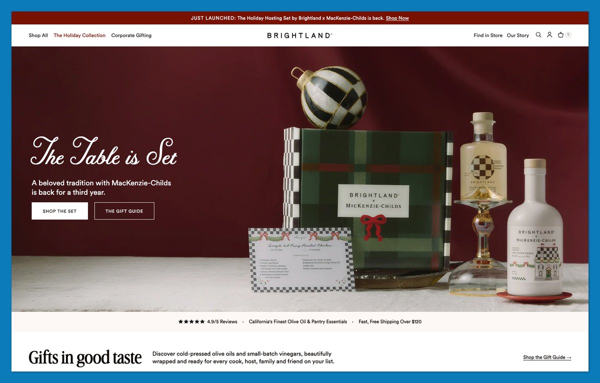
Brightland answers premium-purchase objections in a compact trust strip. It claims “Loved by 600,000+ Customers” and “Ships within 24 Hours,” then adds packaging and California-grown sourcing messages.
Those are Brightland’s claims, displayed in November 2026. Their placement is the lesson: shoppers encounter reasons to consider the price without investigating separate policy pages.
“Gift-ready, no wrapping required!” makes the packaging benefit concrete, while Corporate Gifting gives larger buyers a distinct route. Compared with Hydrant’s numerical headings, Brightland combines proof with practical reassurance about the order itself. List the four objections you hear most and answer each in three words under your hero.
Theme: Custom theme (built on Impact)
16. Cotopaxi: Make the Mission Part of the Merchandising
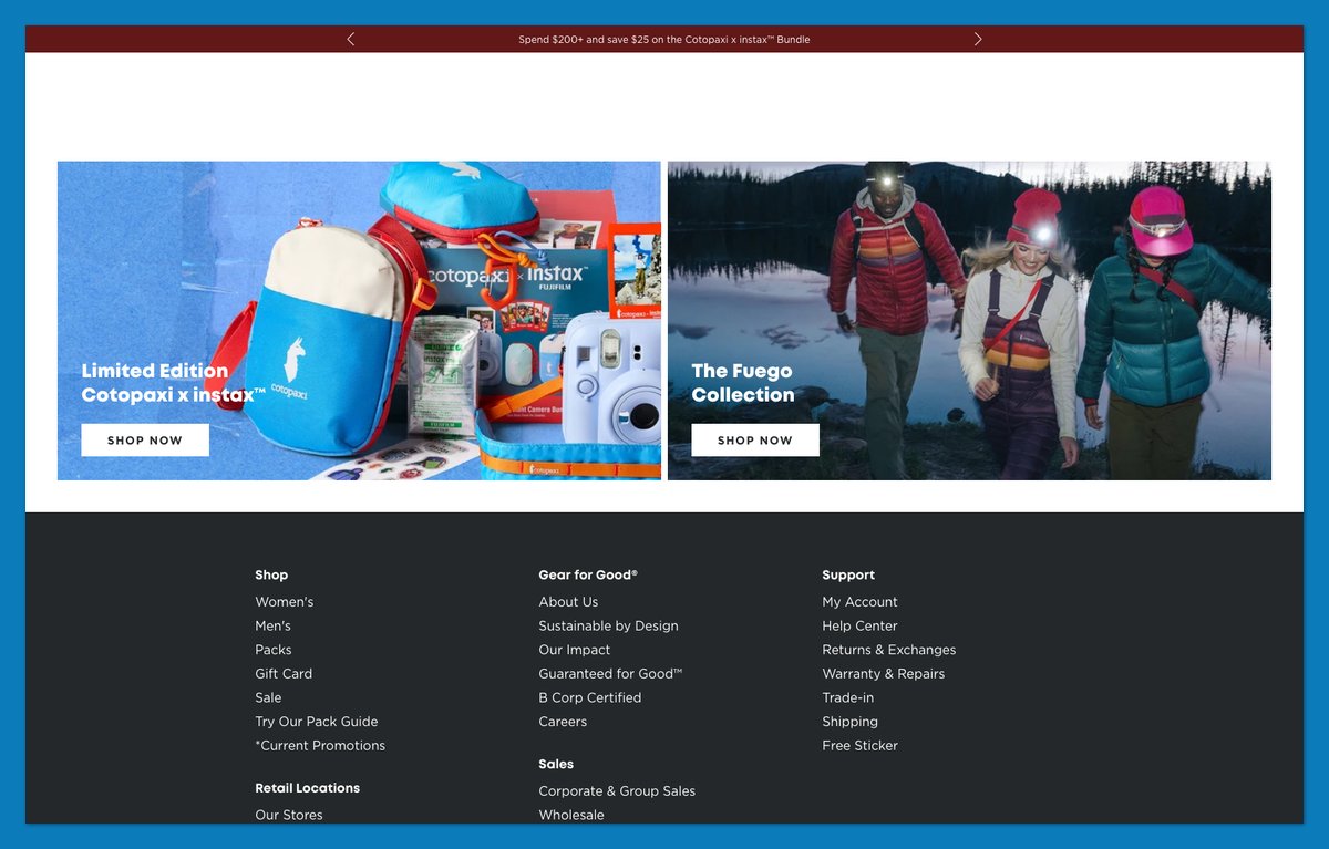
Does your mission have anything tangible behind it? Cotopaxi places its 2025 Foundation Annual Report and 2025 Impact Report on the homepage, alongside the products they contextualize.
“Cotopaxi x ThredUp” links to “Shop Pre-Loved Gear,” turning the mission into another shopping option. “Gear For Good” and “Guaranteed for Good” provide consistent language, but the reports give visitors something more substantial to inspect. A customer-review block and returns portal address immediate purchase concerns.
I’d use this approach only when you have reporting or a functioning program to show. Skip the prominent mission section if you have nothing concrete to publish beyond a statement of intent.
Theme: Custom theme
17. Artifox: Name Products So They Read Like a System
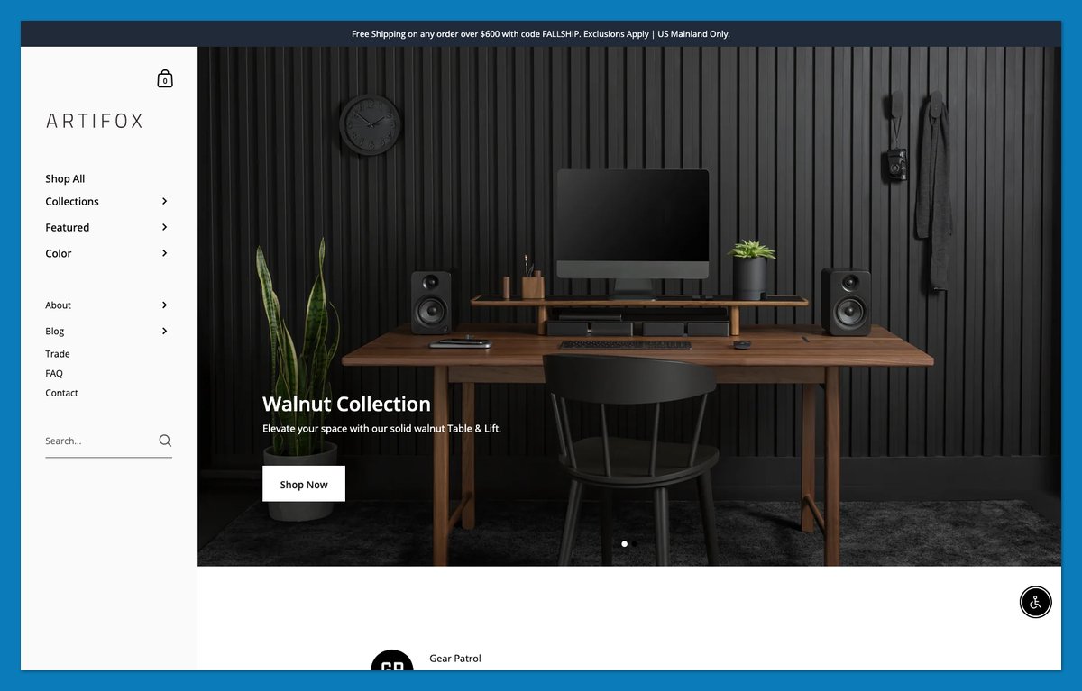
Artifox makes separate furniture pieces read like one setup. Its Walnut Collection uses compact names such as “Desk” and “Lift,” with the shared finish supplying the connection.
“Designed to Work Together” states the premise, while “The Musician’s Set Up” demonstrates it in a recognizable setting. Category tiles still provide access to desks and desktop accessories, so the styled scene doesn’t replace navigation.
Compared with Wild One’s ready-made kits, this introduces complementary products without requiring a bundle. Name products so they sound like parts of one desk setup, then show the full setup in one photo.
Theme: Kingdom (Theme Store)
18. Rachel Comey: Let Named Edits Do the Styling
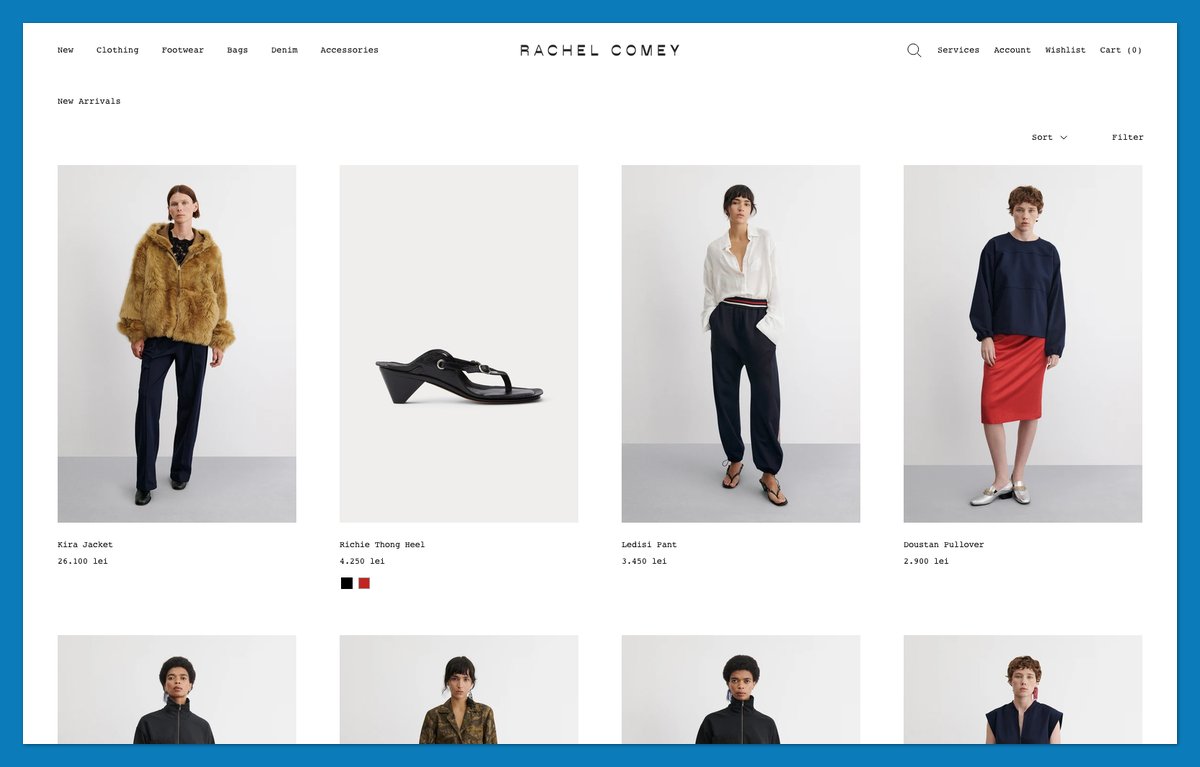
What if your menu helped someone get dressed? Rachel Comey gives shoppers edits such as “9 to 5” and “Soft Focus,” adding an occasion or mood to clothing navigation.
The homepage is almost entirely imagery, with “Shop New Arrivals” providing a direct next step. Courier utility labels distinguish navigation without competing with the photographs. The named edits supply context without requiring long homepage explanations.
Fashion shoppers get an outfit idea before choosing a category. Léo et Violette at number 23 also lets photography lead, but organizes its menu around recognizable bag models rather than styled edits.
Theme: Custom theme (built on Prestige)
19. Vuori: Split the Funnel Early and Name Your Fabric
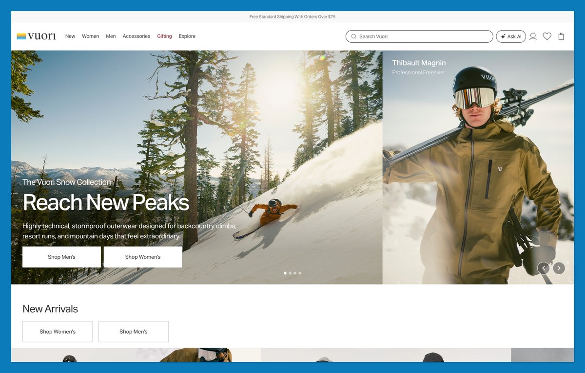
Vuori pairs large editorial imagery with side-by-side “Shop Men’s” and “Shop Women’s” CTAs. You can choose your route without interpreting the campaign photograph.
The “Hello, Halo.” block introduces DreamKnit, which Vuori describes through its softness. Naming the material gives shoppers a term to recognize across products instead of another generic performance-apparel adjective.
The page code indicates Next.js, with Shopify-hosted product media and a myshopify reference. That supports an inferred Shopify connection, not brand confirmation. Borrow the early audience split and signature-material story if they fit your catalog; skip the headless build unless you have developers.
Theme: Headless storefront (Next.js) with Shopify products
20. Our Place: Group a Hero Product by Material
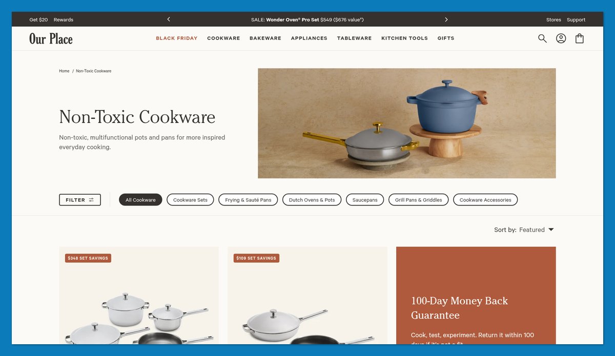
Make variant differences visible before the product page. Our Place separates “Titanium” from “Ceramic Nonstick,” putting material ahead of a generic grid of pans.
Product names carry dimensions, including 10.5-inch and 8.5-inch versions of the Always Pan Pro. That adds a comparison point without requiring shoppers to open every listing. Broader category CTAs serve visitors shopping beyond cookware, while “Shop Gifts Under $50” gives budget-led buyers a separate entrance.
Like Olipop’s fiber-based navigation, this turns a meaningful specification into the collection structure rather than leaving it buried in descriptions. If you sell one product in several materials, make material the first click.
Theme: Custom theme
21. Not Pot: Make the Brand Voice Do the Design Work
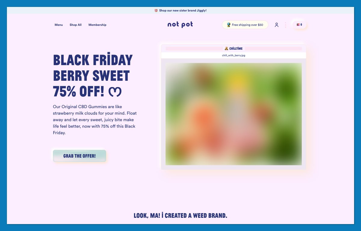
Not Pot calls its newsletter “Not Spam” and its customer section “OUR BEST BUDS.” The jokes make routine interface elements sound like the brand rather than default theme copy.
A Product Matcher supplies practical help beneath that personality. The trust bar displays the brand’s claims about lab testing and THC content, while named testimonial cards add customer context. Playful wording doesn’t exempt a regulated product from substantiating its claims.
I’d start with voice before commissioning custom graphics. Rewrite the generic interface copy, but keep useful guidance and substantiated reassurance alongside it. Personality cannot answer every buying question.
Theme: Custom theme
22. Blume: Shop by Skin Concern, Then Show the Proof
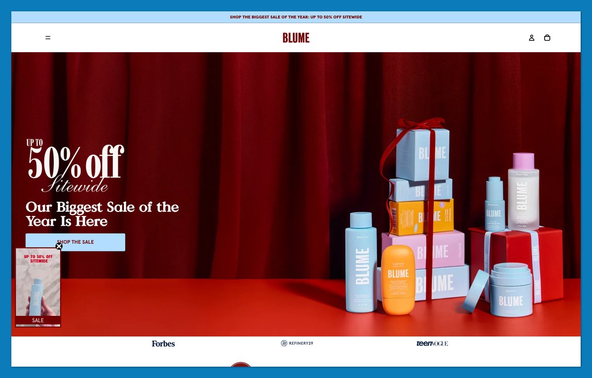
A shopper may recognize sensitive skin before recognizing a product name. Blume makes that concern a navigation shortcut, alongside routes for acne and dark spots.
“SHOP BY SKIN TYPE” repeats the guidance, while bundle names such as Hydration Rescue describe the intended use. A “Before And After” page and a section labeled “Dermatologist Recommended” make the brand’s supporting material easy to find. Their presence isn’t independent verification of results.
The Sill and Caldera + Lab also use Horizon as their base. Blume shows another application: organize beauty products around the question the buyer already has, then link to the brand’s supporting information.
Theme: Horizon (Theme Store)
23. Léo et Violette: Let Photos Lead and Put the Detail in the Menu
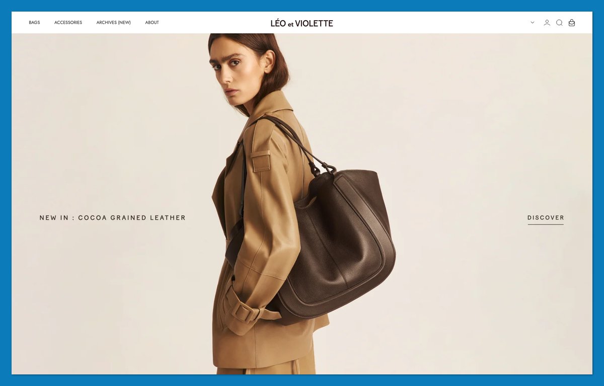
A nearly wordless homepage still needs precise navigation. Léo et Violette supplies model names such as Le Canto and Le Mini Duo rather than expecting visitors to identify every bag from a photograph.
Broader categories, including Crossbody and Business Bags, accommodate shoppers who don’t know those names. Savoir-Faire and Care Instructions give brand and ownership information separate destinations without crowding the homepage.
Compared with Rachel Comey’s mood-led edits, this approach relies on a stable, recognizable lineup. I’d use it for a brand with established models and repeat visitors who know their names; skip model-first navigation if your catalog changes every month.
Theme: Custom theme (built on Prestige)
24. Supergoop: Own the One Category You Sell
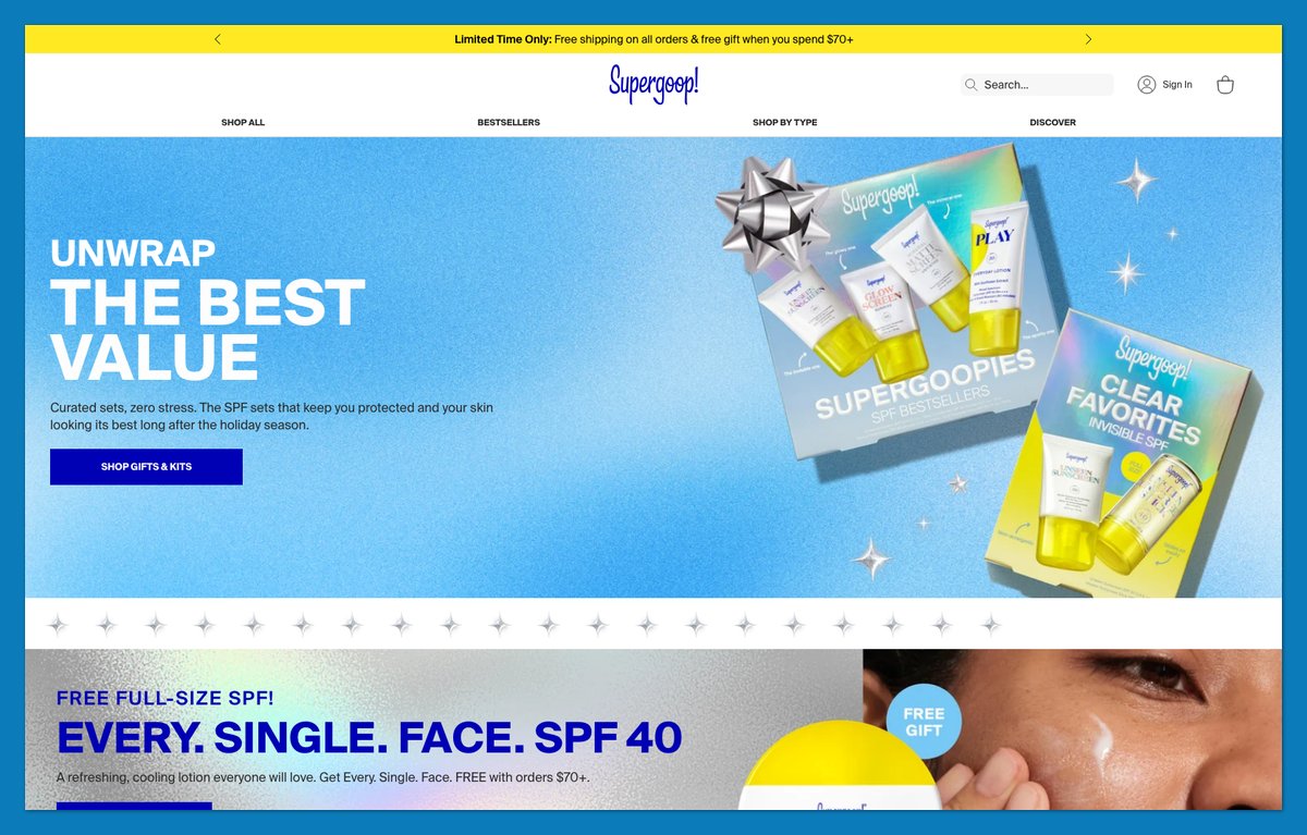
Supergoop makes suncare the organizing idea rather than one department among many. “EVERY. SINGLE. FACE. SPF 40” and “SPF ON REPEAT” give its headings a consistent, punctuated rhythm.
“Shop By Type” supplies the browsing route, while “Did You Know?” adds education within the store. “ONLY AT SUPERGOOP.COM” gives direct shoppers another reason to explore. Suisse Intl typography keeps the short slogans recognizable across those blocks.
The brand describes itself as entirely dedicated to suncare, and its navigation reinforces that positioning rather than copying a broad-catalog layout. If you sell one category, make the category your headline and sort by type.
Theme: Custom theme
25. Golde: Put Recipes Next to the Bestsellers
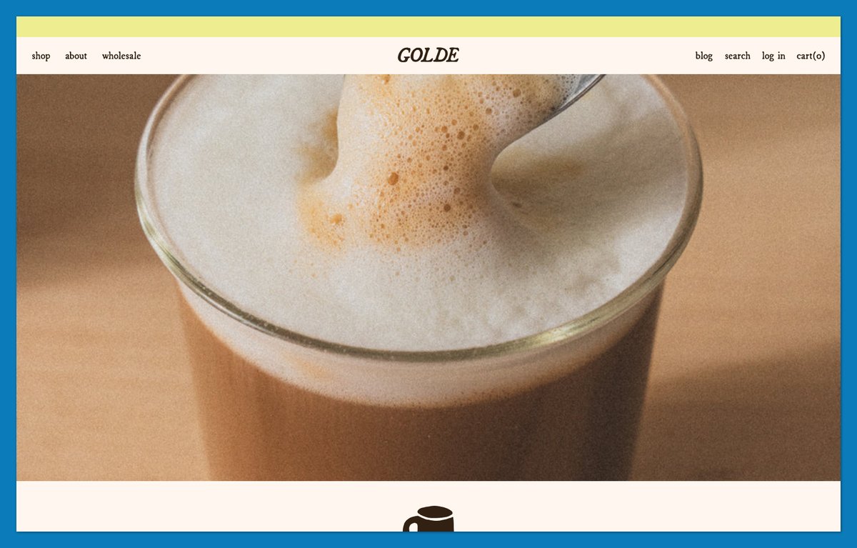
A bag of matcha doesn’t explain what to make tomorrow. Golde supplies that next idea through “The Golden Hour,” a homepage recipe section featuring Matcha Tiramisu and Lemon Turmeric Poppyseed Bites.
Product shortcuts, including Pure Matcha and Superwhisk, keep shopping close to the inspiration. A cookbook extends the content-led approach beyond individual recipes. Visitors don’t have to discover a separate editorial destination after leaving the store.
Fishwife uses recipes to introduce an unfamiliar category; Golde also gives existing buyers reasons to use what they own. Put a useful recipe beside the relevant bestseller before adding another promotional block.
Theme: Custom theme
26. Mahabis: Put the Colorway in the Product Name
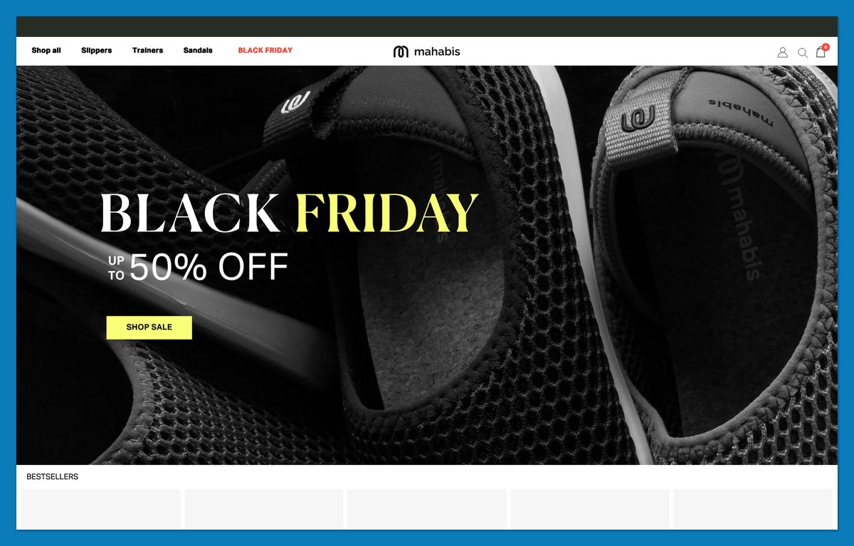
Mahabis labels bestsellers with model-and-color combinations such as “NEO – BLACK” and “MERIBEL – NATURAL.” You can distinguish the listed colorway without opening a product page or relying solely on its photograph.
International shopping details are similarly explicit. A country-and-currency selector covers dozens of markets, while Shipping & Delivery separates information by region. A Canadian shopper doesn’t have to interpret a statement written only for UK customers.
The naming lesson is easy to copy, but regional information deserves equal attention when you sell across borders. If you sell in several countries, put shipping by region one click from the menu.
Theme: Custom theme
27. Fetching Fields: Give Every Product a Story Name
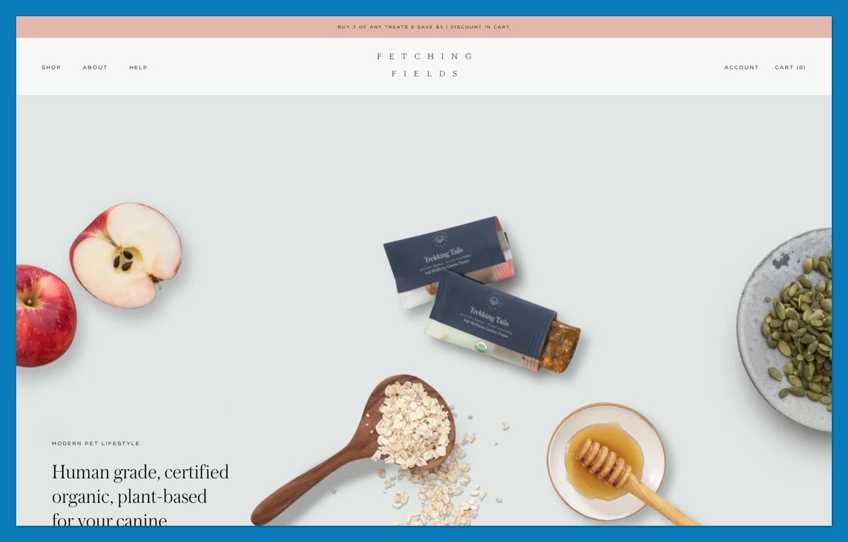
“On Vacay” sounds different from a generic bag of dog treats. Fetching Fields uses that name alongside “Trekking Tails,” giving its small catalog a lifestyle vocabulary.
“Ingredients That Matter” provides a practical counterweight. The brand describes its treats as human-grade, certified organic, and plant-based. Customer quotes and an “As seen” strip add context without turning the homepage into a large editorial site.
The naming works because shoppers have relatively few products to decode. Use this approach for a compact range with clear ingredient explanations, not hundreds of SKUs that need more literal labels.
Theme: Prestige (Theme Store)
28. Areaware: Write Microcopy People Remember
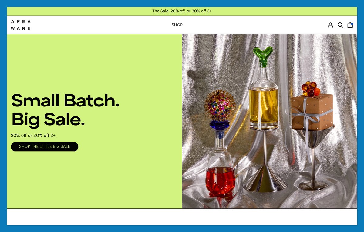
Areaware introduces itself with “Friendly objects for designy people” and labels its cookie banner “Mmm, Cookies.” Interface copy carries the personality, not just the headline.
“Design Story: Cache Box” and “Design Story: Everybody Night Light” give individual objects editorial attention. Compact navigation leaves those stories room to explain why an item belongs in the collection.
You don’t need a custom product finder to borrow this lesson. Replace default wording that makes your store sound interchangeable, while keeping consent choices clear. Rewrite your cookie banner and newsletter box first; they are the cheapest places to sound like yourself.
Theme: Baseline (Theme Store)
29. Counter-Print: Let the Product Covers Be the Interface
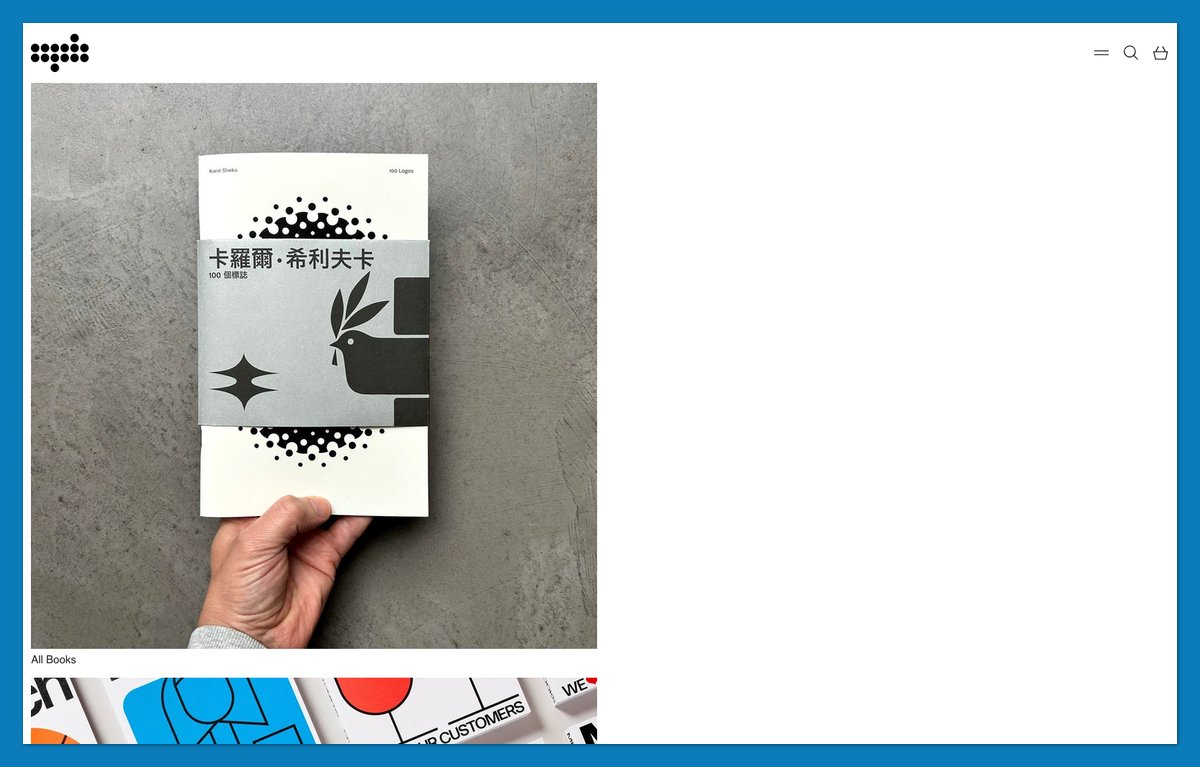
Why compete with artwork that already sells the product? Counter-Print uses a grid-first presentation of book covers, with titles and GBP prices supplying buying information.
Its imprint, “Counterprint Books,” has a main-menu entry beside the broader catalog. Logo Book Set and Typography Book Set offer curated combinations without replacing individual listings. A search overlay gives anyone arriving with a title in mind a direct route to it.
Like Léo et Violette, the store lets imagery do much of the work. Here, the visual asset is the product itself rather than a separate lifestyle photoshoot.
Theme: Exhibit (Theme Store)
30. Jackie Smith: Localize Payments, Shipping and Gifting
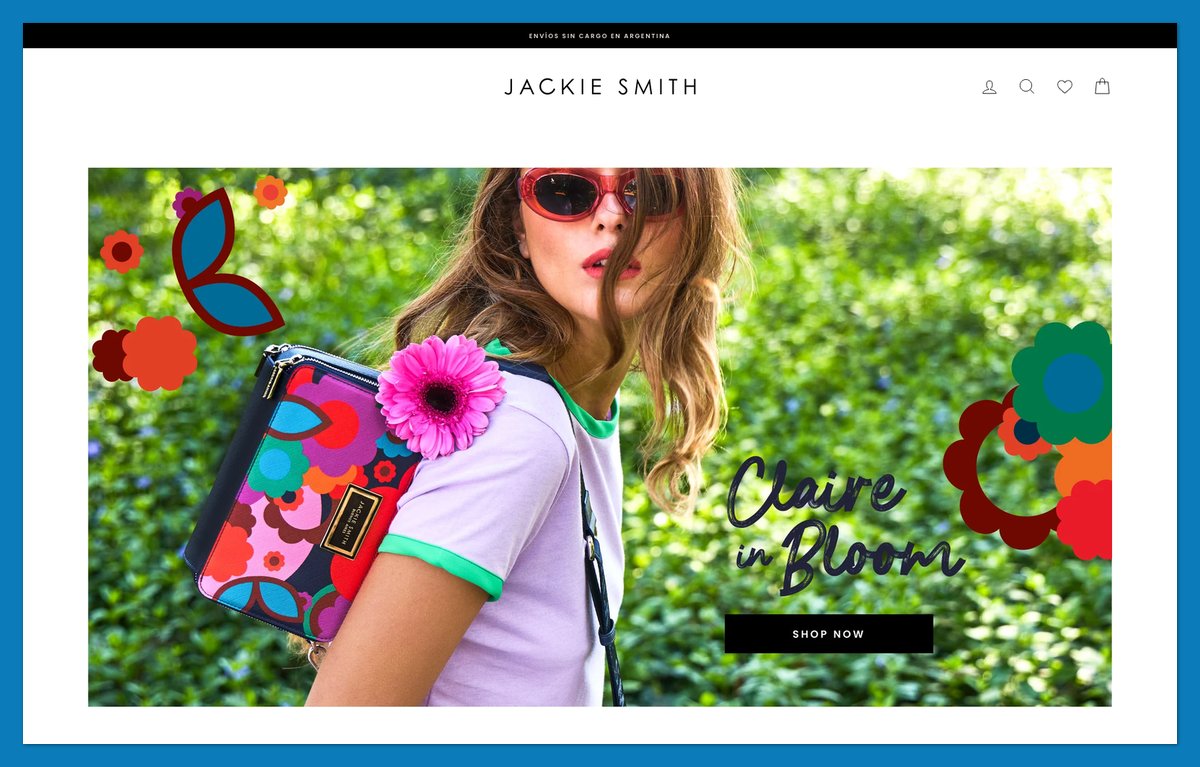
A translated menu isn’t the whole localization job. Jackie Smith pairs a Spanish-first storefront and English toggle with practical information for shoppers in Argentina.
Its announcement messaging states free shipping within Argentina and three or six interest-free installments every day. The cart asks whether you want to write a dedication, making gifting part of the purchase flow rather than an instruction to contact support afterward.
JACKIE CLUB loyalty access adds another recognizable brand feature. But the detail I’d copy first is reassurance about how to pay and receive the order. Sometimes the best design detail is a payment message.
Theme: Impulse (Theme Store)
How to Tell Which Theme a Shopify Store Uses
Check page-source metadata to separate a Theme Store starting point from a custom label.
- Open the source. Visit the store and press Ctrl+U on Windows or Cmd+Option+U in a compatible Mac browser. Alternatively, select View Page Source.
- Search for
Shopify.theme. Readname, the store’s label, andschema_name, where exposed. Hydrant’s label references a campaign, but its schema identifies Dawn; Ugmonk’s identifies Tinker. - Find
theme_store_id. A number can identify a Theme Store theme: Ugmonk’s3627maps to Tinker. A null or missing value can indicate a custom or modified build, but isn’t conclusive. - Try the console. Open browser developer tools and enter
Shopify.theme. A conventional Shopify storefront may expose its metadata here without an HTML search. - Check headless clues. Shopify product images alongside
/_next/files suggest a Next.js connection, as on Vuori and Polaroid. Assets undercdn.shopify.com/oxygen-v2indicate Oxygen hosting, as on Peak Design.
Stores can rename or remove metadata. The “built on” labels in these Shopify website examples are my reading of the code, not brand statements; a customized store won’t necessarily resemble today’s theme demo.
Detector extensions automate these checks but inherit their limitations. For a quick Shopify check, look for cdn.shopify.com or a working /products.json endpoint. Missing metadata alone doesn’t establish a headless build.
What These Shopify Stores Have in Common
Only 48% of leading desktop ecommerce sites and 38% on mobile had decent-or-better product-page UX in Baymard’s March 2026 benchmark. These Shopify website examples illustrate useful patterns, not verified usability scores.
| Pattern | Benchmark | Relevant examples |
|---|---|---|
| Mobile performance | Google’s good CWV thresholds: LCP ≤2.5 seconds, INP ≤200 ms, CLS ≤0.1, at the 75th percentile | Applies to every store here; none were speed-tested for this list |
| Questions answered | 48% desktop, 38% mobile decent-or-better UX; Baymard, March 2026 | Harper Wilde sizing; Parachute inserts |
| Customer reviews | Five reviews associated with 270% higher purchase likelihood than none; Spiegel, 2017 | Artifox and Supergoop review tools |
| Checkout reassurance | 70.22% average abandonment; Baymard, October 2026 | Harper Wilde shipping; Jackie Smith installments |
| Accessibility | EAA applicable since June 28, 2025 | Peak Design’s descriptive alt text |
They Load Fast on Phones
Shopify’s mobile Core Web Vitals pass rate was 76% in HTTP Archive’s 2025 Web Almanac. That’s origin-level data, not a guarantee for your store.
The older Google/Deloitte Milliseconds Make Millions study, published in 2020, associated a 0.1-second improvement across four mobile metrics with 8.4% higher retail conversions and 9.2% higher order value. The improvement covered the shopping journey, not one image. Test your pages against Google’s thresholds after adding apps or imagery.
Their Product Pages Answer Questions
Baymard’s March 2026 research found 42% of test users tried to judge size from images. Harper Wilde’s fit guidance and Parachute’s explanations address that uncertainty.
Reviews need credibility, not perfection. Spiegel Research Center’s 2017 study found purchase likelihood peaked around ratings of 4.0 to 4.7, rather than 5.0. Use customer feedback to clarify suitability and keep product limitations visible.
They Keep Checkout Short
Baymard’s October 2026 research attributes abandonment to extra costs for 40% of non-browsing abandoners; 18% cited forced account creation. Show shipping expectations before checkout and avoid unnecessary account requirements.
The same research reports an average US checkout with 23.48 form elements, compared with an achievable 12 to 14. Shopify handles much of checkout, but your store still controls whether shoppers encounter clear costs or surprises.
They Need to Be Accessible
The European Accessibility Act has applied to consumer ecommerce services since June 28, 2025, potentially including sellers outside the EU. Microenterprise service exemptions may apply below ten staff and with turnover or balance sheet up to €2 million. Confirm with counsel or your national authority.
Audit against WCAG 2.1/2.2 AA:
- Test keyboard access and visible focus.
- Check contrast and descriptive alt text.
- Label forms and test checkout usability.
- Publish an accessibility statement.
How to Get This Look on Shopify
Eight of these Shopify website examples start from free themes. Shopify’s Theme Store listed 24 free themes and over 1,300 paid listings on November 17, 2026.
| Theme | Theme Store price, November 2026 | Stores in this list |
|---|---|---|
| Dawn | Free | Hydrant, Harper Wilde, Parachute, Wild One: customized |
| Horizon | Free | Blume; The Sill and Caldera + Lab: customized |
| Tinker | Free | Ugmonk |
| Prestige | $400 | Fetching Fields; Léo et Violette and Rachel Comey: customized |
| Impact | $400 | Brightland: customized |
| Impulse | $500 | Jackie Smith |
| Kingdom | $280 | Artifox |
| Baseline | $420 | Areaware |
| Exhibit | $360 | Counter-Print |
| Blockshop | $420 | Fishwife |
| Fully custom | Agency or in-house | Supergoop, NYT Store, Soylent, Mahabis, Golde, Not Pot, Rhode, Olipop, Our Place, Cotopaxi |
| Headless | Developer build | Peak Design: Hydrogen/Oxygen; Polaroid and Vuori: Next.js, Shopify connection inferred |
Paid-theme figures are one-time USD prices from the Theme Store on November 17, 2026. Confirm before buying; customization costs extra.
Start With Horizon or Dawn and Use Theme Blocks
Horizon launched on May 21, 2025, with ten presets and rearrangeable theme blocks. BetaKit reported that it replaced Dawn as the default for new stores. Dawn remains available and underpins four examples here.
Let Sidekick Build the Odd Section
Shopify’s December 10, 2025 changelog extended Sidekick AI block generation to every Theme Store theme. Describe a section, such as Parachute-inspired fabric comparisons. Review and revise the result; delete blocks that clash.
When Headless Makes Sense
Choose headless only when developers need capabilities a theme cannot provide. Hydrogen covers Shopify’s Storefront and Customer Account APIs; the conventional theme editor no longer controls your storefront.
Rough vendor budgets, not quotes:
- Freelancer-built premium-theme store: $3,000 to $5,000.
- Agency custom design: $15,000 to $50,000.
Budget separately for subscriptions using EP’s Shopify pricing guide. Start with the theme route unless your requirements justify developer costs.
Shopify Design Trends for 2027
-
AI builds sections, not a finished strategy. Sidekick block generation has supported every Theme Store theme since December 10, 2025, as covered above. Horizon underpins three examples here, but generated sections still need a buying purpose. Describe the question each block must answer, then check its mobile layout.
-
Products appear inside AI assistants. Shopify’s December 2025 Winter ’26 Edition introduced Agentic Storefronts and theme A/B testing. Products can surface through assistants such as ChatGPT. Modern Retail reports that buyers generally finish on merchant storefronts, so accurate product data and clear product pages still matter.
-
Headless development is becoming more flexible. On July 30, 2026, Shopify and Vercel announced a rebuild of Hydrogen as open-source, framework-agnostic tooling. Three examples here use headless storefronts. More framework choices expand your technical options, but they don’t remove the need to budget for developers and ongoing maintenance.
-
Finders supplement conventional menus. Polaroid’s Camera Finder and Caldera + Lab’s skin analysis address uncertainty directly. Soylent’s product quiz offers another example from my November 2026 observations. Start with the decision shoppers struggle to make; don’t commission a quiz simply because another store has one or because your menu feels long.
-
Kits provide a first purchase. Ugmonk’s starter kits and Wild One’s Walk Kits package useful combinations, while Fishwife introduces newcomers through its Starter Pack. These November 2026 Shopify website examples offer an alternative to an undifferentiated bestseller grid: show what a complete starting order looks like, then let experienced buyers choose individual products.
The Bottom Line
The strongest Shopify website examples make buying easier through structure. Parachute explains fabric choices; Polaroid helps select a camera; Ugmonk packages a starting kit. Twenty-seven of the 30 use Shopify themes, and eight start from a free base.
Pick two or three lessons that match your product, then implement one before changing the whole site. Use a finder when choice is difficult, a kit when accessories complete the purchase, or localized payment messaging when customers need reassurance. Check mobile performance and checkout clarity against the benchmarks above before adding another visual flourish. Your product knowledge matters more than reproducing another brand’s layout.
Start a Shopify store, install Horizon or Dawn, and apply one lesson from this list this week.
FAQ
Which Shopify theme do the best stores use?
There’s no official ranking of themes used by the best Shopify stores. In this selection, Dawn is the most common base with four stores, followed by Horizon and Prestige with three each. Ten use custom themes, and three are headless. Choose for your catalog, not a famous store’s appearance.
How can I tell if a website is built on Shopify?
Look for Shopify.theme or cdn.shopify.com in the page source, or check whether /products.json exposes a product catalog. These are clues rather than a complete architecture audit, especially for headless stores. See “How to Tell Which Theme a Shopify Store Uses” above for the procedure and detector limitations.
How much does it cost to build a Shopify store like these?
US Basic pricing is approximately $29 monthly with annual billing or $39 month-to-month; confirm through the Shopify pricing guide. Free themes cost nothing; paid themes here cost $280 to $500 one-time. Rough vendor build budgets are $3,000 to $5,000 for a freelancer-built premium-theme store or $15,000 to $50,000 for agency custom design.
Can AI design my Shopify store?
AI can generate sections, but you still need to review them. Since December 10, 2025, Shopify’s Sidekick has supported prompt-based block generation across every Theme Store theme. Describe the section you need, revise it, and remove anything that clashes. Product accuracy and usable navigation remain your responsibility, not the generator’s.
What is a headless Shopify store?
A headless Shopify store uses a separate front end connected to Shopify commerce services through APIs, rather than a conventional Shopify theme. Peak Design uses Hydrogen on Oxygen. Shopify and Vercel announced a framework-agnostic Hydrogen rebuild on July 30, 2026, expanding developer options without making headless a no-code substitute for themes.
How many businesses use Shopify?
Shopify says millions of businesses in 175+ countries use its platform; it does not publish an exact merchant count. Its November 3, 2026 results reported $119.1 billion in merchant GMV for Q3 2026, up 29% year over year. GMV measures merchandise value sold, not Shopify’s revenue or the number of stores.



Comments 0 Responses