

A handful of stores from the last version of this guide have closed or changed. That’s the problem with collecting ecommerce website design examples: a beautiful screenshot can outlive the business behind it. Useful inspiration shows what you can learn from a store now, not what made it interesting several redesigns ago.
I checked these stores in November 2026, focusing on the choices their storefronts help you make. Each entry explains one design lesson you can apply to your own store, followed by a “Built on” line identifying its platform. The examples range from everyday purchases, such as coffee, to products that need more explanation, such as custom packaging and fragrance.
Of these 30 stores, 22 run on Shopify: 19 use themes and three have separate, headless front ends. The other eight show alternatives for different catalogs and development requirements. Start with stores facing the same buying questions as yours. Then use the design benchmarks after the list to check mobile usability and checkout, where attractive layouts alone won’t solve the problem. The final sections cover AI tools and practical starting points for your build.
Table of contents
- 1. The Sill: Shop by Problem, Not Just by Product
- 2. Two Chimps Coffee: A Quiz and Subscription Builder That Do the Barista's Job
- 3. Graza: Turn Your Packaging Into the Whole Visual System
- 4. Nothing: Run Editorial Campaigns Inside the Store
- 5. Rebecca Atwood: Make Samples and Calculators Part of the Menu
- 6. Packwire: Put a Configurator and an Instant Price on the Homepage
- 7. Great Jones: Show Prices and Personality Right in the Menu
- 8. Recess: A Lowercase Voice and One Loud Brand Color
- 9. Manolo Blahnik: Turn Your Best Sellers Into Named Icons
- 10. Ghia: A Pack Builder and a Gift Flow on One Page
- 11. Via Copenhagen: One Hero Product, Almost No Navigation
- 12. Hungry Tiger: Make the Label Part of the Design
- 13. Blume: Shop by Concern, Then Prove It
- 14. Tracksmith: Sell the Sport, Not Just the Kit
- 15. Bite: Explain an Unfamiliar Product in Three Steps
- 16. Bohemian Traders: Name Collections Like Stories
- 17. Buffy: Publish What's Inside the Product
- 18. Native Union: Rebuild the Menu Around Each New Device
- 19. A.N. Other: Refund the Samples to Remove the Risk
- 20. OWL: A Three-Item Menu and a Founder Story
- 21. The Wolf Gang: Tiered Cart Rewards That Raise Order Value
- 22. Fellow: Teach People to Use What You Sell
- 23. Beatific: Put a Real Phone Number Next to Your Reviews
- 24. Mulberry: Put Repairs and Craft in the Main Menu
- 25. Save Khaki United: Fit Guides for the Products You Sell Most
- 26. Really Well Made: A Plain-Spoken 'Why Buy From Us' List
- 27. Baronfig: A Six-Word Menu and One Headline per Product
- 28. Only/Once: Keep Sold Items Online as an Archive
- 29. The Burren Perfumery: Let the Landscape Tell the Story, and Spell Out Shipping
- 30. Package Free Shop: Three Trust Badges Above the Fold
- What Makes Good Ecommerce Web Design in 2027
- Ecommerce Design Trends for 2027
- How to Get This Look for Your Own Store
- The Bottom Line
- FAQ
1. The Sill: Shop by Problem, Not Just by Product
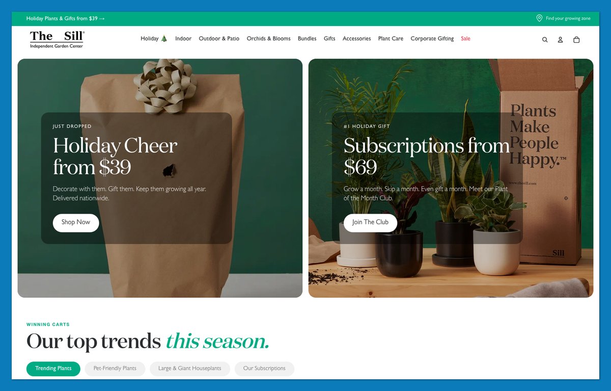
The Sill answers “What will survive in my apartment?” before asking you to choose a plant. When I checked in November, its Indoor menu offered beginner-friendly and low-light options alongside a Pet-Friendly route.
That advice continues beyond navigation. Homepage sections let you shop by size or solution, while “Find Your Growing Zone” gives outdoor shoppers another practical starting point. Virtual plant appointments extend the guidance when a filter isn’t enough.
DM Serif Display headings add character, while Geist keeps supporting information readable. The pairing gives advice and product descriptions a consistent hierarchy without making every line compete for attention.
What to copy:
- Problem-based labels: Name the conditions your product solves.
- A finder tool: Help uncertain shoppers narrow their options.
- A clear type pairing: Give headings personality and body text clarity.
Built on: Shopify (custom theme built on Horizon)
2. Two Chimps Coffee: A Quiz and Subscription Builder That Do the Barista’s Job
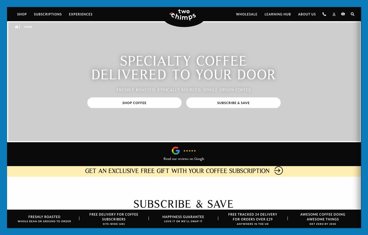
Two Chimps Coffee puts “Not sure what to pick?” beside its Coffee Wizard quiz. That invitation addresses shoppers who need help choosing coffee, not just finding a familiar package.
The subscription builder handles the practical decisions:
- Grind size: Match the coffee to your equipment.
- Amount: Choose how much you need.
- Delivery frequency: Set the replenishment schedule.
Subscribers also get free delivery. Dated Google reviews show when customers shared their experiences, rather than presenting anonymous praise.
Playful names such as “Baba-Laba-Ding-Dong” give the catalog personality, but the selection tools do the harder work. I’d borrow that division: let product names entertain while configuration labels stay literal. Gift-subscription and redemption routes also distinguish the buyer from the recipient.
Steal this: Add a “not sure?” quiz, then connect its answers to a pre-filled subscription configuration.
Built on: WooCommerce (WordPress)
3. Graza: Turn Your Packaging Into the Whole Visual System
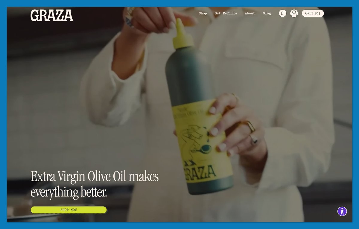
Graza makes olive oil recognizable before you read a product description. Its squeeze bottles sit within a lime-and-cream visual system, with ITC Garamond Condensed adding an editorial feel.
The November storefront paired that presentation with direct product explanations. Drizzle’s “Made for eating, never heating” tells you its job immediately. Frizzle’s “Your new high heat kitchen hero” explains a different use without requiring specialist knowledge.
“Get The Trio” gives shoppers a bundle-first route, while refill cans serve returning customers. I’d copy the continuity between packaging and page, not Graza’s specific shade of green. The one-line product jobs also make the bundle easier to understand: each bottle has a distinct purpose.
What to copy:
- Packaging colors: Carry your existing identity onto the screen.
- One-line jobs: Explain when to use each product.
- A useful bundle: Group complementary products.
Built on: Shopify (custom theme)
4. Nothing: Run Editorial Campaigns Inside the Store
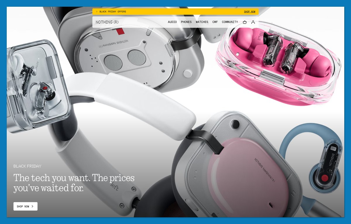
Nothing places editorial content inside the shopping journey rather than confining it to a blog. In the November 2026 UK storefront, I saw artist conversations and a musician-led battery test alongside product films and “Shop by category.”
That gives the electronics cultural context while preserving a route to purchase. The sparse dot-matrix visual language ties the different content formats together.
The block I’d borrow first is “Why buy on nothing.tech.” It presents direct-purchase benefits, including 30-day returns and free delivery. If shoppers can find your products through another retailer, your own store needs to explain why they should buy from you.
Keep those benefits near the products, not only on a separate policy page.
Steal this: Add a “why buy direct” block with concrete benefits rather than a general promise of better service.
Built on: headless Shopify (Hydrogen)
5. Rebecca Atwood: Make Samples and Calculators Part of the Menu
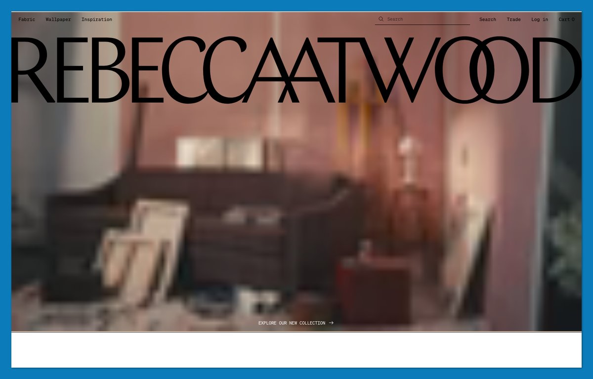
Rebecca Atwood doesn’t expect a fabric photograph to answer every purchasing question. Its navigation surfaces swatch ordering and a wallpaper calculator alongside the products.
The storefront separates Fabric from Wallpaper, with Inspiration providing another route into the collection. “Artful fabrics for a layered life” establishes the mood; sampling and quantity tools help you act on it.
Product cards also show fibre content, including “100% UV Polyester (Post-Consumer).” That gives shoppers something concrete to compare beyond pattern and color.
Unlike The Sill’s beginner guidance, these tools serve someone who knows the desired look but needs to establish suitability and quantity.
What to copy:
- Swatches: Make sampling easy to find.
- Calculators: Help shoppers order the right amount.
- Material details: Put meaningful specifications on cards.
If you sell by the yard, roll or square foot, put those tools in the top menu.
Built on: Shopify (custom theme)
6. Packwire: Put a Configurator and an Instant Price on the Homepage
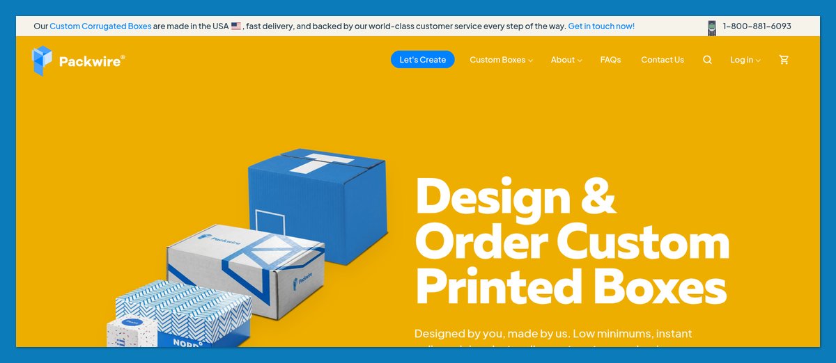
Packwire introduces custom packaging with “Low minimums, instant online pricing,” not an invitation to wait for a quote. Its homepage makes the design-and-order process part of the pitch.
A four-step explanation takes shoppers from choosing a shape through design and purchase to unboxing. A 3D preview lets them inspect their design before ordering, while proof approval supplies another checkpoint.
I’d copy that combination of self-service and reassurance. The configurator supports exploration; production information helps buyers establish whether the service fits their deadline and order size.
What to copy:
- A prominent configurator: Show customization before asking for contact details.
- A practical FAQ accordion: Answer minimum-order and production-time questions beside the ordering explanation, and make pricing easy to understand.
Built on: a custom build (Astro)
7. Great Jones: Show Prices and Personality Right in the Menu
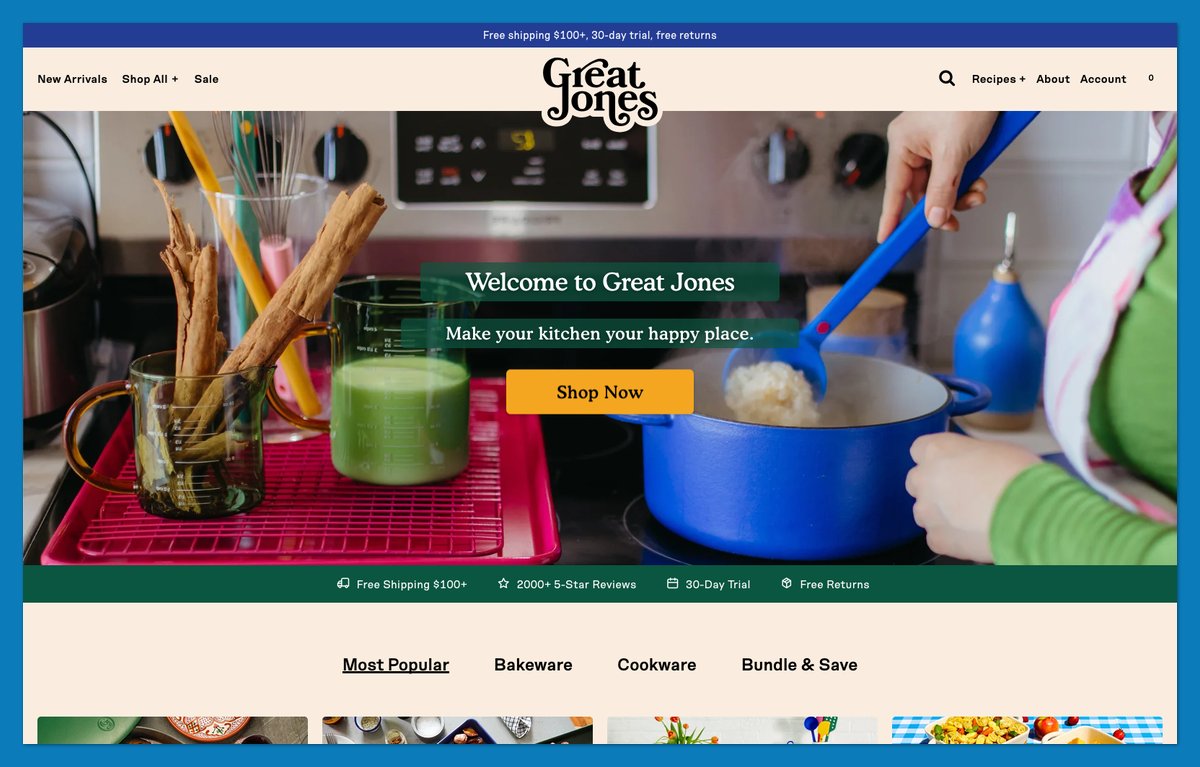
Great Jones puts prices inside its navigation tiles. In November 2026, I could see The Dutchess at $250 and Holy Sheet at $50 without opening their product pages.
The names add personality; the prices let shoppers establish whether an item fits their budget while browsing. Food-inspired color names such as Blueberry reinforce the playful voice.
The header supplies practical reassurance:
- Shipping: Free above $100.
- Trial: 30 days.
- Returns: Free.
Its collaboration with Fellow, featured later in this list, extends that personality into the merchandise. The navigation doesn’t make shoppers choose between useful information and distinctive branding.
Steal this: Put a price and a distinctive product label on menu tiles, then keep your returns promise visible in the header.
Built on: Shopify (custom theme)
8. Recess: A Lowercase Voice and One Loud Brand Color
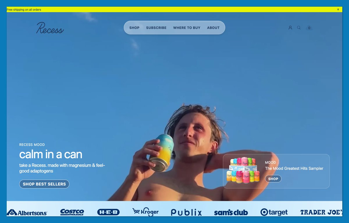
Recess opens with “calm in a can,” maintaining that lowercase voice through labels such as “ways to buy.” Its acid yellow-green announcement bar supplies a strong accent without making every element compete.
The more useful merchandising choice is its emphasis on samplers. A first-time customer can explore the range rather than immediately commit to one flavor.
Subscription and store-locator routes serve different buying preferences. A system font stack avoids requiring downloaded brand fonts for the main text.
What to copy:
- A sampler-first route: Give new customers a manageable introduction to the range.
- One loud accent: Reserve your strongest color for important elements.
Keep the sampler easy to find alongside the route returning customers use to reorder.
Built on: Shopify (custom theme)
9. Manolo Blahnik: Turn Your Best Sellers Into Named Icons
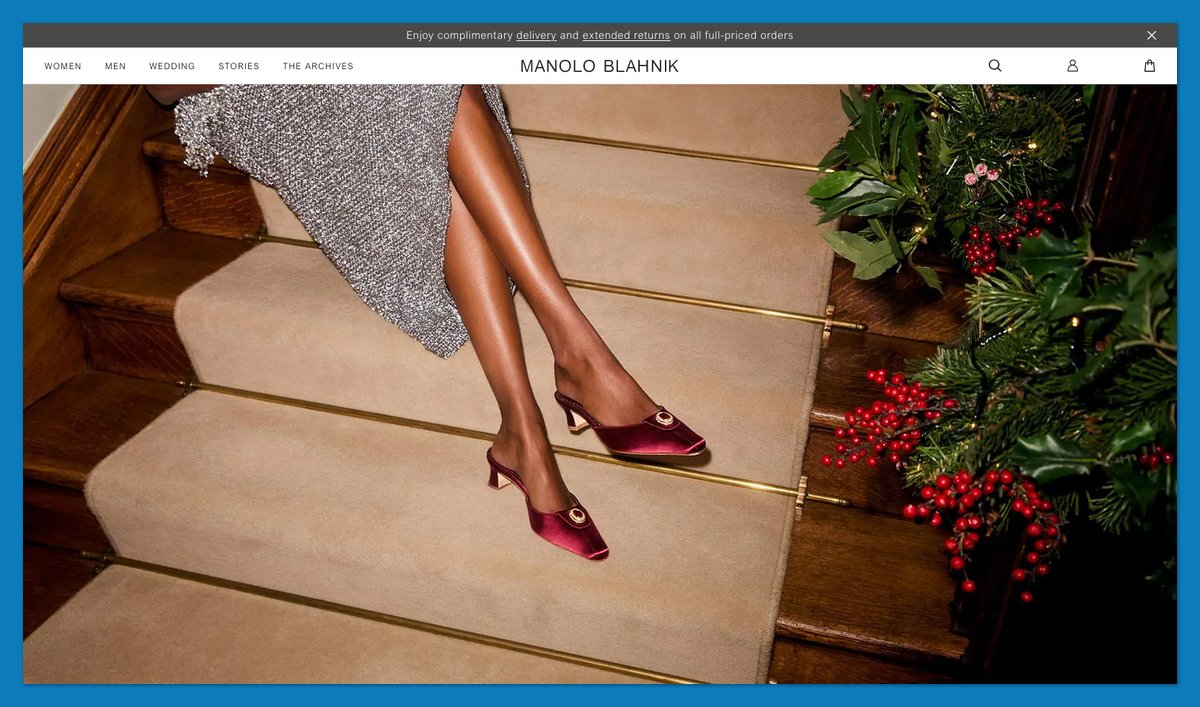
Manolo Blahnik gives established products their own navigation territory. The Classics menu names icons such as Hangisi and BB instead of burying them inside broader shoe categories.
Stories and The Archives add context around that recognition. Shoppers can approach through a familiar design or explore the brand’s history.
The international storefront also makes delivery information visible, with complimentary shipping to more than 70 destinations and a region/currency selector.
Compare this with Mulberry at number 24: Manolo Blahnik foregrounds recognizable classics, while Mulberry gives repair and care prominent space. Both use navigation to communicate more than product categories.
Steal this: Give enduring best sellers permanent, named menu entries so returning customers don’t have to rediscover them inside changing collections.
Built on: Magento (Adobe Commerce)
10. Ghia: A Pack Builder and a Gift Flow on One Page
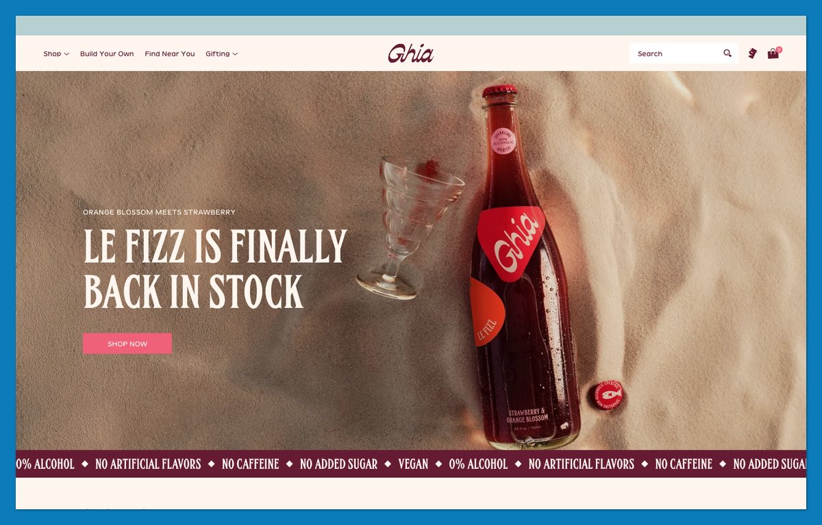
Ghia separates replenishment from gifting. Its build-your-own Le Spritz pack lets shoppers assemble 16 cans, with a “set them on repeat” subscription option.
The gift route uses a different sequence: “Pick a bottle, write the note, choose the day.” It recognizes that gift buyers need control over the recipient’s experience, not just product selection.
Display fonts give the store an editorial character, while product copy stays concrete. “17 pours in every bottle” translates bottle size into an understandable serving quantity.
Recess lowers first-order commitment with samplers; Ghia adds control over the contents and occasion.
Steal this: Create a gift path that lets buyers write a note and choose the delivery day before completing the order.
Built on: Shopify (customised Dawn theme)
11. Via Copenhagen: One Hero Product, Almost No Navigation
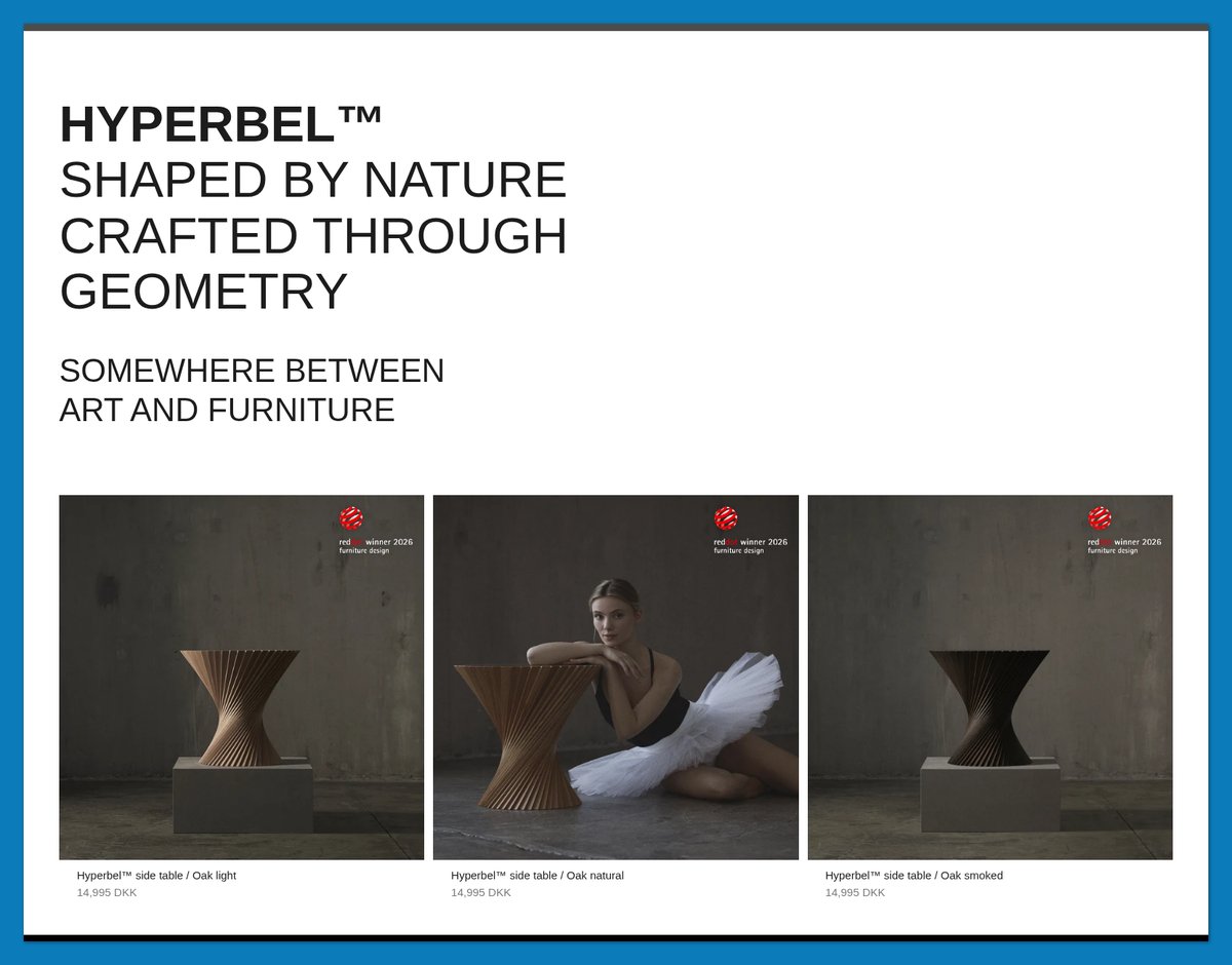
Via Copenhagen gives its Hyperbel side table almost the entire stage. The header has a centered logo and a Cart link, rather than a menu designed for a large furniture catalog.
The product story connects nature with geometry, describing the table as “somewhere between art and furniture.” Customer Instagram images place that sculptural object in lived-in settings.
Reassurance stays concrete: European shipping includes customs and duties, and orders ship within five days.
The spare header works because the remaining space explains both the product and the purchase.
Steal this: If you sell one product, remove unnecessary navigation and use that space for its story and delivery reassurance. Keep essential support and policy information accessible.
Built on: Shopify (Stretch theme)
12. Hungry Tiger: Make the Label Part of the Design
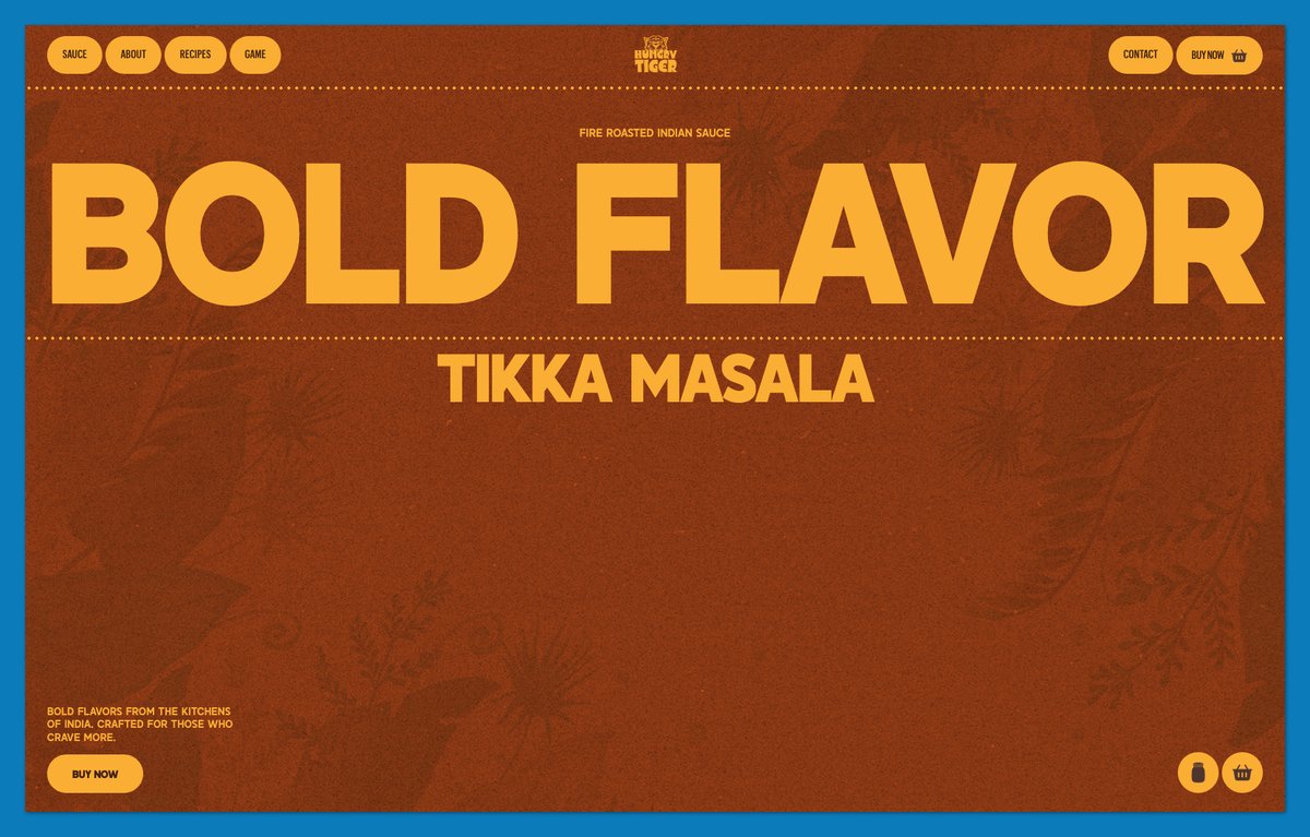
Hungry Tiger brings the jar’s information onto the page. Its “what’s inside” section and inline nutrition panel make ingredients readable without requiring shoppers to inspect a packaging photograph.
The lowercase “bold flavor” headline establishes the voice. “Let’s get cooking” connects the sauce to meals, with recipe cards including Easy Chicken Tandoori and Paneer Tikka Masala.
That pairing answers two buying questions: what’s in the product, and what can you make with it? An unfamiliar food product needs both explanations before checkout.
What to copy:
- Designed ingredient information: Make the label readable as page content.
- Product-linked recipes: Give shoppers a specific meal to imagine making.
Keep those details close to the sauce they describe.
Built on: Webflow (Webflow Ecommerce)
13. Blume: Shop by Concern, Then Prove It
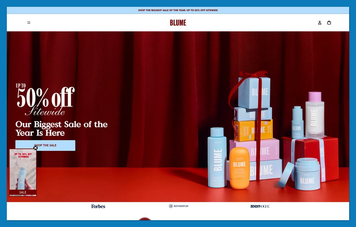
Blume now centers its storefront on skincare for acne-prone and sensitive skin. “Shop by Concern” gives shoppers a problem-based route, with Acne and Dark Spots among the options.
A Before And After entry adds an evidence-oriented path. The storefront also presents a “Dermatologist Recommended” block and retailer certification claims rather than relying solely on product descriptions.
This resembles The Sill’s navigation, but skincare needs a different supporting layer. A concern label identifies a candidate product; relevant evidence helps shoppers evaluate its claims.
I’d keep those functions together instead of sending all supporting information to an About page.
Steal this: Pair concern-based navigation with attributed, product-relevant proof. Don’t treat a retailer badge as evidence for every possible skincare outcome.
Built on: Shopify (Horizon theme)
14. Tracksmith: Sell the Sport, Not Just the Kit
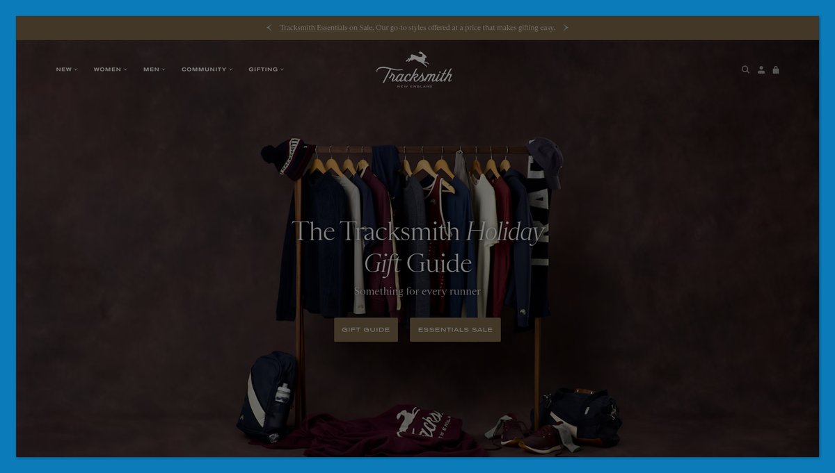
Tracksmith gives newcomers a “Start Here” entry point and runners a reason to stay beyond the product grid. The Journal includes films and stories about the sport.
Hare A.C. provides a community connection, while The Tracksmith Foundation focuses on youth track and field. Those elements support the heritage track styling with more than photography.
The detail I’d borrow is the “100 Mile Guarantee on All Footwear.” It describes reassurance in terms of product use rather than only calendar days, directly addressing how shoes feel while running.
Steal this: Use a product-relevant guarantee with clear eligibility and claim terms. Calculate what your business can support before promising a distance or usage allowance to customers.
Built on: Shopify with an Astro front end
15. Bite: Explain an Unfamiliar Product in Three Steps
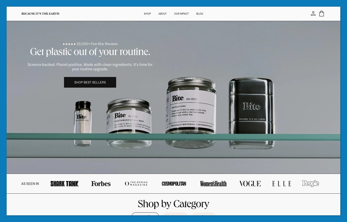
Bite doesn’t assume shoppers know how toothpaste tablets work. “How to Use Toothpaste Bits” turns an unfamiliar format into a sequence someone can understand before buying.
“Build Your Starter Kit” provides the next step. The message “Buy once, refill forever” explains the longer-term purchase pattern without making the first order entirely about a subscription.
Product cards present a one-time alternative alongside the subscription option. Preserve that distinction when your product requires both a behavior change and a new buying commitment.
What to copy:
- A numbered how-to strip: Explain product use on the homepage.
- A starter kit: Give beginners a clear first purchase.
Teach the unfamiliar action before asking shoppers to choose their replenishment schedule.
Built on: Shopify (custom theme)
16. Bohemian Traders: Name Collections Like Stories
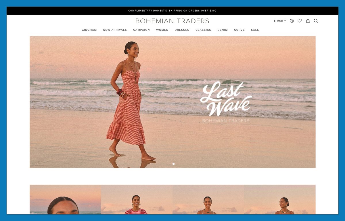
Bohemian Traders gives its navigation a vocabulary beyond clothing categories. Named collections such as Tidebound and Poetica sit alongside print stories, including Paisley Palace.
That creates a route for shoppers who remember a pattern rather than a product name. Silhouette filters and a Curve section preserve practical browsing, with sizes spanning 2XS to 4XL.
I’d copy the layering, not replace descriptive labels with poetic ones. A print name encourages exploration; a length filter answers a specific requirement.
The BigCommerce build also shows that distinctive fashion merchandising isn’t limited to Shopify.
Steal this: If you design your own prints, name them and let shoppers browse by print. Retain clear size and garment-type routes for customers shopping to a requirement.
Built on: BigCommerce
17. Buffy: Publish What’s Inside the Product
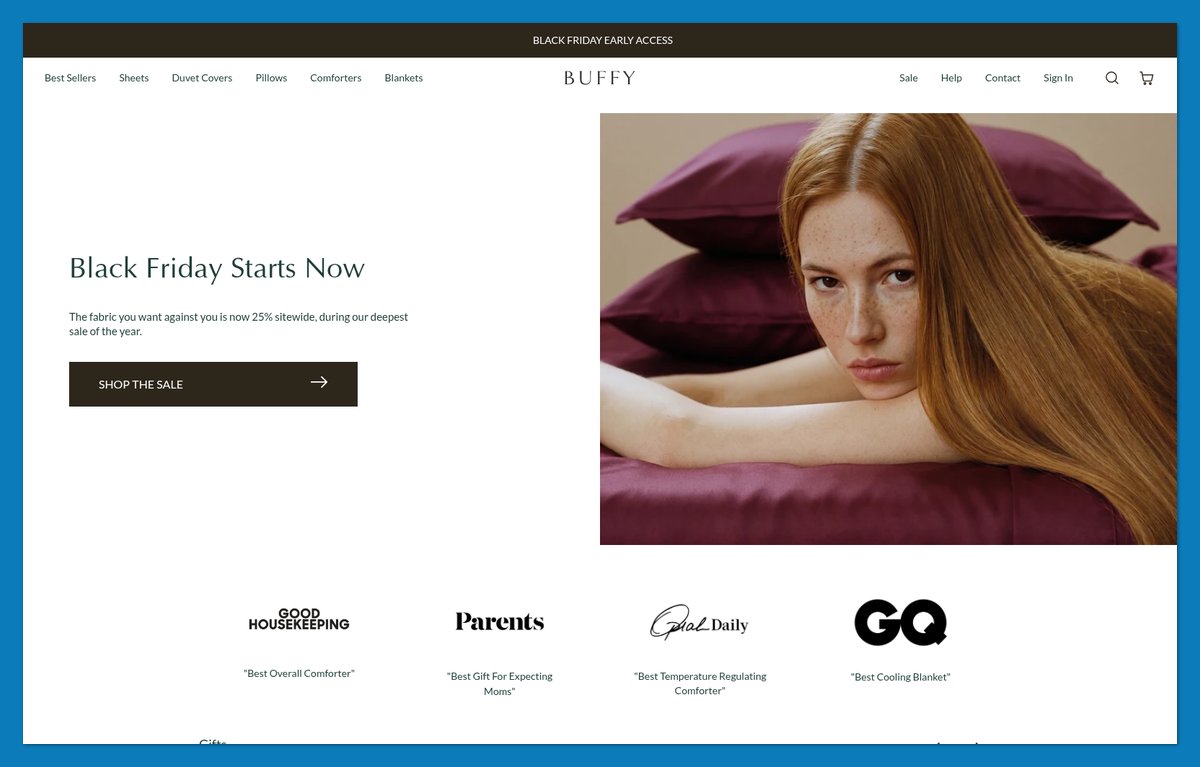
Buffy describes itself as “a house of botanic textiles” and claims “Every yarn tested, certified, and published.” Material information takes a larger role than a generic sustainability paragraph.
The navigation also starts with sleep problems, including Heat and Perspiration and Side Sleeping. It connects a shopper’s concern to the catalog, much as Blume does for skincare.
An OEKO-TEX Class 1 callout supplies a named standard shoppers can investigate. “Method” and “A weaver’s yarn” extend the focus on how the textiles are made.
I’d borrow that emphasis on inspectable information rather than add another broad environmental slogan.
Steal this: Link material claims to supporting documentation. Specify which product or component each certificate covers instead of using one badge to represent the whole range.
Built on: Shopify (custom theme on a Dawn base)
18. Native Union: Rebuild the Menu Around Each New Device
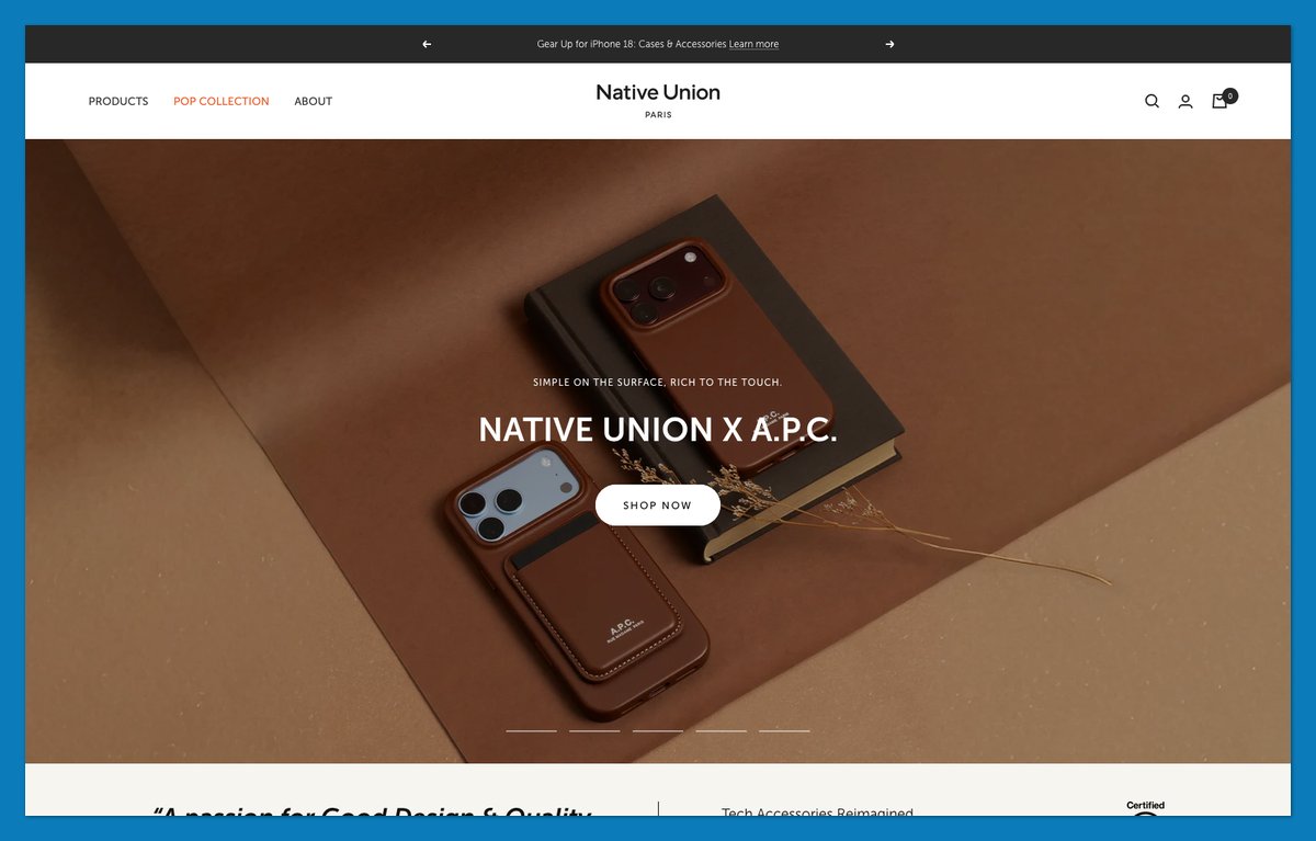
Native Union organizes accessories around compatibility as well as product type. Device-specific navigation gives shoppers a more direct starting point than browsing every case.
Collection tiles retain broader routes, while the A.P.C. leather collaboration adds a fashion-oriented entry point. Compatibility and personal style serve different buying needs.
The review presentation is specific, too. In November, the storefront displayed a Yotpo average of 4.7 out of 5 across 12,589 reviews.
What to copy:
- Device-led navigation: Add supported devices when compatible products become available.
- Rating plus review count: Show how much feedback supports the average.
Keep compatibility information consistent between menu labels and product pages. A shortcut should take shoppers to suitable products, not another round of checking.
Built on: Shopify (Focal theme)

19. A.N. Other: Refund the Samples to Remove the Risk
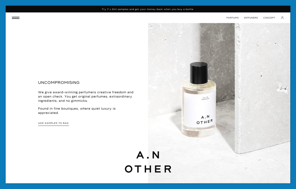
A.N. Other addresses the obstacle to buying fragrance online: you can’t smell the page. Its discovery offer presents seven 2ml samples, with the purchase credited when you buy a bottle.
That makes sampling a step toward the full-size order rather than a separate expense. Keep the credit conditions visible if you adopt this model.
The brand also credits perfumers by name, including Rodrigo Flores-Roux. Its compact menu gives their work a dedicated Perfumers entry.
Rebecca Atwood uses samples to establish material suitability; A.N. Other connects sampling directly to the next order.
Steal this: Credit the sample price against a first full-size purchase, with straightforward redemption instructions. Explain any restrictions before the customer orders the samples.
Built on: headless Shopify (Next.js front end)
20. OWL: A Three-Item Menu and a Founder Story
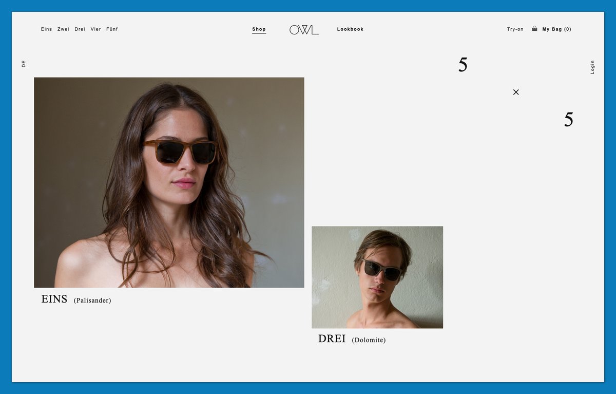
OWL opens with “Nicely Crafted Glasses” over a full-width video. Shop and Lookbook flank the OWL wordmark, with Try-on and My Bag as supporting links.
The founder story asks why people have a hallway full of shoes but only one pair of glasses. It introduces three friends from Berlin and Hamburg and an honest-price proposition.
“Handcrafted from acetate” supplies a concrete product detail, while the try-on route addresses a practical concern for eyewear buyers. The minimal layout still makes room for product information and purchasing help.
Steal this: If your range fits on one page, reduce the main navigation and explain why the brand exists. Keep try-on or sizing help easy to reach.
Built on: a custom Ruby on Rails build
21. The Wolf Gang: Tiered Cart Rewards That Raise Order Value
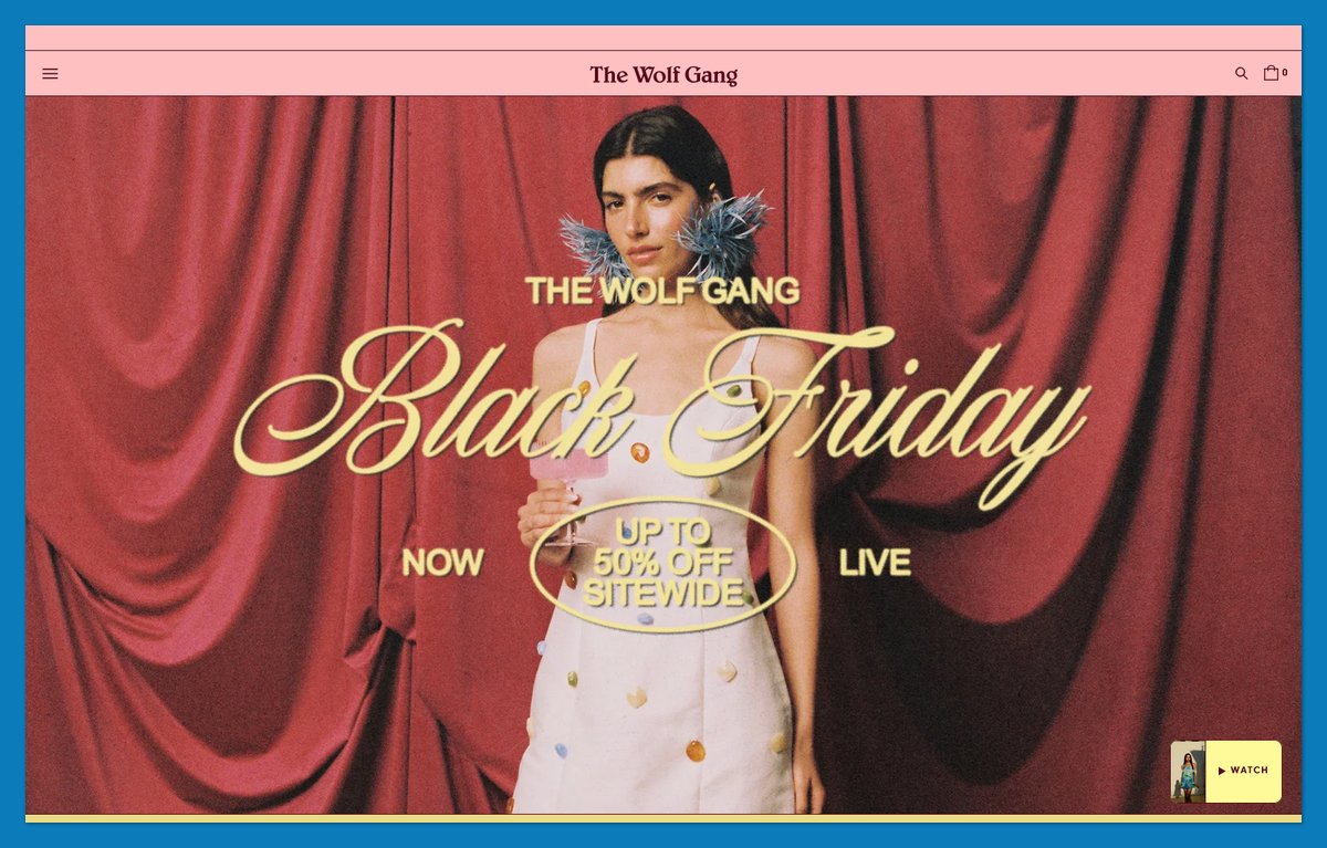
The Wolf Gang showed a two-stage cart reward pattern when I checked in November: a free-shipping milestone followed by a higher free-gift milestone. Copy the visible progression, not the particular offer.
A Size Guide sits in the main menu, providing help before checkout. The Judge.me review carousel adds customer feedback around the print-led fashion presentation.
Measure the cart pattern’s effect rather than assuming a larger basket means a more profitable order. Every incentive has a cost.
What to copy:
- A two-tier cart bar: Explain the next benefit and its conditions.
- Top-level sizing help: Make the fit guide visible before someone adds a dress.
Keep incentives secondary to checkout, and let shoppers proceed without adding more products.
Built on: Shopify (customised Dawn theme)
22. Fellow: Teach People to Use What You Sell
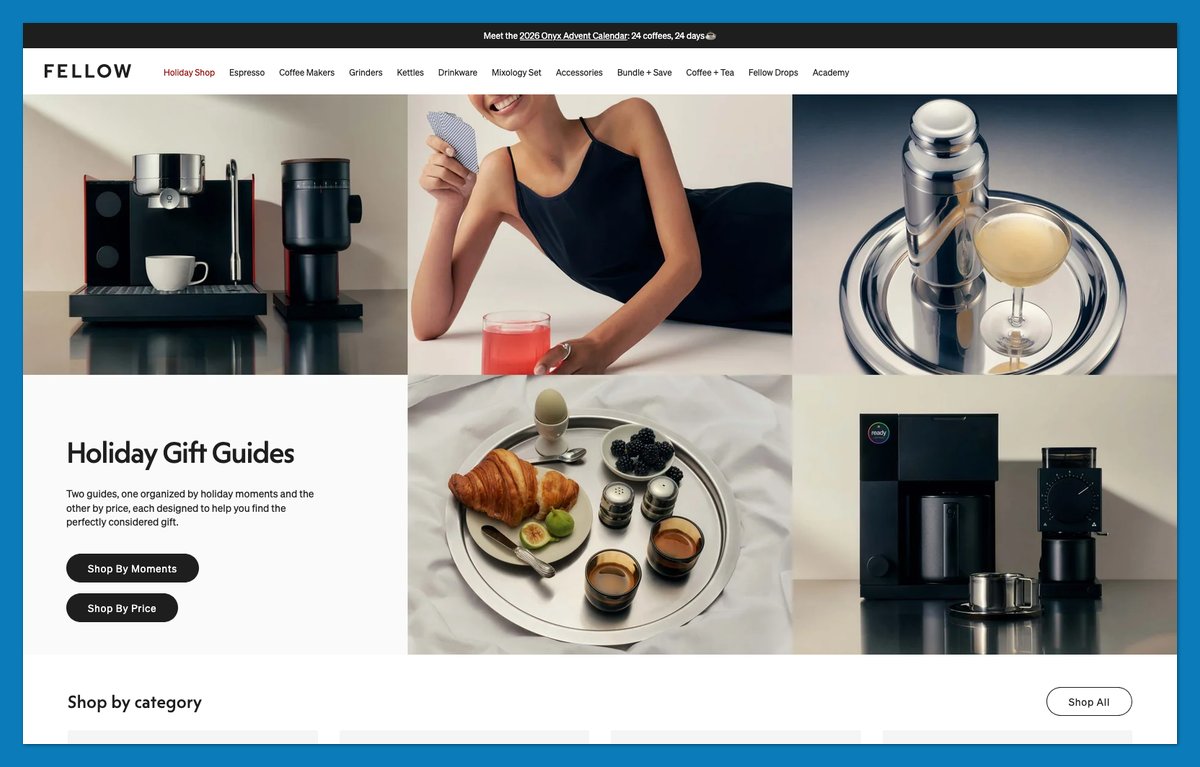
Fellow pairs “Espresso, evolved” with support for the equipment’s owner. An Espresso 101 Class provides education, while machine registration continues the relationship after purchase.
The store connects equipment with coffee through Fellow Drops and its text-based coffee program. That creates a repeat interaction beyond the initial hardware order.
A neutral palette keeps the equipment prominent, with muted blue and rust accents.
Two Chimps helps shoppers choose coffee; Fellow helps them use the equipment they’re buying. I’d make that support visible before checkout, when customers are deciding whether they can get good results at home.
Steal this: Link a setup guide or introductory class from each relevant hardware product page so shoppers can evaluate the support before committing.
Built on: Shopify (custom theme)
23. Beatific: Put a Real Phone Number Next to Your Reviews
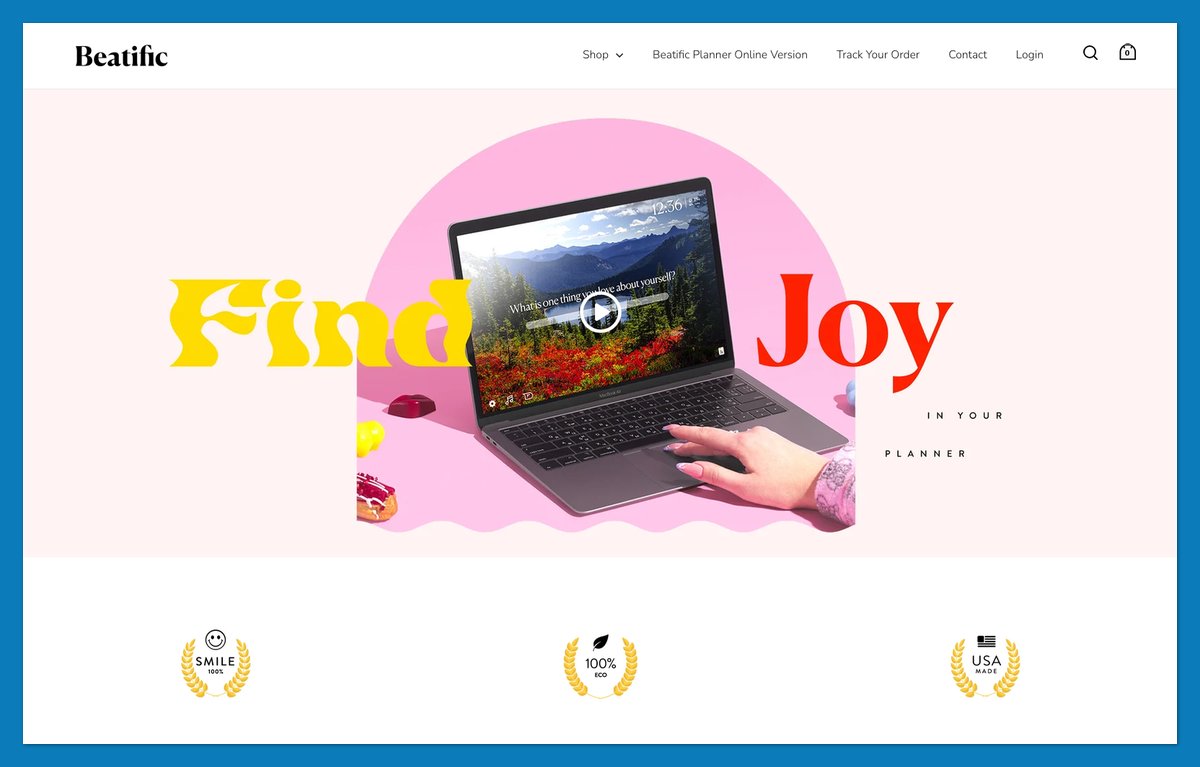
Beatific places an invitation to text or call beside its review proof. In November, the announcement bar paired that contact route with a claim of more than 11,393 five-star reviews.
The combination answers two questions: have other customers bought successfully, and can I reach someone for help?
A “How it Works” section supports planner shopping, while “Buy One Plant One” explains the tree-planting commitment. Shippori Mincho headings and a light Nunito body create a consistent hierarchy.
What to copy:
- Contact beside proof: Put a monitored support route beside customer feedback.
- A usage explanation: Show how the planner or journal fits someone’s routine.
Choose a contact channel your team can reliably maintain as order volume grows.
Built on: Shopify (Split theme by Out of the Sandbox)
24. Mulberry: Put Repairs and Craft in the Main Menu
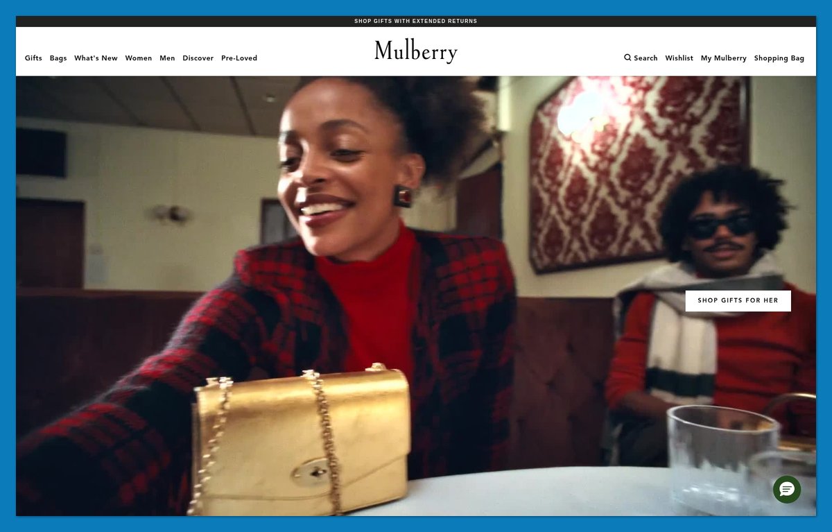
Mulberry gives repair and care services space alongside its bags. The Discover menu includes Craftsmanship and Repairs, making longevity part of the shopping structure rather than a footer claim.
In-store care appointments and leather-care information extend that approach. They explain what ownership can look like after the first delivery.
The menu also provides shortcuts to recognizable designs, including Bayswater and Alexa. Unlike Manolo Blahnik’s emphasis on named classics, the lesson here is how prominently service supports premium positioning.
Repairable furniture and equipment can use the same approach. Show customers the support available beyond the initial purchase.
Steal this: If you sell durable goods, list repair and care as menu items, not merely FAQ answers. Explain how customers access those services.
Built on: a custom enterprise build
25. Save Khaki United: Fit Guides for the Products You Sell Most
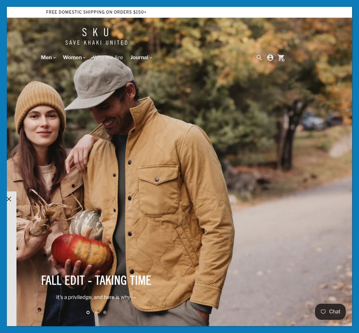
Save Khaki United puts fit guidance where shoppers can find it before choosing a product. Its Chino Guide compares Original with Easy and Weekend fits; dedicated tee and shorts guides also appear in the menu.
“WE KNOW CHINOS” has practical content behind it. Shoppers don’t have to infer every fit difference from separate product photographs.
The restrained black-and-white presentation supports that focus. “Love What You Do” features add context through makers such as Farmhouse Pottery without replacing buying information.
Like Rebecca Atwood, Save Khaki surfaces guidance tied directly to its core purchase.
Steal this: Create one fit-comparison page for each major staple. Link it from the main menu and relevant product pages so customers can compare before selecting a size.
Built on: Shopify (Context theme)
26. Really Well Made: A Plain-Spoken ‘Why Buy From Us’ List
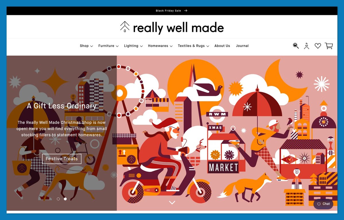
Really Well Made introduces itself as an independent London retailer, then gives that identity substance through “10 Things you’ll love about us.”
The “Welcome to Peckham” showroom block adds a physical place to the business. Next-day delivery for warehouse stock supplies another concrete reason to choose this retailer.
Shoppers can browse by brand or designer, but those routes alone wouldn’t explain why to buy here rather than from another stockist.
Great Jones answers the same question as an own-brand seller with its trial-and-returns promise. Really Well Made must distinguish the retailer as well as the merchandise.
Steal this: Write a “why buy from us” list using services you actually provide. Place it where shoppers encounter the catalog.
Built on: Shopify (customised Dawn theme)
27. Baronfig: A Six-Word Menu and One Headline per Product
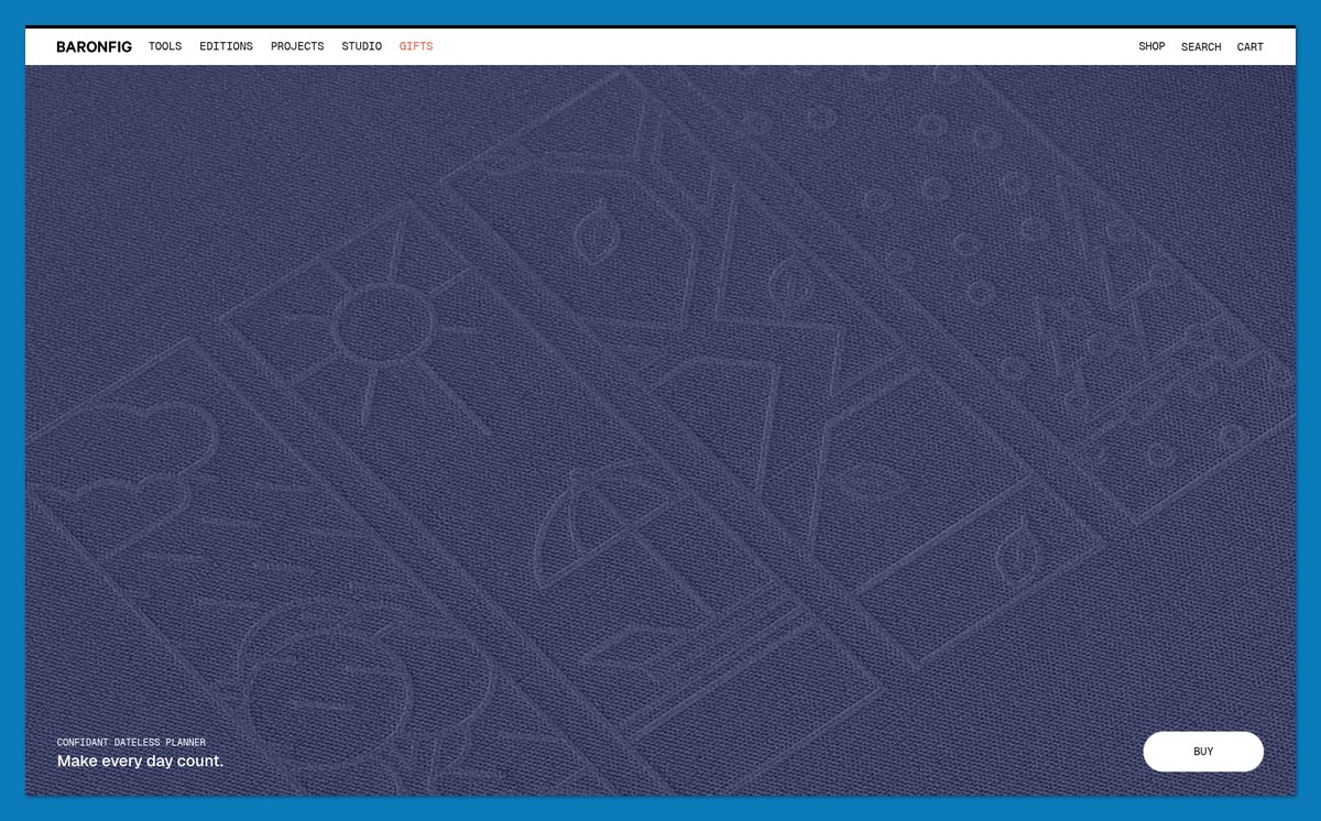
Baronfig gives each hero slide one product and a short headline. “Make every day count” and “A masterpiece in your hand” demonstrate the compact copy approach.
The navigation uses six single-word labels, beginning with Tools and ending with Shop. Geist handles the main typography, while Geist Mono gives smaller accents a functional character.
For a brand calling itself “Tools for Thinkers,” the language and type treatment reinforce the same positioning without a lengthy introduction.
What to copy:
- One product per hero: Give each slide one subject and a clear route onward.
- A mono accent: Use it selectively for labels or specifications.
Keep essential products reachable outside the carousel so browsing doesn’t depend on waiting for a slide.
Built on: Shopify (Tinker theme)
28. Only/Once: Keep Sold Items Online as an Archive
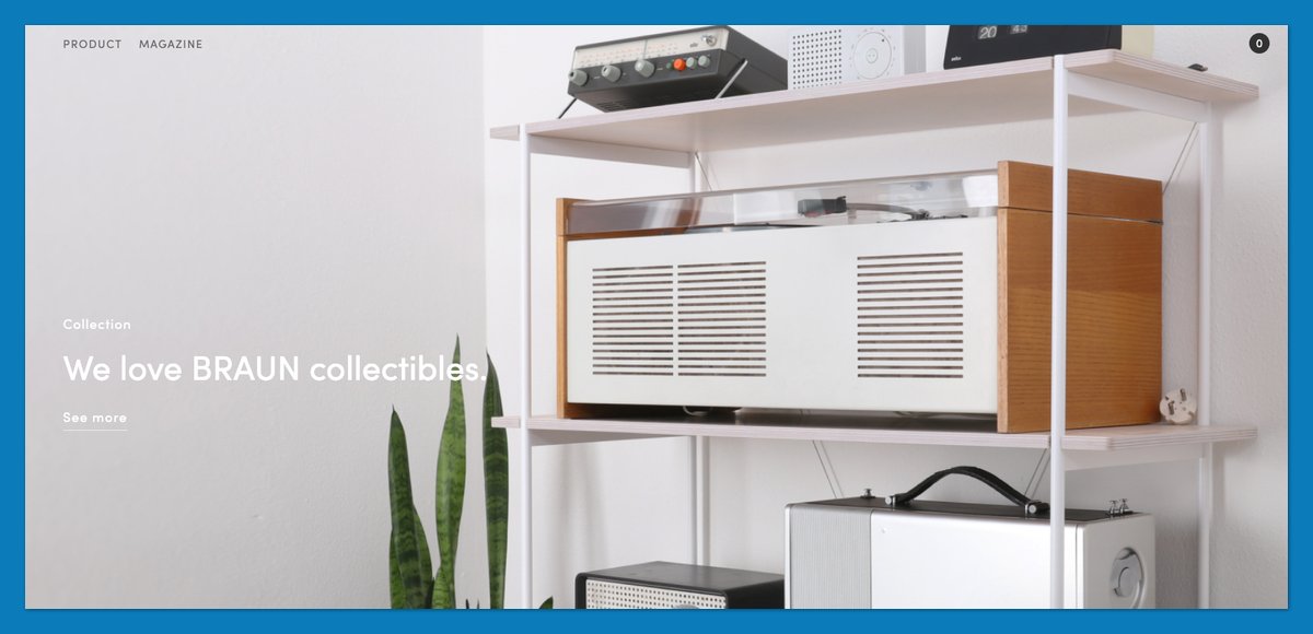
Only/Once keeps sold design objects visible instead of erasing them from the catalog. A Sold archive and notification forms give those pages a purpose after the original item has gone.
For a dealer in one-of-a-kind Braun and Bauhaus objects, past stock demonstrates the collection’s character. Shoppers can also express interest in something similar.
The magazine adds context, while the claim that an experienced in-house specialist overhauls Braun electronics addresses condition and care.
I’d borrow the archive pattern for vintage goods, with unmistakable availability labels.
Steal this: Keep sold items live with a notification form. Explain whether subscribers are waiting for that exact item or a comparable future find; don’t imply guaranteed restocking of a one-off.
Built on: a custom build (Kirby CMS + Stripe)
29. The Burren Perfumery: Let the Landscape Tell the Story, and Spell Out Shipping
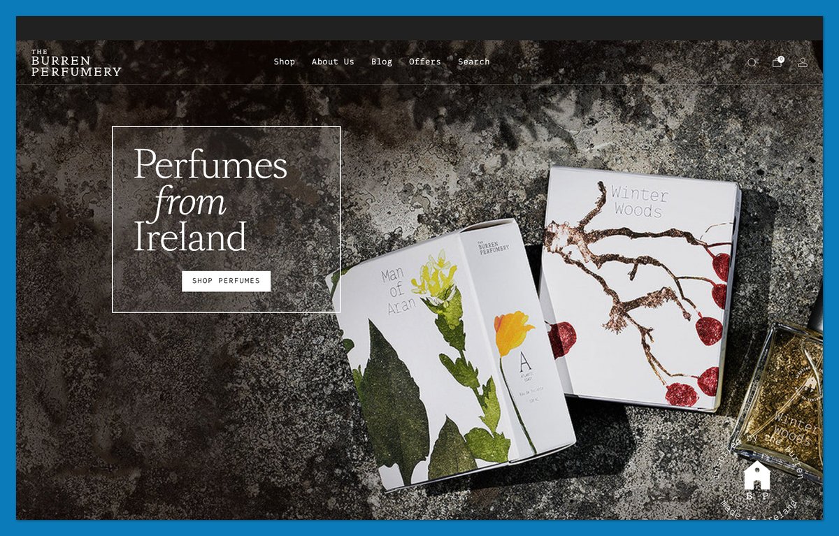
The Burren Perfumery connects its products to County Clare with “Perfumes from Ireland” and the statement that everything is made on site, by hand, in small batches.
Scent-family cards and behind-the-scenes content develop that sense of place. Shipping information is equally tangible:
- Ireland and the EU: Free above €70.
- Worldwide: A sliding delivery scale.
- Worldwide orders above €200: Free delivery.
International buyers can evaluate delivery costs before becoming attached to a product. Baymard’s October 2026 research identifies extra costs as a major abandonment reason.
Steal this: Post shipping tiers on the homepage and repeat relevant costs near purchase decisions. Keep the location-based storytelling, but don’t make overseas customers hunt for delivery rules.
Built on: Shopify (Venue theme)
30. Package Free Shop: Three Trust Badges Above the Fold
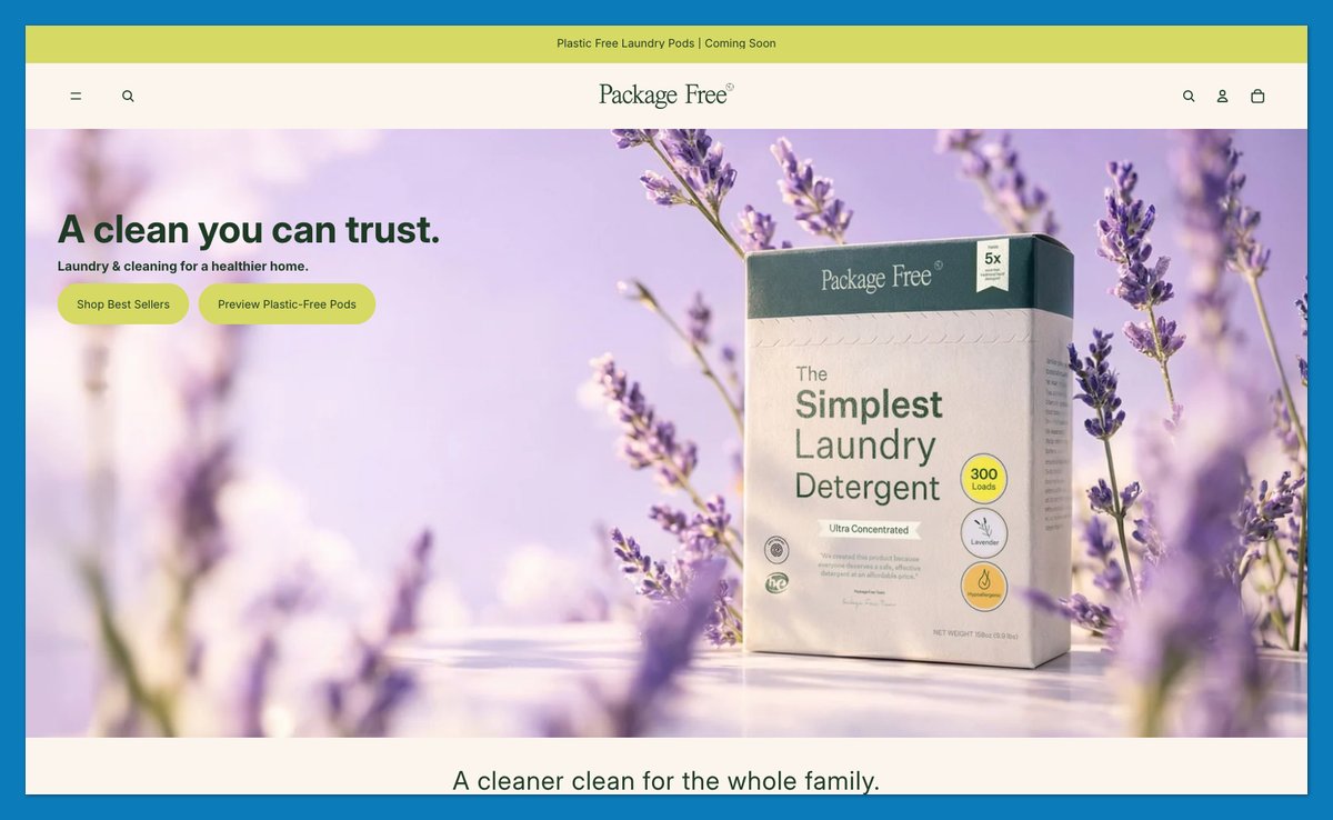
Package Free Shop now foregrounds an own-brand cleaning range. Its hero promises “A cleaner clean for the whole family,” followed by three claims:
- Minimal Ingredients
- 100% Bio-Based
- Formulated & Packaged in USA
The Clean Collection and category tiles provide a direct route into the products. Inter handles typography throughout, with bold headings creating hierarchy rather than a mixture of display fonts.
I’d borrow the concise presentation, not treat the badges as proof by themselves. Substantive claims still need accessible explanations.
What to copy:
- Three short badges: Keep wording compact without sacrificing accuracy.
- One typeface: Use weight and size to distinguish headings from supporting information.
Give shoppers a route from each claim to the details supporting it.
Built on: Shopify (Pitch theme)
What Makes Good Ecommerce Web Design in 2027
Only 48% of leading desktop ecommerce sites have decent-or-better product-page UX, falling to 38% on mobile, according to Baymard’s 2026 benchmark. Use these checks to evaluate ecommerce website design examples beyond their appearance.
| Principle | What to check | Benchmark |
|---|---|---|
| Mobile | Reachable menus and purchase controls | Roughly 70% of retail traffic |
| Speed | LCP / INP / CLS at the 75th percentile | ≤2.5s / ≤200ms / ≤0.1 |
| Product pages | Scale, costs and returns | 48% desktop / 38% mobile decent+ |
| Checkout | Guest checkout and unnecessary elements | 12 to 14 achievable; 23.48 average |
| Accessibility | WCAG audit and statement | EAA applies since 28 June 2025 |
| Trust | Reviews, contact and returns | Five reviews: +270% purchase likelihood, Spiegel 2017 |
Design for Mobile First
Secondary reporting of Statista’s Q1 2026 figures puts mobile at roughly 70% of retail traffic and about 60% of global ecommerce revenue. Adobe’s reported US mobile revenue share reached 51.3% in Q2 2026.
Check filters and purchase controls on a phone before approving desktop layouts. OWL’s compact navigation shows how little menu space a focused range needs. Don’t let sticky add-to-cart controls obscure content.
Hit the Core Web Vitals Thresholds
Google’s thresholds measure loading, responsiveness and visual stability at the 75th percentile of real visits, not your fastest laboratory test.
The Deloitte/Google study from 2020 associated a 0.1-second improvement across four mobile metrics throughout the journey with 8.4% higher retail conversions and 9.2% higher average order value.
Portent’s 2022 analysis found ecommerce conversion averaging 3.05% at one-second loads versus 0.67% at four seconds. Treat “good” thresholds as a floor, then compare your own real-user performance with conversion.
Answer Every Question on the Product Page
Baymard’s 2026 benchmark identifies four common omissions:
- In-scale images: Missing on 37% of sites.
- Human-model images: Missing on 23%.
- Total-cost estimates near Buy: Missing on 67%.
- Return-policy links: Missing on 44%.
Some 42% of test participants tried to judge size from images. Pair photography with details like Rebecca Atwood’s fibre content and Save Khaki’s fit guides.
Spiegel Research Center’s 2017 study found 270% greater purchase likelihood with five reviews versus none. Verified-buyer badges added 15% to purchase odds; purchase likelihood peaked around 4.0 to 4.7 stars, not five.
Strip the Checkout Back
Baymard’s October 2026 update puts average cart abandonment at 70.22% across 50 studies. Some 42% of US shoppers had abandoned because they were just browsing.
Excluding browsing-only abandoners, reported reasons included:
- Extra costs: 40%.
- Slow delivery: 20%.
- Card-information distrust: 19%.
- Forced accounts: 18%.
- Complicated checkout: 17%.
- Unclear upfront total: 12%.
Offer guest checkout and show total costs early, as Burren does with shipping. Audit the form: Baymard finds 23.48 elements on average in US checkouts, while 12 to 14 is achievable.
Build Accessibility In (the EAA Already Applies)
The European Accessibility Act has applied since 28 June 2025 to covered consumer ecommerce services. Legal commentators say overseas sellers serving EU consumers can also fall within scope.
A service-obligation exemption may cover microenterprises with fewer than 10 people and annual turnover or balance sheet not above €2 million. Interpretation varies; check national guidance or counsel.
EN 301 549 v3.2.1 maps to WCAG 2.1 AA. Build toward WCAG 2.2 AA, but don’t treat that target as a compliance guarantee.
Audit:
- Navigation: Keyboard access and visible focus.
- Content: Contrast and meaningful image alternatives.
- Forms: Labels and accessible checkout.
- Documentation: A useful accessibility statement.
UsableNet’s mid-2026 data projected over 6,000 US website accessibility lawsuits that year, mostly under ADA Title III.
Show Trust Signals Early
Great Jones displays returns reassurance; Beatific provides direct contact; Tracksmith states its footwear guarantee. Place equivalent evidence near buying decisions.
Baymard’s October 2026 finding that 19% cited card-information distrust supports prioritizing credible reassurance. Show review counts with averages, and make contact details and return terms accessible before checkout.
Ecommerce Design Trends for 2027
Shopify can generate theme blocks from a prompt, but the strongest patterns I saw still address familiar buying questions. These ecommerce website design examples combine newer tools with clearer product selection.
AI Builds Theme Sections From a Prompt
Shopify’s 10 December 2025 changelog extended Sidekick’s AI block generation to every Theme Store theme, not just Horizon.
Horizon launched in May 2025 with 10 presets and a block-based structure. The Sill and Blume use Horizon-based storefronts, although that doesn’t establish whether either used AI generation.
Describe the block you need, then review it on mobile. Expect iteration; delete a generated block if it conflicts with the theme.
Squarespace Blueprint AI and Wix’s AI builder offer alternatives. Compare them in Shopify vs Squarespace vs Wix.
Shopping Inside AI Assistants
Shopify’s Winter ’26 Edition, released in December 2025, introduced:
- Agentic Storefronts: Products surfacing through AI assistants.
- SimGym: AI store simulation.
- Theme A/B testing: Comparing design variants.
OpenAI launched Instant Checkout in September 2025, then pulled back in March 2026. Modern Retail reported that Shopify purchases would usually finish on the merchant’s own storefront.
Keep structured product information accurate, but continue designing the landing page and checkout for people arriving from those conversations.
Trends I Saw Across the 30 Stores
- Lowercase, conversational voice: Recess and Hungry Tiger use informal headings without abandoning product explanations. Borrow the consistent voice, not just lowercase styling.
- Shop-by-concern navigation: The Sill, Blume and Buffy organize routes around problems. Use this when customers know their desired outcome but not the product name.
- Quizzes and builders: Two Chimps’ Coffee Wizard handles uncertainty; Ghia and Bite offer configurable starting points. Match the tool to the decision.
- Headless front ends: Nothing uses Hydrogen, A.N. Other uses Next.js, and Tracksmith uses Astro. Packwire uses Astro in a custom build. Reserve headless architecture for clear requirements and an ongoing development budget.
- Refills and subscriptions: Graza’s refill cans and Bite’s replenishment message make repeat purchasing visible. Recess and Two Chimps give subscriptions dedicated routes.
- Cart progress indicators: The Wolf Gang shows multiple reward tiers; Bite and Graza use shipping-threshold patterns. Explain the next benefit without blocking checkout with upsells.
None of these customer-facing patterns requires a custom build, even when the store demonstrating it uses one.
How to Get This Look for Your Own Store
Nineteen of these ecommerce website design examples use Shopify themes, not separate front ends. Start with the buying problem you want to solve, then choose the platform.
| Platform | Stores on this list | Best for |
|---|---|---|
| Shopify themes: 19 | The Sill, Rebecca Atwood, Baronfig, Recess, Beatific, Blume, The Wolf Gang, Package Free Shop, Native Union, Really Well Made, The Burren Perfumery, Via Copenhagen, Save Khaki United, Buffy, Graza, Ghia, Great Jones, Bite, Fellow | Most direct-to-consumer brands |
| Headless Shopify: 3 | Nothing: Hydrogen; A.N. Other: Next.js; Tracksmith: Astro | Developer-supported front-end control |
| WooCommerce | Two Chimps Coffee | WordPress content plus commerce |
| BigCommerce | Bohemian Traders | Growing catalogs seeking a hosted alternative |
| Webflow | Hungry Tiger | Design-led small catalogs |
| Magento (Adobe Commerce) | Manolo Blahnik | Enterprise, multi-region requirements |
| Custom builds: 4 | Mulberry: enterprise build; OWL: Ruby on Rails; Packwire: Astro; Only/Once: Kirby CMS + Stripe | Unusual requirements and development teams |
- Themes that match the list: Dawn underpins Ghia, The Wolf Gang and Really Well Made, plus Buffy’s base. Horizon appears at Blume and beneath The Sill’s customization. Named alternatives include Focal and Venue. A shared theme won’t reproduce custom photography or functionality.
- Budget: Rough vendor estimates put premium themes mostly at $100 to $400 once, freelancer-built theme stores at $3,000 to $5,000, and agency custom design at $15,000 to $50,000. Confirm scope and ongoing costs before commissioning work.
- AI shortcut: Use Sidekick block generation, covered above, for a specific section rather than asking it to copy an entire store.
Use the platform comparison chart to narrow your shortlist before paying for a theme or development.
The Bottom Line
Copy the buying help before the styling. The Sill helps you choose, Rebecca Atwood helps you establish suitability, and Save Khaki helps you understand fit. These ecommerce website design examples offer more useful starting points than a font or animation alone.
Pick two or three lessons that match your product. Use a quiz for difficult choices or samples for products needing physical evaluation. Publish shipping tiers if you sell internationally, then check speed and checkout against the benchmarks above. Shopify is my default recommendation for most new stores because these examples show the range its theme system supports: 19 use themes, with another three using headless Shopify. Start with a theme unless you have a specific requirement for a separate front end. The other eight stores prove good design isn’t exclusive to one platform.
Start a Shopify store and try one of the themes above.
FAQ
How much does an ecommerce website design cost?
Rough vendor estimates put freelancer-built theme stores at $3,000 to $5,000 and agency custom designs at $15,000 to $50,000. Premium Shopify themes mostly cost $100 to $400 once. Separately, US Shopify Basic is about $29 monthly billed annually or $39 month-to-month. Check current prices and budget for ongoing costs.
Can AI design my Shopify store?
AI can generate parts of your Shopify design, but you still need to review the result. Since December 2025, Sidekick has supported prompt-based block generation across all Theme Store themes. Horizon uses flexible blocks. Test generated sections on mobile, check accessibility, and revise or remove anything that conflicts with your theme.
Does the European Accessibility Act apply to my online store?
The EAA can apply to ecommerce services offered to EU consumers, with obligations effective since 28 June 2025. A microenterprise exemption may cover service providers with fewer than 10 people and annual turnover or balance sheet not above €2 million. Confirm your classification and national requirements with the relevant authority or qualified counsel.
What Core Web Vitals scores should an online store aim for?
Aim for LCP of 2.5 seconds or less, INP of 200 milliseconds or less, and CLS of 0.1 or less. Google measures these thresholds at the 75th percentile of real visits. Check mobile performance across product pages and checkout, not just the homepage. See “Hit the Core Web Vitals Thresholds” above.
What is a good cart abandonment rate?
There isn’t one universal target. Baymard’s October 2026 average is 70.22% across 50 studies, ranging from 55% to 84%. Compare your own trend across similar traffic and device segments. Some 42% of US shoppers reported abandoning because they were just browsing, so not every abandoned cart indicates a checkout problem.
How much ecommerce traffic comes from mobile?
Mobile represents roughly 70% of worldwide retail website traffic and about 60% of ecommerce revenue, per secondary reporting of Statista’s Q1 2026 figures. Adobe’s reported US mobile revenue share reached 51.3% in Q2 2026. These measures differ: use your own traffic and revenue data to prioritize improvements to mobile shopping.



Wow, Ecommerce is the new crude. Thank you for this properly articulated post. I feel inspired
I read your blog. The information you give in the blog is very good.
👍👍👍
The information you give in the blog is very good.
Thanks!
Hey there, your article is so convincing that I can’t stop myself from saying something about it. I have 1 query. Could you please help me out with what is NoSQL in E-commerce. Thank you for sharing this beautiful article about Ecommerce Website Design.
Thank you for sharing this great piece of content. Really enjoyed reading.
You’re welcome!
Very well written blog.Thanks for sharing and too much detailed and informative for beginners.
Thanks Amanda!
Your article is very informative. You have added a lot to this content. I like this content a lot. Thank you for publishing this informative content.
👍👍👍
Thanks for the information, I am looking for the good ecommerce platforms. I am thinking to use Bigcommerce or opencart. Opencart is free so I will give a try.
Great Post!
nice article, thanks for share.
You’re welcome Dhaka!
i appreciate you for this article. you have enough knowledge on ecommerce listing. Thanks for sharing this amazing atricle.
Thanks!
Hello, I am not sure what to think about this article. The content is interesting but I found it in French and it is full of mistakes and not really readable.
Was it am automatic translation?
Hello Natacha,
For this article the translation is automatic.
Great post, It’s very informative for me. Thanks for sharing.
You’re welcome Ajeesh!
Thank you very much for this great share.
You’re welcome!
My Pleasure
https://www.exporthub.org
Great article! I did not find any mention of the Ecommerce platform used for Wolfgangstore, MSGM, Monolo Blahnik, Makr and 4254. May I know what they used? Thanks!
It looks like they are using a custom built platform.
Thank you so much for sharing these sites, it really helped me to decide the features for my site.
You’re welcome Xavier!
Thank you so much for sharing these sites, i will try to implement some of their features in to mine now!
Awesome!
Thanks a lot for this. I could borrow some designs from different websites and put it up on mine.
You’re welcome Sid!
Ive tried to take inspiration from these sites and implement some aspects in to mine….Thank you so much for sharing!
We’re really glad you found this useful Carl!
–
Bogdan – Editor at ecommerce-platforms.com
Amazing list of online store designs. Thanks for sharing with us!
You’re welcome 🙂
They all look the same!
Exactly !!