Your web design, in many cases, is the determining factor for a lot of customers – whether to buy from you or not. A broken web page will usually scare people off, the credibility and trust disappears and people are worried that you might process the orders with the same types of faults as your designed pages.
How can we avoid this, and is it really necessary to invest thousands of dollars into a developers and designer to create a unique design? I guess there are certain advantages to that (the developer and designer will usually have a good idea of what is currently trending in those areas), but you can also settle for a much cheaper option, and customize it yourself.
Ready-made web templates from sites like ThemeForest, TemplateMonster and Shopify are in great demand, and for many good reasons. I'd like to give you some of those reasons in a list below, think twice before you make a mistake of spending money that could have been invested elsewhere, here is the list of reasons why a ready-made template might be a good idea:
- They're modern, clean and easily customizable.
- Up-to-date technology used to build and design.
- Friendly and available support.
- Special feature requests for the author.
- Very cheap, usually below the hundred dollar price tag.
oftentimes, the developer will have built-in custom settings panel which will allow you to modify the template to your own liking; the colors, the images, font-types and other ‘minor' tweaks – those will essentially lead to you having a unique styled template that cost you little to nothing.
The Layout of Your eCommerce Store
Try and think about the layout that you would like to use on your business store, try and remember all the great designs you've seen in the past, and see whether you can find similar options available on any of the template marketplaces we listed above.
At the end of the day, this template is going to be used for at least a few months, so making the right choice is important. Pick something you like, but always remember about the customers (usability).
Look for Responsive, Social and Lightweight Integration
A responsive design means that you're catering to the mobile audience freely, and that is very important these days. Social integration means that the template of your choice will provide easy social sharing integration (great if part of the template itself), and lightweight stands for the best practices in coding; thus making the template easy to navigate, and also quick to load.
Take Your Time & Observe Your Options
You want to get the store live as quickly as possible, we get that. However, how many times do things that get rushed turn out to be great? I'm sure you've done this in your life at least a couple of times, rushing to do something – only to realize that taking it slowly could've been a lot better.
Same applies for picking a template. Put all those templates that you like in one particular file, and after you've got 10 templates in total, begin to analyze them once more – this time, consider everything and write down the things you like and dislike about each. It is more than likely that in the end you'll be left with at least one or two that you feel strongly about. Pick that one!
3 Great Examples of a Wonderful Web Design for an eCommerce Store
The best way to learn is by example, so I've taken the time to find three unique online stores that have modern, acessible and user-friendly web designs. You don't have to follow the same footsteps, but it is always good to have something to look at. All of our discussed points in the first part of the post still stand true.
Adobe KnowHow
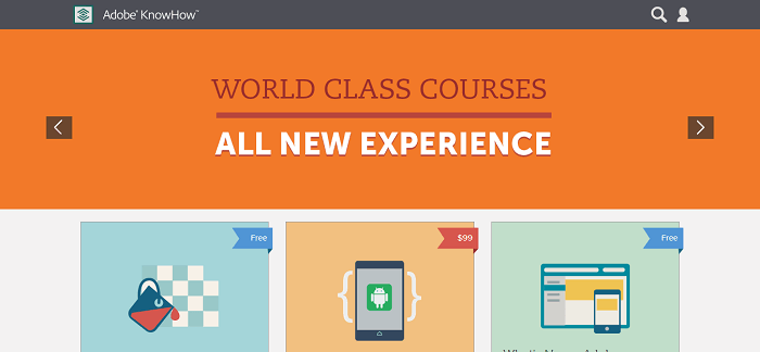
It's trendy, it's modern, it's minimal and it's easy on the eyes. It is the perfect execution of a modern online store selling digital goods. Of course, it is built by Adobe and they're quite the experts when it comes to anything design related, but it doesn't mean you can't take example and inspire yourself to find something similar. Go trough the product pages and see how they're using the newest technology to maintain a good shopping and browsing experience.
Sleeping Duck
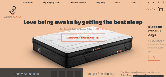
I'm not sure what else are Australians famous for, apart from the obvious kangaroos. But this web design is flawless, and it goes to show how different colors and HTML elements can affect the browsing experience. That ‘Discover the Benefits' button right in the middle is transparent, but as soon as you mouse-over it – it ignites in color, calling for instant action!
The product pages feature infinite-scrolling and also has some interesting JavaScript elements added to it; like the ability to execute how their mattresses work in a way that each layer gets added on top of each other. By observing this, we realize that we can build our online stores as personal as we like, it comes down to finding a template that will allow us to do that.
Pencil by FiftyThree
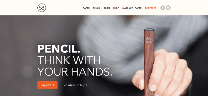
Selling just one single product? Take example from the guys over at FiftyThree store, their magnificent and fairly famous product ‘Pencil' is incubated in a wonderful single page website that also provides all the necessary pages for information, how-to's, testimonials, and the buy page, of course.
It features the ever popular infinite-scrolling single page design that allows the reader (customer) to immerse himself in experience the product through words.
Try My Two Favorite Shopify Themes
The platform that I work with the most is Shopify (see the review here), and I tend to enjoy new theme additions to the Shopify Theme Store, every now and then. Lets take a look.
Whoa Baby
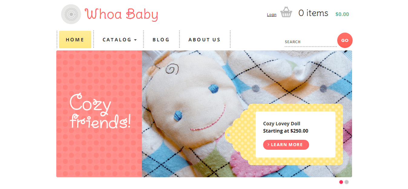
Don't let the name fool you. It is a very professional eCommerce theme that has the right design elements added to it to make it appealing to any age group. I've found it particularly easy to change colors and the overall layout of the theme with just a few clicks. Created by the world-renowned design team at Happy Cog, Philadelphia Whoa Baby incorporates the very best in quality layout and user-friendliness.
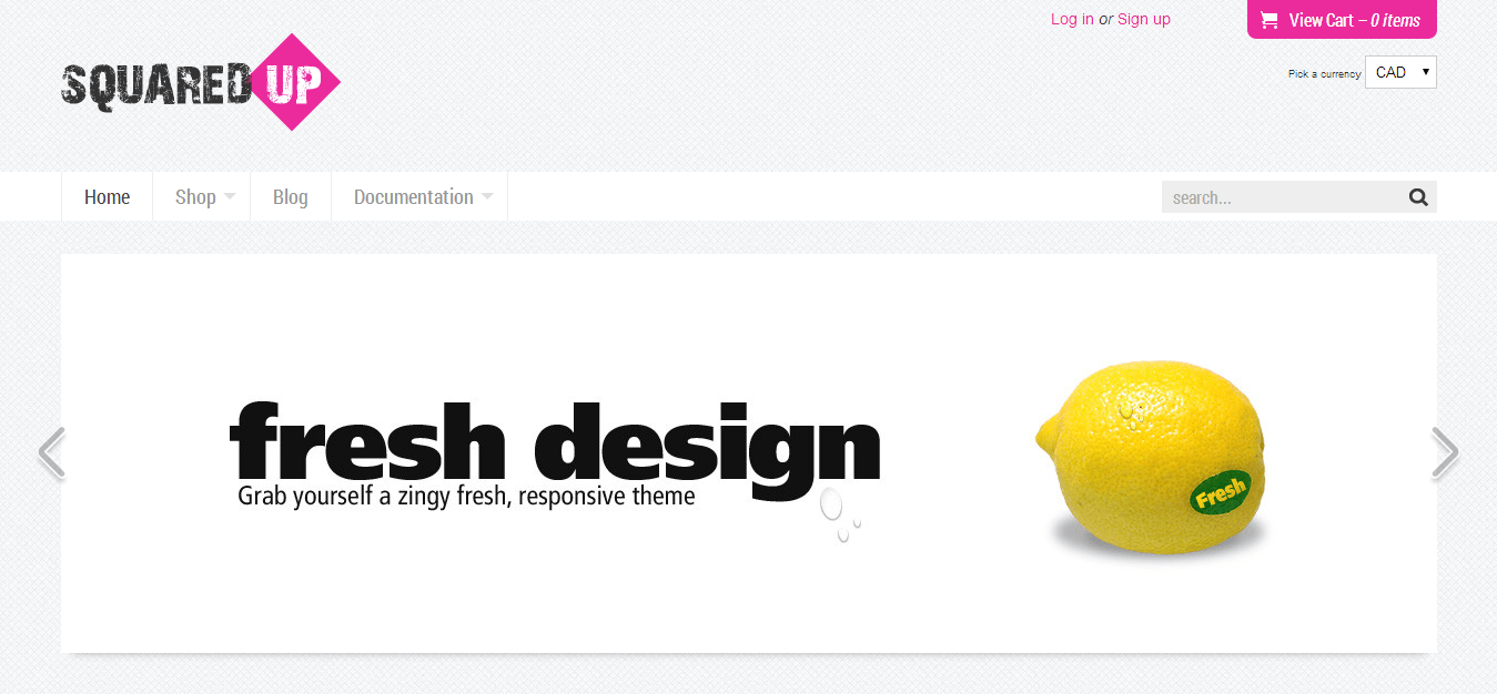
Clean, crisp and current, Fresh Squared Up is a fully responsive Shopify theme. Automatically adjusting its display to suit the device in use, this theme always looks its best. It has a squared layout that makes it very easy to distinguish from a product and other parts of your store. Easy on the eyes, and has the same quality support that others themes would.
Last Words for Choosing Your First eCommerce Template
If I was to ask you honestly, do you really enjoy the cluttered old-school design of Amazon – would you say yes? Of course, by now everyone is used to it, but in other parts of the web world, things have long changed and these days modern stores will look a lot like the samples we've covered in this post.
Give us your questions and concerns, and we'll get right back to you with answers. Go slow, but make steady progress. Don't forget to show us your newly launched stores, even more so if this post was your starting point!
Not sure yet what platform to choose for your new shop? Check out my comparison chart to get an overview of the most popular ecommerce site builders.


