
Untuk mana-mana perniagaan yang ingin menjual dalam talian, mempunyai tapak web yang direka dengan baik adalah amat penting. Ambil mana-mana jualan e-dagang atau strategi pemasaran, dan perkara pertama yang anda akan perhatikan ialah mereka semua akan bercakap tentang kepentingan reka bentuk web yang baik.
Seperti yang telah kami katakan sebelum ini, tapak web anda ialah etalase digital dan ini adalah peluang utama anda untuk memberi kesan kepada pelawat.
Beberapa jenama e-dagang terbesar membelanjakan berjuta-juta dalam mengubahsuai reka bentuk tapak web mereka untuk menjadikannya lebih menarik dan memberikan pengalaman pesanan yang lancar.
Isi kandungan
Syukurlah, anda tidak perlu mengeluarkan wang sebanyak ini.
Dalam artikel ini, kami akan membincangkan beberapa tapak web e-dagang yang paling indah yang kami temui, perkara yang mereka lakukan dengan betul dan proses pemikiran di sebalik reka bentuk tersebut.
Reka Bentuk Laman Web E-dagang Terbaik 2026
Saya menyisir beratus-ratus reka bentuk tapak web e-dagang sejak awal tahun 2024, dan berikut ialah senarai definitif saya bagi tapak web e-dagang yang terbaik.
1. Sill
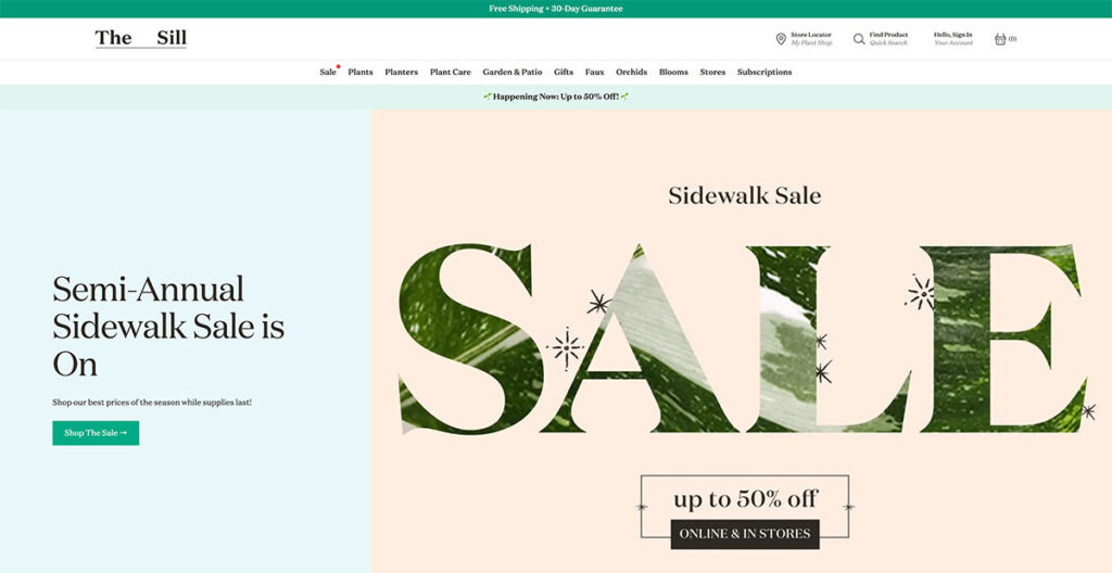
Sill menggunakan warna semula jadi di seluruh tapak, memberikan anda suasana yang sangat mesra. Itu masuk akal, kerana mereka menjual tumbuhan.
Sesiapa sahaja yang memahami reka bentuk web tahu betapa sukarnya untuk mempersembahkan sesuatu dengan seni yang asas seperti tumbuh-tumbuhan, tetapi The Sill menawarkan pelajaran yang sangat baik.
Lipatan wira sentiasa dikemas kini dengan imejan baharu bergantung pada cuti dan acara yang akan datang, dan semasa anda menatal lebih jauh ke bawah, anda akan melihat beberapa kategori popularnya.
Wang itu tidak berhenti di situ; tatal lebih jauh ke bawah dan anda akan melihat gabungan pendatang baharu, tumbuhan mesra haiwan peliharaan dan beberapa penjual terlaris mereka.
Pengaki dibentangkan dengan menarik, dengan sumber, pilihan akaun dan pautan penting. Mereka juga berjaya memerah kotak pendaftaran e-mel di sana!
Dibina menggunakan: Shopify
2. pasangan
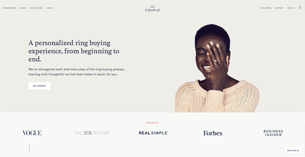
pasangan melakukan kerja yang luar biasa dalam menyebarkan kesedaran tentang berlian buatan makmal mereka, sambil juga mengeluarkan banyak bukti sosial di halaman utama mereka.
Lipatan wira mempunyai imej cantik seseorang yang memakai salah satu cincin mereka, jadi anda tahu dengan tepat rupa produk sebenar. Di bawah itu, anda mempunyai banyak bukti sosial dengan nama besar yang telah menampilkan Pasangan, termasuk orang seperti Vogue dan Forbes.
Mereka juga menggunakan banyak imejan dekat dan mempunyai chatbot untuk menjawab sebarang soalan yang anda ada. Ini adalah sentuhan yang hebat, kerana pengguna boleh mendapatkan soalan mereka dijawab hampir serta-merta.
Dibina menggunakan: Shopify
3. Rebecca Atwood
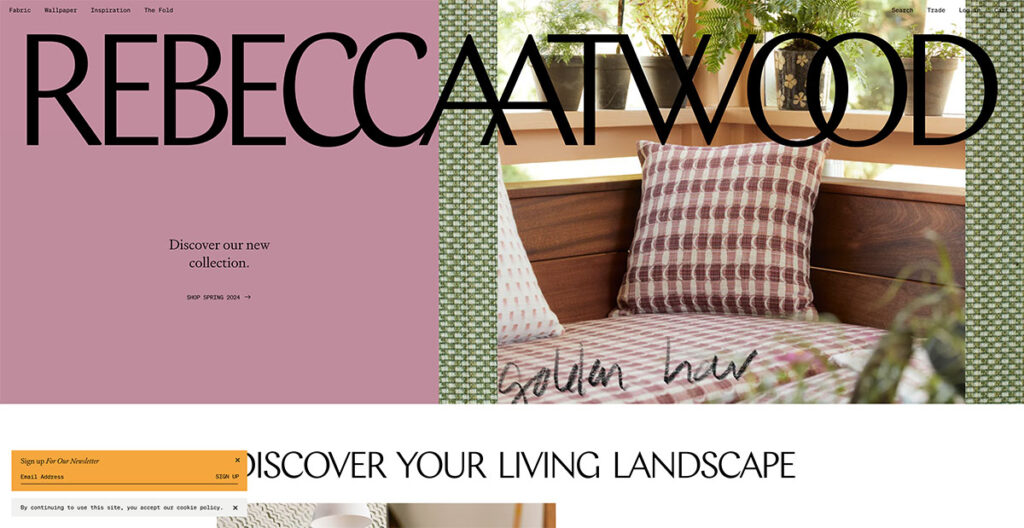
Jika anda pergi ke Tapak Rebecca Atwood, anda akan melihat logo besar terpampang betul-betul di bahagian atas. Ia lebih besar daripada logo konvensional, yang biasanya terletak di penjuru kiri sebelah atas, dan anda tidak boleh mengklik padanya.
Penggunaan warna pastel, dan reka bentuk web yang mengalir bebas menjadikan laman web ini sangat menarik dengan segera. Jika anda terus menatal ke bawah, bar navigasi mengambil tempatnya di bahagian atas, dengan beberapa butang kategori mudah untuk dipadankan.
Ia sangat mudah, dan itulah yang saya suka mengenainya. Anda serta-merta dapat mengetahui bahawa mereka membuat kertas dinding dan berkecimpung dalam fabrik, menjadikannya salah satu daripada beberapa tapak yang menonjolkan keperibadian mereka melalui reka bentuk web.
Dibina menggunakan: Shopify
4. Mulberry
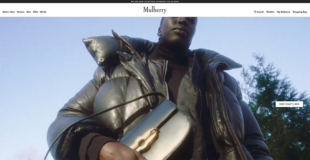
Mulberry's reka bentuk telah berubah dengan ketara. Mereka membuat beg tangan, dan laman web ini berjaya mencapai keseimbangan antara keanggunan dan kemewahan.
Jika anda membeli beg premium, anda tidak mengharapkan reka bentuk yang lebih berfungsi seperti Amazon atau mana-mana jenama e-dagang lain.
Anda juga tidak mahu tapak yang terlalu rumit untuk dinavigasi. Hanya tuding kursor anda pada mana-mana tote, dan anda akan melihat imej seseorang yang memakainya; memberi anda idea yang jelas tentang penampilannya apabila digandingkan dengan pakaian.
Sentuhan halus inilah yang menjadikan Mulberry masukan kelima dalam senarai tapak e-dagang kami yang direka bentuk terbaik.
Dibina menggunakan: Anda dapat menekanya, Shopify!
6. Burung Hantu
Burung hantu mempunyai halaman selamat datang yang mungkin mengelirukan anda pada mulanya. Di bahagian atas, anda akan melihat pautan untuk Buku Tinjauan dan Kedai – agak standard. Walau bagaimanapun, klik pada imej dan anda akan segera melihat sebab tapak e-dagang ini berada dalam senarai kami.
Ia adalah jenama cermin mata hitam Sweden, dan bukannya mempunyai pengaki konvensional, mereka meletakkan pautan di bar sisi. Sebagai contoh, butang "Log Masuk" diletakkan di bar sisi, sesuatu yang saya tidak pernah lihat sebelum ini.
Sambil anda terus menatal ke bawah, anda akan melihat fotografi produk yang menakjubkan bagi bingkai dan cermin mata mereka. Penggunaan off-white benar-benar dilakukan di sini, dan pasti menjadikannya menonjol.
Dibina menggunakan: Shopify
7. Baronfig
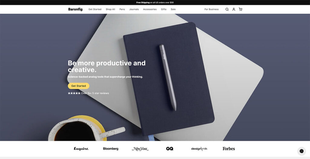
Baronfig membuat pen, jurnal dan "alat analog" lain. Dalam dunia yang penuh dengan Moleskines dan jenama lain, sukar untuk menonjol. Namun, jenama itu melakukan perkara itu.
Daripada hanya membombardir pelawat dengan gambar produk mereka, mereka menggunakan penempatan semula jadi dan banyak bukti sosial untuk mendapatkan pelawat menukar.
Tepat di bawah lipatan wira, anda mempunyai logo penerbitan besar yang menampilkan jenama itu, dan jika anda terus menatal lebih jauh, anda akan melihat beberapa fotografi produk yang sangat bagus.
Mereka menutup halaman dengan Soalan Lazim tentang halaman, memastikan bahawa mereka menandakan keperluan SEO juga. Suka!
Dibina menggunakan: Shopify
8. Recess
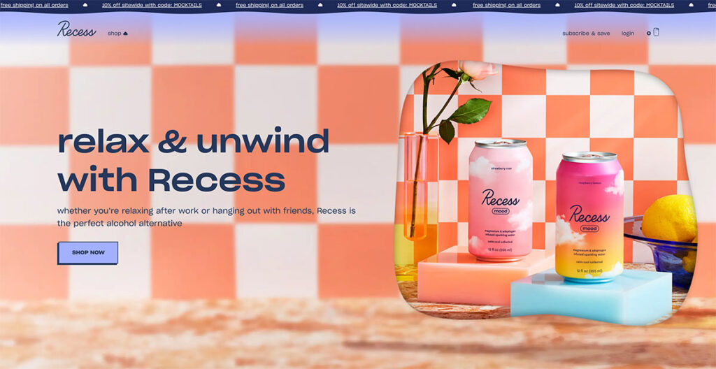
Seterusnya, kami ada Recess, jenama berwarna-warni yang terkenal dengan koktel dan minuman bebas alkohol. Reka bentuk tapak mereka adalah perubahan yang menakjubkan daripada produk lain yang telah kami bincangkan setakat ini.
Dengan awan terapung pada halaman yang memberikan kesan 3D dan sepanduk teratas dinamik yang menyerlahkan faedah seperti diskaun dan penghantaran percuma, reka bentuk tapak ini benar-benar menonjolkan keunikan jenama.
Mereka menggunakan warna-warna hangat yang mudah dipandang mata, daripada hijau kepada oren dan biru, jadi anda tidak akan terpaksa melantun keluar dari tapak dengan serta-merta.
Semasa anda menatal ke bawah, anda akan melihat lipatan berbeza yang dikhaskan untuk barisan produk mereka, setiap satunya mengikut tema warna yang serupa.
Keseluruhan reka bentuk menangkap dengan sempurna perkara yang mereka mahu pelanggan rasakan dan menambah dimensi baharu pada jenama.
Dibina menggunakan: Perlukah saya katakan?
9. Packwire

Selalu sukar untuk mereka bentuk tapak e-dagang untuk menjual kotak. Ya, kotak literal. Packwire melakukan kerja yang hebat untuk menjadikan produk yang membosankan kelihatan menarik dengan warna biru dan oren yang tajam.
Ia menggunakan kesan tatal paralaks, jadi semasa anda menatal ke bawah, anda akan melihat gambaran bersih semua kotak yang mereka tawarkan, dengan butang untuk menyesuaikan setiap kotak mengikut keinginan anda (anda boleh memesan pembungkusan tersuai juga).
Saya suka hakikat bahawa semasa anda menatal lebih jauh ke bawah, anda melihat arahan langkah demi langkah tentang cara mereka bentuk pembungkusan tersuai. Ia adalah laman web yang sangat kemas malah mempunyai bahagian FAQ di bahagian bawah.
Dibina menggunakan: Anda tahu itu.
10. Caroline Z Hurley (CZH)
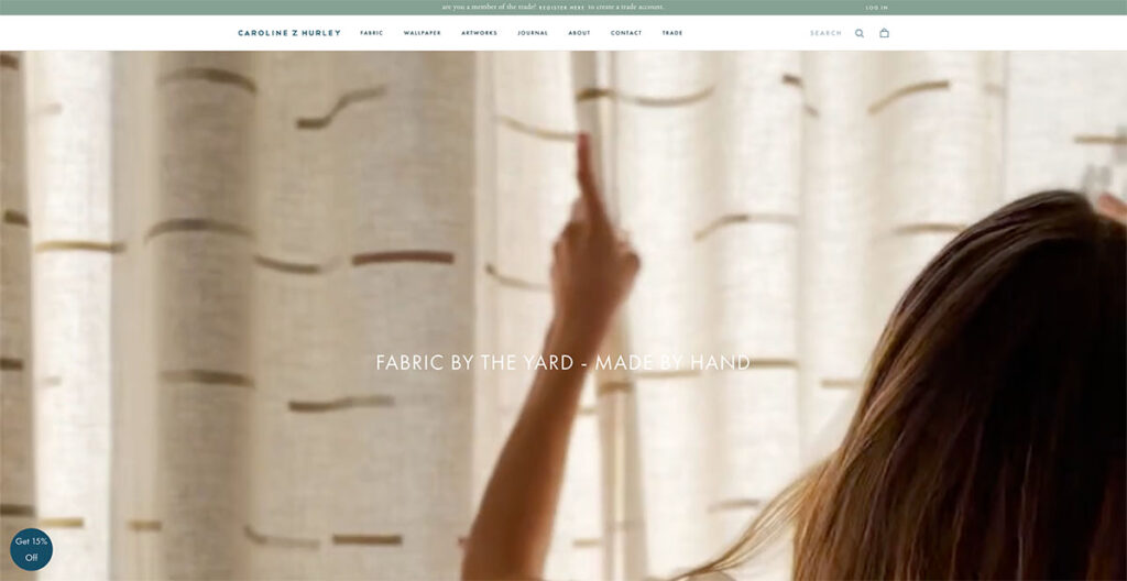
Caroline Z Hurley ialah kedai e-dagang dalam talian yang menjual fabrik bercetak blok di tepi halaman. Saya tidak tahu tentang anda, tetapi produk seperti itu tidak benar-benar akan menggembirakan telinga saya.
Walau bagaimanapun, lihat tapak e-dagang mereka yang hebat, dan anda akan berasa sukar untuk mencari pesaing yang kelihatan lebih baik dalam industri ini.
Mereka memisahkan setiap reka bentuk produk dalam segi empat tepat yang kemas, betul-betul di halaman utama. Anda boleh memilih untuk menyemak imbas kertas dinding atau pergi ke bahagian karya seni mereka untuk mendapatkan gambaran visual tentang rupa kertas dinding dan fabrik mereka.
Mereka juga mempunyai blog yang benar-benar menambah sisi kemanusiaan jenama itu, kerana ia dikendalikan oleh pengasas di mana mereka bercakap tentang kehidupan seharian mereka. Markah teratas di sekeliling.
Dibina menggunakan: Juga Shopify
11. Beatific

Beatific menggunakan reka bentuk digital dan warna kontras untuk mempamerkan jurnal dan buku nota mereka dengan cara yang cantik. Sejurus selepas itu, anda akan melihat testimoni video dimainkan di bahagian bawah.
Ia bukan "bermain" secara teknikal, tetapi ia adalah GIF yang menarik perhatian anda (anda boleh melihat keseluruhan ulasan video dengan mengklik pada ikon main).
Tatal lebih jauh ke bawah, dan anda melihat kaunter web yang menunjukkan bilangan ulasan yang diterima oleh jenama itu. Memandangkan ia terus meningkat, saya tidak akan menaruh banyak kepercayaan kepadanya (saya melihatnya berubah daripada 8.4k kepada 8.6k dalam tempoh lima minit), tetapi penggunaan fotografi manusia untuk menarik perhatian kepadanya benar-benar terasa menyenangkan.
Di bahagian bawah, terdapat lipatan penuh yang dikhaskan untuk video "Cara Ia Berfungsi". Sentuhan yang begitu bagus.
12. Bunga
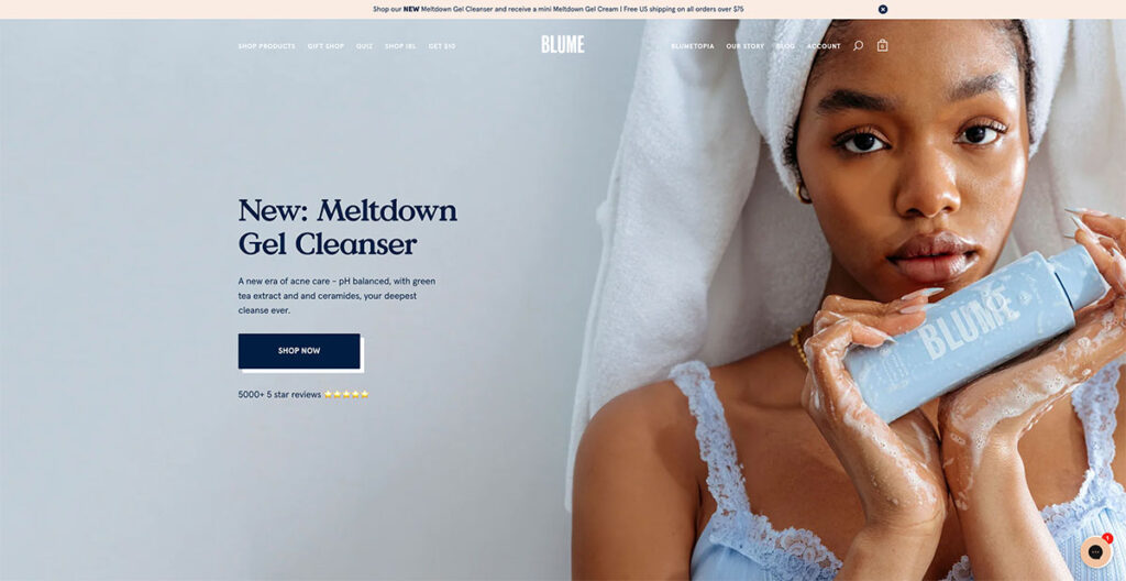
Semasa anda menatal laman utama Blume, anda akan melihat mereka membahagikan dengan tepat cara menggunakan dan memesan kotak langganan- menjadikannya sangat mudah untuk pelanggan memahami proses tersebut.
Dalam kes Blume, anda hanya perlu memilih perkara yang anda mahu, pilih berapa kerap anda ingin menerima salah satu kotak peribadi anda, kemudian batalkannya pada bila-bila masa anda mahu- betapa mudahnya?!
13. Gang Serigala
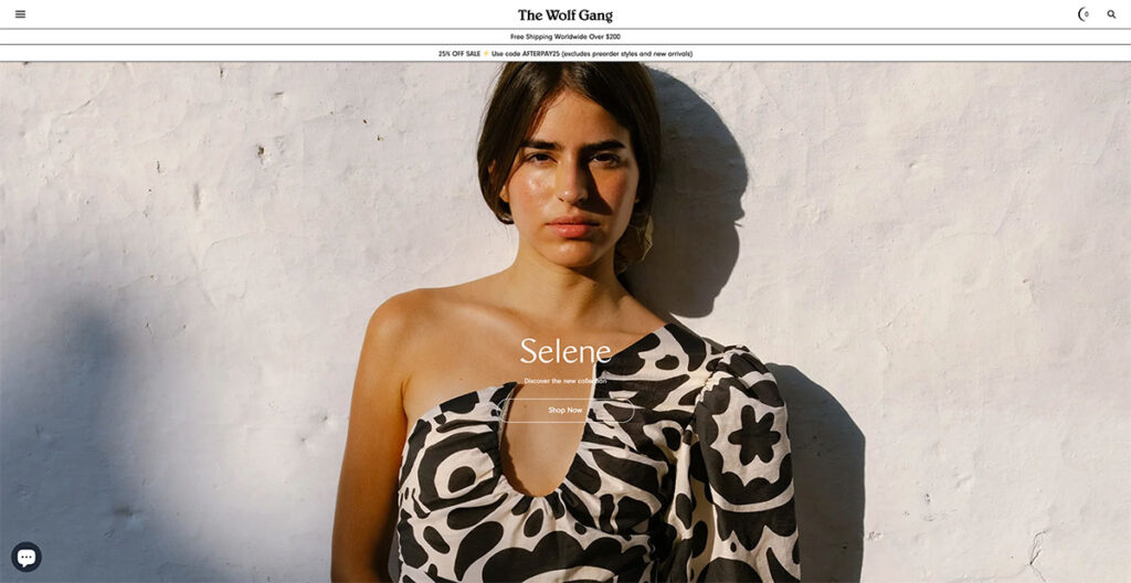
. Laman web Wolf Gang membezakan dirinya dengan reka bentuk yang merangkumi bayang-bayang dan berat, sangat berbeza dengan keutamaan tipikal untuk kecerahan dan keceriaan warna yang dilihat di banyak tapak lain.
Tipografinya menegaskan dirinya dengan berani, menuntut perhatian segera. Satu aspek yang saya dapati sangat bijak ialah cara ia memudahkan navigasi: satu jentikan roda skrol tetikus saya dengan mudah membawa saya ke bahagian kandungan seterusnya.
Ciri ini bijak menangani keletihan tatal, menjadikan pengalaman menyemak imbas lancar dan menarik. Ciri yang menonjol bagi saya ialah peralihan bahagian ke bahagian yang lancar ini.
14. MSMG

MSMG berdiri sebagai pameran utama warna terang dan imejan yang menarik. Ciri yang paling menarik perhatian saya ialah penukaran kursor tetikus kepada 'M'.
Ia mungkin kelihatan seperti kemunduran ke tahun 90-an, dan memang begitu. Walau bagaimanapun, terdapat daya tarikan tertentu untuk nostalgia dan getaran retro yang menarik minat orang ramai.
Mungkinkah ini masa untuk memasukkan sedikit masa lalu ke dalam reka bentuk tapak web anda?
15. LAIN
Tidak seperti kebanyakan tapak yang menggunakan logo melekit di bahagian atas, LAIN mempunyai nama mereka di bahagian bawah, memastikan nama jenama kekal kelihatan tanpa mengira tempat anda menavigasi di tapak.
Reka bentuk memberikan keseimbangan antara keanggunan dan kefungsian, kerana susun atur gridnya dengan lancar membimbing pandangan penonton dari satu elemen ke elemen seterusnya.
Laman web ini dibahagikan secara simetri ke bahagian tengah, dengan AN Lain yang berputar secara inovatif teks dan imej untuk mengekalkan minat visual.
Pendekatan ini meningkatkan daya tarikan tapak dengan ketara berbanding yang lain yang tidak mempunyai simetri atau organisasi.
Dibina menggunakan: WooCommercemj
16. Kopi Dua Simpanse
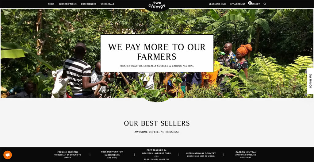
Kopi Dua Simpanse bijak menyerlahkan keunikannya melalui reka bentuk web dan pemesejannya, dengan bangganya mengumumkan bahawa petani mereka diberi pampasan lebih baik daripada yang lain.
Mereka telah menyelerakan menu hamburger biasa dengan kelainan unik yang sangat menyerlah. Tapak ini penuh dengan sentuhan istimewa yang membezakannya. Anda boleh melihat semua prop nilai jenama di bahagian bawah, daripada pilihan penghantarannya kepada fakta bahawa ia adalah neutral karbon.
Agak menarik apa yang telah mereka capai dengan reka bentuk sedemikian yang hanya memanfaatkan rona hitam dan putih.
Dibina menggunakan: WooCommerce
17. Bukan Rang Undang-Undang Lain
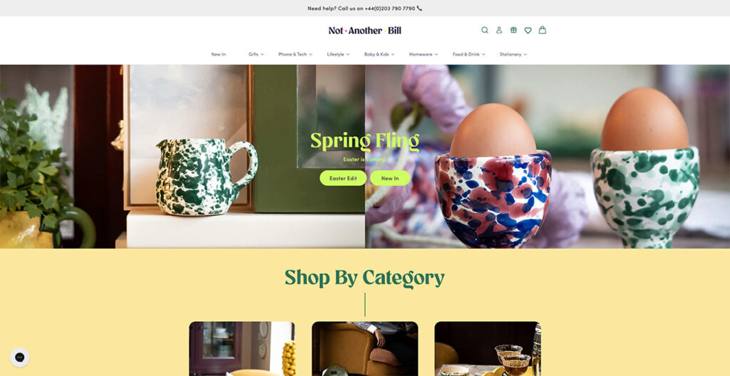
Apabila anda mendarat di Bukan laman web Bil Lain, jelas sekali mereka melakukan perkara yang berbeza. Pendekatan mereka terhadap reka bentuk bukan hanya tentang kelihatan cantik; ia mengenai menjadikan produk cantik dan minimalis mereka sebagai bintang rancangan.
Mereka melakukan ini dengan menggandingkan warna berani item mereka dengan banyak ruang putih yang bersih, yang membolehkan setiap produk bersinar dengan sendirinya. Tetapi apa yang benar-benar membezakan mereka ialah cara mereka membuat membeli-belah untuk hadiah unik dengan mudah.
Sejak awal lagi, halaman utama mereka menampilkan menu lungsur yang bertujuan untuk membawa anda kepada perkara yang anda inginkan dengan pantas.
Ingin mencari 'Kad Ucapan' yang sesuai untuk 'Remaja'? Anda hanya tinggal dua klik sahaja lagi. Komitmen untuk menjadikan kehidupan lebih mudah bagi pelanggan mereka inilah yang benar-benar menonjol.
Bawa pulang di sini? Menjaganya dengan mudah untuk pembeli-belah anda boleh membuat dunia yang berbeza.
18. Kedai Percuma Pakej
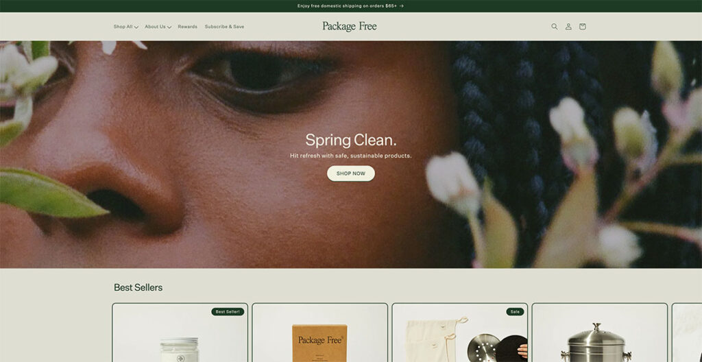
Bagi syarikat yang menawarkan barangan keperluan rumah, reka bentuk Kedai Percuma Pakej tidak kurang cantik. Daripada bola pengering hingga berus gigi, lelaki ini membuat semuanya, dan fokus utama mereka adalah menjual produk dalam pembungkusan tanpa plastik.
Saya secara automatik memihak kepada mana-mana jenama yang mementingkan jejak ekologi mereka, tetapi reka bentuk tapak mereka benar-benar mengambil kek. Mereka dengan bangganya mengumumkan bahawa mereka menawarkan penghantaran percuma melebihi $25, dan penggunaan warna semula jadi dan tanah benar-benar menambah daya tarikan kepada kedai yang menjual barangan kegunaan harian.
Dibina menggunakan: Shopify
19. Manolo Blahnik
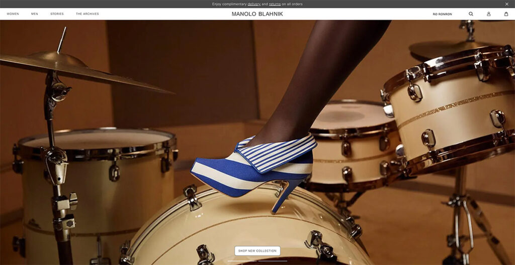
Manolo Blahnik Kerjaya cemerlang selama lebih empat dekad menuntut tapak web yang mencerminkan prestij jenama.
Semasa anda menavigasi tapak, pengalaman itu serupa dengan menonton pertunjukan fesyen berlangsung, menyelaraskan dengan sempurna dengan intipati jenama mereka.
Ciri yang menonjol ialah kesan bayangan yang digunakan di sebalik produk mereka, menambahkan lapisan keunikan yang tidak biasa dilihat di tempat lain.
Bawa pulang? Memasukkan kesan bayangan pada imej produk anda boleh meningkatkan kesan visualnya dengan ketara.
20. Kesatuan Anak Negeri
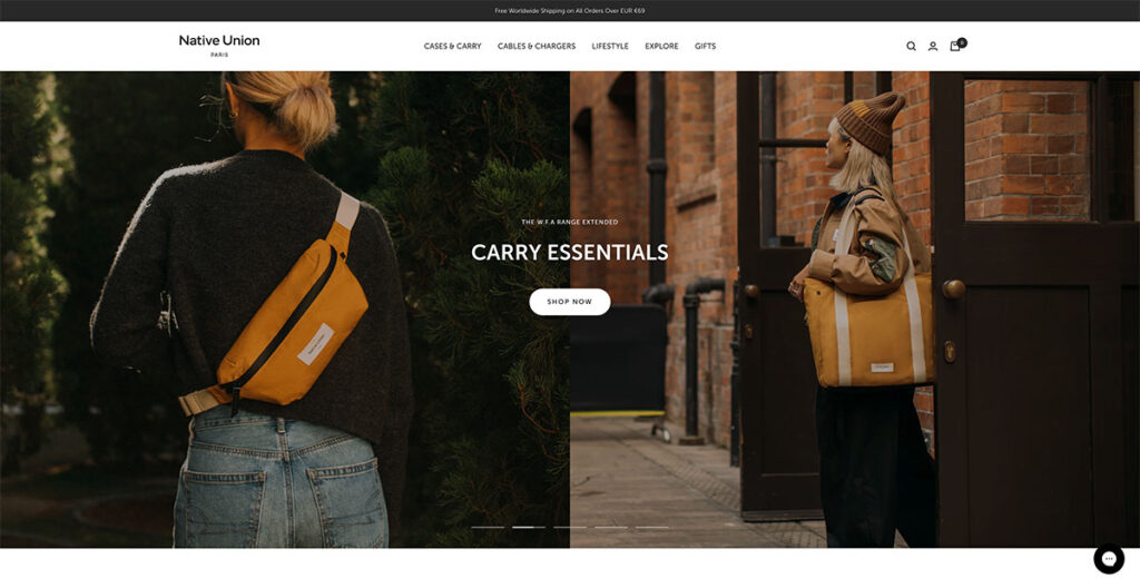
Kesatuan Orang Asli interaktiviti ditingkatkan melalui penggunaan sepanduk gelongsor, memudahkan navigasi yang mudah merentasi pelbagai halaman. Memilih untuk kandungan berat imej berbanding teks bukan sahaja memikat perhatian pengguna tetapi juga memberikan gambaran produk yang lebih tepat.
Dengan foto produk menjadi tumpuan utama, pengguna dibiarkan dengan ketidakpastian yang minimum tentang perkara yang ditawarkan. Meneroka tapak Native Union, menu pengepala secara intuitif membawa sub-produk ke dalam fokus tanpa memerlukan satu klik.
Ciri mesra pengguna ini dipertingkatkan lagi dengan penggabungan ikon, membolehkan pengguna melihat dengan cepat sifat perkara yang akan mereka terokai.
Dibina menggunakan: BigCommerce (kejutan!)
21. Betul-betul Dibuat
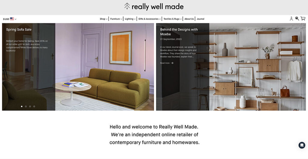
Tapak web Really Well Made sesuai dengan namanya, menawarkan susun atur yang bersih dan tajam, tanpa mengorbankan fungsi. Bagi mereka yang mencari inspirasi tentang cara menggabungkan media sosial dengan lancar dengan kehadiran dalam talian mereka, jangan cari lagi.
Halaman utama mereka memaparkan suapan Instagram mereka dengan jelas, berfungsi sebagai strategi cemerlang untuk meningkatkan kepercayaan pelanggan. Satu perkara yang saya sangat suka tentang mereka ialah mereka secara konsisten menarik perhatian ke blog mereka, di mana mereka menerbitkan kandungan yang hebat dan menggunakan seruan tindak (CTA) yang berbeza juga.
Ini bukan sahaja membolehkan mereka mempamerkan fotografi yang berbeza daripada halaman produk mereka tetapi juga menyediakan ruang untuk terlibat dalam dialog yang kurang dipacu jualan dengan penonton mereka.
Dibina menggunakan: Shopify
22. Mood Baik
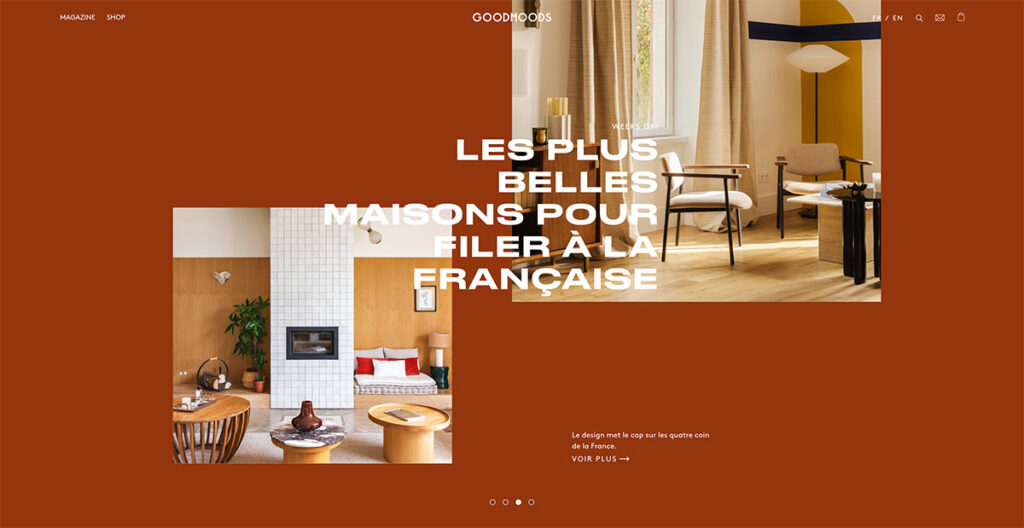
Kesederhanaan sentiasa menjadi faktor kemenangan dalam dunia reka bentuk web. Sebagai seseorang yang telah mengikuti evolusi reka bentuk web sejak akhir 90-an, saya boleh memberitahu anda bahawa tapak yang terlalu berbelit-belit hampir selalu kehilangan pelawat.
Good Moods melakukan tugas yang baik untuk mencari keharmonian antara bentuk dan fungsi, mempamerkan personaliti uniknya sambil turut memberi perhatian kepada perabot berkualiti tinggi mereka.
Laman webnya mempesonakan dengan fotografi gaya hidup yang indah yang menggabungkan warna-warna cerah dengan rona lembut dan menenangkan, mencipta pengalaman visual yang tenang.
Palet warna yang dipilih membisikkan ketenangan, menjemput pengunjung untuk berlama-lama dan meneroka. Dengan begitu banyak tapak perabot untuk dipilih, agak sukar untuk mencari identiti anda. Good Moods ialah contoh yang baik tentang cara melakukannya dengan betul.
23. The Burren Perfumery
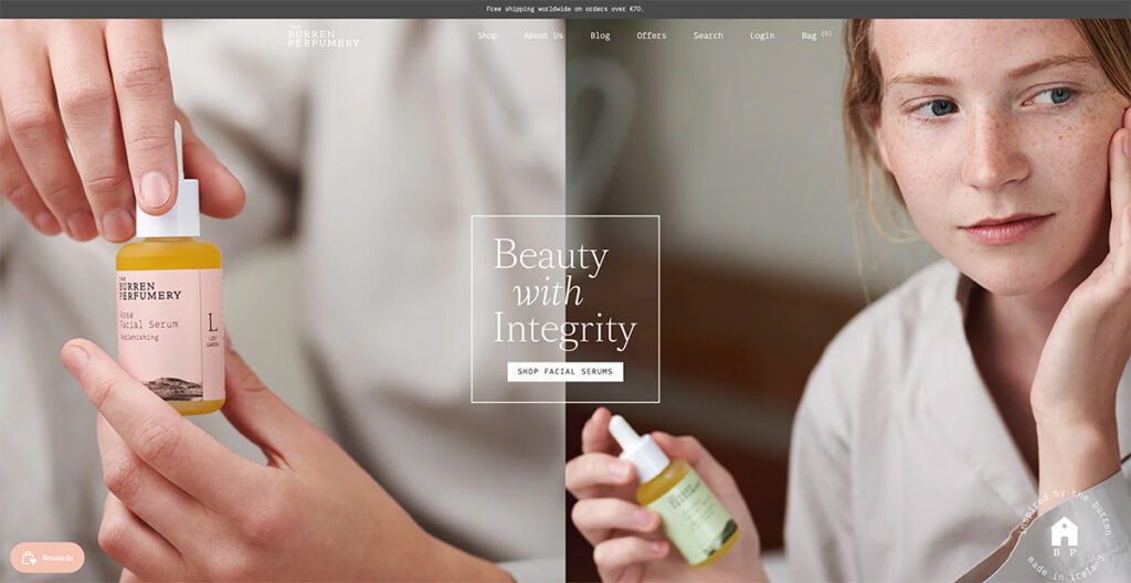
Saya segera tertarik dengan penggunaan mahir fotografi gaya hidup Burren Perfumery di laman web mereka.
Setiap imej dengan cantik merakam perjalanan minyak wangi mereka dari penciptaan hingga digunakan, dengan gubahan membuatkan saya kagum. Bukan hanya visual yang menarik perhatian saya; pilihan fon mereka adalah unik menawan dan menambah kelainan yang menarik pada penceritaan mereka.
Dibina menggunakan: Shopify
24. Melalui Copenhagen
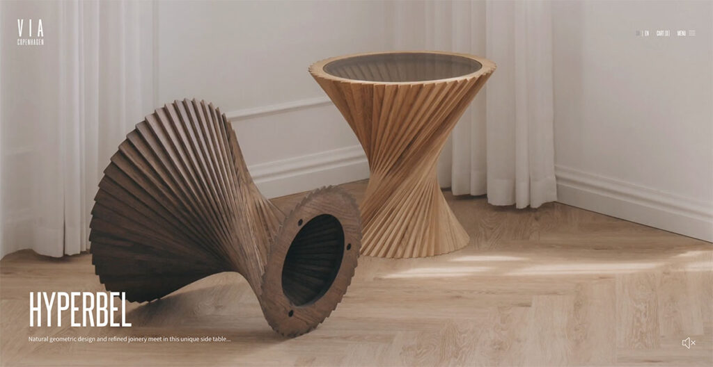
Melalui laman web Copenhagen mengambil pendekatan berani untuk navigasi. Daripada tatal tanpa henti yang biasa, ia bertukar antara halaman dengan setiap tatal, memberikan persembahan yang berbeza dan dinamik yang menjadikan setiap produk menonjol dengan jelas.
Penggunaan palet warna neutral meningkatkan keanggunan reka bentuk, menjadikan visual lebih menarik. Apa yang menarik di sini ialah keputusan untuk melepaskan penatalan tradisional untuk peralihan halaman demi halaman.
Kaedah ini bukan sahaja menarik perhatian tetapi juga memastikan setiap produk diberi momennya dalam perhatian. Saya suka bahawa mereka menggantikan tatal halaman konvensional dengan sesuatu yang baharu, itulah sebabnya ia berada dalam senarai ini!
25. Selamatkan Khaki
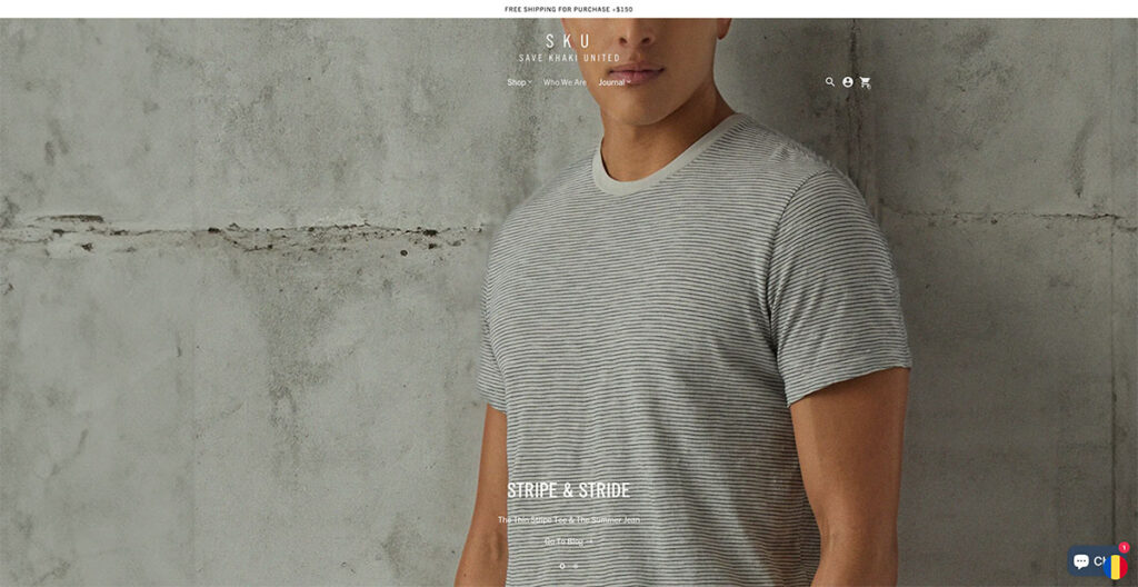
Simpan tapak Khaki segera menarik perhatian saya. Falsafah reka bentuk mereka sangat bergantung pada penggunaan imejan yang merentangi seluruh lebar halaman, mewujudkan pengalaman visual yang mengasyikkan.
Saya telah menjumpai banyak artikel dan laporan yang menasihatkan agar tidak menggunakan karusel di halaman utama, memetik kebimbangan mengenai pemesejan bercampur dan kekurangan tumpuan yang dirasakan. Namun, pendekatan Save Khaki mencabar tanggapan ini dengan berkesan.
Karusel mereka tidak mengebom saya dengan mesej bercanggah; sebaliknya, ia secara elegan menyerlahkan produk mereka yang digunakan dalam situasi harian.
Apa yang menarik perhatian saya ialah bagaimana mereka berjaya mengekalkan navigasi Kedai Lelaki dan Kedai Wanita statik. Pilihan reka bentuk ini membolehkan pelawat seperti saya menyelami membeli-belah dengan mudah pada bila-bila masa, bukti reka bentuk yang mengutamakan pengguna tapak.
Dibina menggunakan: Shopify
26. Selimut Buffy
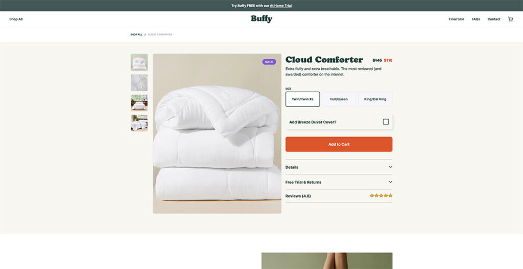
Melihat foto latar belakang di tapak web Buffy, saya tidak dapat mengelak daripada memikirkan betapa selesanya untuk berehat di salah satu sofa mereka. Dan itulah yang anda mahu capai daripada tapak yang direka dengan baik.
Mereka berbangga kerana mempunyai selimut yang paling gebu, paling lembut dan paling ringan di pasaran, dan persembahan laman web mereka menjadikan dakwaan itu benar-benar meyakinkan. Rasanya seperti comforter menjual dirinya, yang hanya bercakap dengan fotografi produk mereka.
Semasa saya mula menatal, kod diskaun muncul serta-merta. Ia adalah taktik yang mudah, pasti, tetapi tidak dapat dinafikan berkesan untuk menarik perhatian. Pendekatan ini kelihatan seperti strategi yang mudah, namun ia sangat cekap untuk menarik pengunjung kali pertama untuk membuat pembelian.
Dibina menggunakan: Shopify
27. Hanya sekali
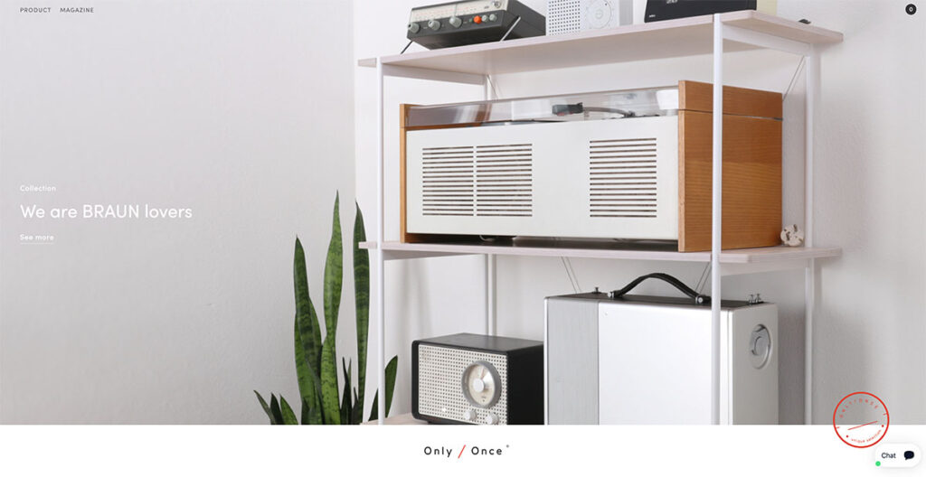
Melayari Laman web Only/Once, saya serta-merta terpegun dengan betapa cantiknya mereka mempamerkan artifak vintaj mereka.
Mereka berjaya menyampaikan daya tarikan, watak, dan cerita di sebalik setiap karya, membolehkan artifak bercakap sendiri.
Pendekatan ini menggariskan tarikan magnetik nostalgia, sesuatu yang sangat bergema dengan saya dan, tidak syak lagi, dengan ramai orang lain.
Falsafah reka bentuk minimalis Only/Once menekankan bahawa kadangkala, membiarkan produk menjadi tumpuan utama boleh dikatakan paling banyak.
Perkara yang Menghasilkan Reka Bentuk Web E-dagang yang Baik
Apabila mereka bentuk halaman pendaratan, halaman produk atau tapak e-dagang penuh, terdapat faktor utama tertentu yang perlu anda ambil kira. Mari kita terokai beberapa perkara ini:=
Responsive reka bentuk
Yang ini bukan kepalang. Kebanyakan orang menggunakan telefon mereka semasa menyemak imbas melalui web, jadi anda perlu memilih reka bentuk tapak yang mudah alih responsive dan menyesuaikan dengan baik pada saiz skrin yang berbeza.
Anda harus tahu itu responsiveness bukan sahaja mempengaruhi penampilan tapak anda pada skrin yang berbeza, tetapi juga memberi kesan kepada kedudukan carian. Google telah mengutamakan tapak mesra mudah alih buat sementara waktu sekarang, dan ia mungkin akan diteruskan.
Pengalaman Pengguna (UX/UI)
Navigasi, peletakan butang, kemudahan penggunaan, ini hanyalah beberapa perkara yang mempengaruhi pengalaman pengguna di tapak. Apabila mereka bentuk tapak, pengalaman pengguna adalah amat penting.
Daripada peluncur ke menu lungsur hingga kesan tuding, terdapat banyak cara yang boleh anda gunakan untuk meningkatkan keseluruhan pengalaman pengguna tapak anda.
Tidak mengapa jika anda menggunakan Shopify or BigCommerce atau WooCommerce, hampir semua platform e-dagang utama memberi anda pelbagai pilihan untuk dimainkan.
Menggunakan Clear CTA
Pada pandangan saya, seruan tindakan (CTA) yang jelas adalah penting dalam reka bentuk web atas beberapa sebab yang menarik. Mereka berfungsi sebagai panduan langsung, membawa pengguna daripada minat awal mereka kepada hasil yang diingini, sama ada membuat pembelian, melanggan surat berita atau memuat turun panduan.
Panduan ini menghapuskan sebarang kekeliruan, meningkatkan pengalaman dan kepuasan pengguna dengan ketara pada tahap peribadi.
Saya perasan itu CTA juga meningkatkan kebolehgunaan dan kebolehcapaian tapak web, menjadikannya lebih mudah untuk pelawat dari semua kebolehan teknikal untuk menavigasi.
Dari sudut perniagaan, Saya melihat CTA yang jelas sebagai alat penting untuk menukar trafik tapak kepada tindakan yang boleh diukur, secara langsung mempengaruhi kadar penukaran dan, akhirnya, kejayaan tapak web.
Bagi saya, mereka seperti suar dalam landskap digital, memastikan pelawat menemui jalan mereka dan terlibat secara bermakna dengan tapak.
The Line Bawah
Dan itu pembalut! Saya tahu ini adalah bahagian yang agak luas, tetapi kami telah berjaya merangkumi beberapa reka bentuk tapak web e-dagang yang sangat menarik pada tahun 2024.
Adakah anda mempunyai orang lain yang anda ingin lihat dalam senarai ini? Beritahu kami dalam ulasan di bawah!


Wah, E-dagang ialah minyak mentah baharu. Terima kasih atas siaran yang diutarakan dengan betul ini. Saya berasa terinspirasi
saya baca blog awak. Maklumat yang anda berikan dalam blog adalah sangat baik.
👍👍👍
Maklumat yang anda berikan dalam blog adalah sangat baik.
Terima kasih!
Hai, artikel anda sangat meyakinkan sehingga saya tidak dapat menahan diri saya daripada mengatakan sesuatu mengenainya. Saya ada 1 pertanyaan. Bolehkah anda membantu saya dengan apa itu NoSQL dalam E-dagang. Terima kasih kerana berkongsi artikel indah tentang Reka Bentuk Laman Web E-dagang ini.
Terima kasih kerana berkongsi kandungan hebat ini. Sangat seronok membaca.
Sama-sama!
Blog yang ditulis dengan sangat baik. Terima kasih kerana berkongsi dan terlalu banyak terperinci dan bermaklumat untuk pemula.
Terima kasih Amanda!
Artikel anda sangat bermaklumat. Anda telah menambahkan banyak pada kandungan ini. Saya sangat suka kandungan ini. Terima kasih kerana menerbitkan kandungan bermaklumat ini.
👍👍👍
Terima kasih atas maklumat, saya sedang mencari platform e-dagang yang bagus. Saya sedang berfikir untuk menggunakan Bigcommerce atau opencart. Opencart adalah percuma jadi saya akan mencuba.
Pos Hebat!
artikel yang bagus, terima kasih kerana berkongsi.
Anda dialu-alukan Dhaka!
saya menghargai anda untuk artikel ini. anda mempunyai pengetahuan yang mencukupi tentang penyenaraian e-dagang. Terima kasih kerana berkongsi atrik yang menakjubkan ini.
Terima kasih!
Halo, saya tidak pasti apa yang perlu difikirkan tentang artikel ini. Kandungannya menarik tetapi saya menemuinya dalam bahasa Perancis dan ia penuh dengan kesilapan dan tidak benar-benar boleh dibaca.
Adakah ia terjemahan automatik?
Hello Natacha,
Untuk artikel ini terjemahan adalah automatik.
Jawatan yang bagus, Ia sangat bermaklumat untuk saya. Terima kasih kerana berkongsi.
Anda dialu-alukan Ajeesh!
Terima kasih banyak atas perkongsian hebat ini.
Sama-sama!
Dengan senang hati
https://www.exporthub.org
Artikel yang bagus! Saya tidak menemui sebarang sebutan tentang platform E-dagang yang digunakan untuk Wolfgangstore, MSGM, Monolo Blahnik, Makr dan 4254. Bolehkah saya tahu apa yang mereka gunakan? Terima kasih!
Nampaknya mereka menggunakan platform tersuai.
Terima kasih banyak kerana berkongsi tapak ini, ia sangat membantu saya menentukan ciri untuk tapak saya.
Anda dialu-alukan Xavier!
Terima kasih banyak kerana berkongsi tapak ini, saya akan cuba melaksanakan beberapa ciri mereka ke dalam saya sekarang!
Awesome!
Terima kasih banyak untuk ini. Saya boleh meminjam beberapa reka bentuk dari tapak web yang berbeza dan meletakkannya pada saya.
Anda dialu-alukan Sid!
Saya telah cuba mengambil inspirasi daripada laman web ini dan melaksanakan beberapa aspek dalam saya….Terima kasih banyak kerana berkongsi!
Kami sangat gembira anda mendapati Carl berguna ini!
-
Bogdan – Editor di ecommerce-platforms.com
Senarai menakjubkan reka bentuk kedai dalam talian. Terima kasih kerana berkongsi dengan kami!
Anda dialu-alukan 🙂
Mereka semua kelihatan sama!
betul-betul!!