So you have an e-Commerce site or are building one, and you're wondering “What can I do to increase my conversion rates?” Well, then this post is for you!
Here is a list of e-Commerce sites offering the most inspirational checkouts; the websites in this list have got their checkouts absolutely right and will give you a clear idea of how you can go about designing a checkout page that will increase conversions by turning visitors into customers:
1. Apple
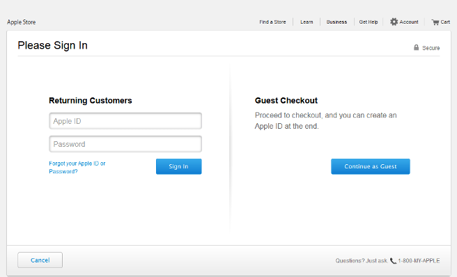
Apple has an attractive website that does full justice to the Apple brand. The checkout page is also very well-designed and makes good use of white-space to lay full emphasis on call to action buttons.
One of the most common reasons for basket abandonment is forcing users to register their details before they checkout. To get around this issue, Apple provides a guest check out option to its users which means shoppers are not required to enter a truckload of information into forms or create an account to purchase a product from Apple.
However, the flip side of a guest checkout option is the customer's shopping information won't be saved for future transactions, nor will they be able to track their order. But if that is not a problem with your customers, this is a helpful feature.
2. Bellroy
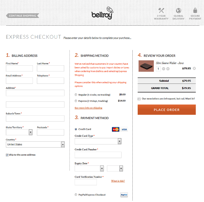
Bellroy has handled the problem of shopping cart abandonment due to a lengthy checkout process differently as compared to Apple. It provides a one-step checkout to its users making the process completely smooth for its shoppers. Studies show that one page e-Commerce checkout pages have higher conversions as compared to a two page checkout.
On the Bellroy checkout page, users are required to provide just the most relevant information like delivery address and payment details. Designers have created the page in a manner such that all relevant details can be entered from a single page itself; this eliminates the need of having multiple webpages for checkout.
E-Commerce stores can design their checkout pages this way to avoid confusing shoppers and to save their time.
3. Nixon
There are e-Commerce stores that are not in favor of providing a guest checkout option or one-page checkout. Such e-Commerce stores that offer customers a multi-page check out process should take a cue from Nixon that has designed their checkout page brilliantly.
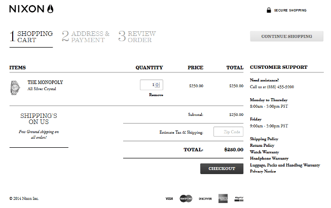
When customers are completing the checkout process, they want to have a clear idea of where they are and how many steps are left before they can complete the purchase process. Nixon's checkout page includes a progress bar at the top of the page to inform shoppers about the number of steps involved in the process.
The website makes it easy for shoppers to make out the number of steps completed and the ones left by showing this information in ‘bold'.
The page also includes links to shipping policy, return policy, product warranty details and privacy notice to instill trust with the customers.
4. Amazon
The common perception of web designers and e-Commerce store owners is to provide a bunch of options like ‘continue shopping', ‘add to wishlist' or ‘buy later' on checkout page. Amazon altogether works on a different principle.
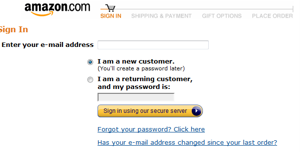
The checkout page on Amazon gives only two options to its users: either to purchase the products that are in their shopping cart or to simply close the window. This has been done to ensure that once shoppers are ready to buy a product, they are not distracted and their focus remains completely on that one task of completing the purchase journey.
5. Made
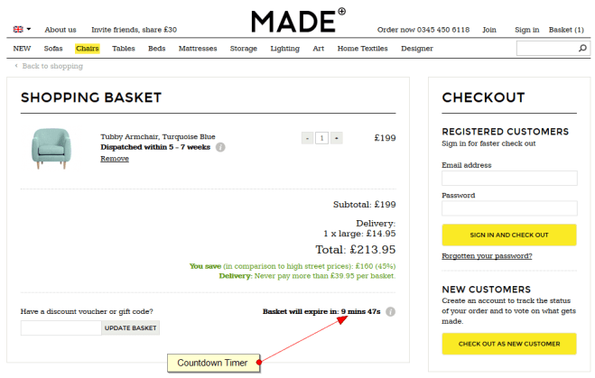
Compared to other online furniture retailers' websites, Made is beautifully crafted. It features all its products in a manner that is visually stunning. Similar to product pages, the checkout page on this site is also clean and clear. Designers of this site have added the countdown timer on the page to create a sense of urgency in shoppers. This encourages them to make their purchases right then or risk missing out.
Apart from the timer, the page also displays how much shoppers are saving on their orders to make them more confident about their purchase decision and to entice them to click on the checkout button.
6. Toys”R”Us
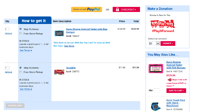
There are times online shoppers are buying gifts for their loved ones. When purchasing from an online store, the item may ship in the manufacturer's original packing which may reveal what's inside spoiling the surprise.
Toys”R”Us can get a gold star for designing the novel feature which allows customers to keep gift shipments a surprise.
7. Fab
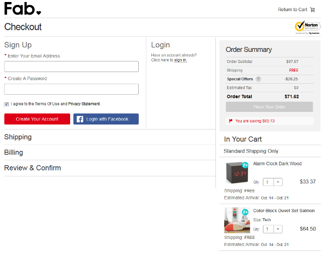
Fab on its checkout page provides an option to login with Facebook to complete the purchase, thereby saving precious time of its customers which will otherwise be spent registering on the site.
Also, it shows shipping charges beneath each product in the cart. It offers free shipping for purchases that have gone beyond a predetermined amount and depending on the area the products are to be delivered. Free shipping is the factor that compels shoppers to order.
All e-Commerce stores cannot afford to offer free shipping as that can eat into their bottom line. But if that fits their budget, this is the option that should be considered to lure in customers.
8. eBags
The checkout page of eBags is neatly laid out with informational content to provide all relevant information to shoppers on the page itself before they finally click on the ‘Continue Checkout' button.
On the checkout page, eBags has provided a live chat option that lets consumers get answers to their questions or doubts in real time. It also provides a loyalty program that awards customers with points in exchange of purchase. These points can then be redeemed in future by them.
9. Zappos
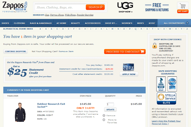
The biggest concern of most online buyers is whether the site they are giving their personal information along with credit card details to, is safe or not. To quell these worries, Zappos provides its potential customers with trust signals like credit card logos, small lock icon and third-party security seals. The seals are prominently displayed on the checkout page to communicate security to buyers. This is an excellent shopping cart practice that every e-Commerce store should incorporate.
Moreover, it even lets users update quantity or remove from cart while they're still on the checkout page.
10. Dune London
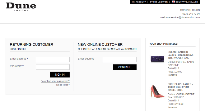
Another essential for any e-Commerce checkout page is to make sure customers can always see exactly how much and what they are paying for. Dune London gets it right by providing the product summary on the checkout page. It even makes sure that customers know exactly how much they are paying as they go through the checkout process. This feature ensures customers they are not being saddled with any hidden charges.
The checkout page of Duke London delivers a clean and simple shopping experience to its users in an excellent manner.
11. Simply Hike
This e-Commerce store's website is a great example of how an online retail store should keep customer needs at the back of its mind, while designing the site.
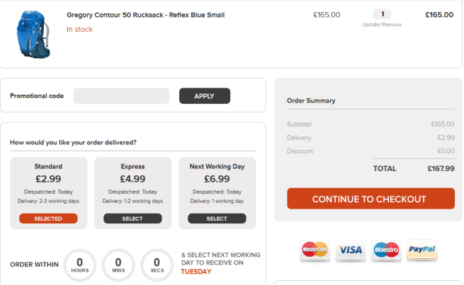
It offers different shipping options like ‘Standard', ‘Express' and ‘Next Working Day' and charges the customer accordingly.
Apart from shipping options, it also provides various payment options like credit card and Paypal to ensure customers don't abandon the shopping cart just because their preferred payment options are unavailable. This feature helps an e-Commerce store decrease shopping cart abandonment and increase conversions.
12. Crocs
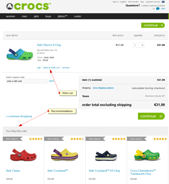
Croc's checkout pages are an exercise in design. Its ‘Move to Wishlist' feature lets shopper save the products for later.
They keep the buyer in funnel by recommending related products right at the end on the first checkout page. This is another excellent shopping cart practice which is quite under-used.
An e-Commerce store can boost conversion rates on their checkout page by providing all relevant information to their online potential customers, which helps them make a confident purchase decision. Take a cue from the aforementioned e-Commerce sites and optimize your checkout page for higher conversion rates!
Author Bio:
Michael Georgiou is a dynamic business professional and entrepreneurial guru associated with Imaginovation – proven his success in creative strategy, online branding, project management, and communication projects in both the public and private sectors.




Thanks for sharing an informative blog post. I have been looking for this kind of reference.
You’re welcome!
inspirational means beautifull also but amazon isn’t especially nice designed 🙂
very good examples uf UX :), but I think that the improvement of graphic design also had a positive effect by increasing visitors to shop and a willingness to purchase
Nice article. Wiggle has since changed their checkout flow and now force users to register.
Great post. Thanks for sharing. With the number of mobile users increasing rapidly, If you could give a round up of mobile shopping/checkout of few major retailers someday that would be great.
That’s a great idea Nomi, thanks a lot!